Tooltips display when you hover over or right-click a feature in your model. You can create tooltips at three levels:
- Feature class tooltips: When you create tooltips for a feature class in the Model Explorer, the tooltips appear for all features of that type. For example, if you create a tooltip "Buildings" for the Buildings feature class, all buildings and building subsets display "Buildings."
- Data source tooltips: When you define tooltips as part of configuring a data source, those tooltips override the feature class tooltips. For example, if you configure a particular building data source with the tooltip "West-side Buildings," the buildings that are part of that data source display "West-side Buildings," while other buildings display "Buildings."
- Selection set tooltips: When you select a set of features and use the Properties panel to create tooltips for them, the selection set tooltips override all others. For example, if you select three west-side buildings and create a tooltip "Restaurants," each of those buildings displays "Restaurants," while the remaining west-side buildings display "West-side Buildings," and every other building displays "Buildings."
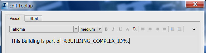
Tooltips can contain generic text as well as properties. For example, road tooltips can be the word "Road" or the property NAME. If you use a property, all individual features that contain a value for that property will display that value.
- For example, if you use the NAME property for roads, each road will display its name in the tooltip. If a road does not contain a value for NAME, its tooltip will be blank.
You can also include an image or a link in a tooltip. For information about links, see Add Links.
You can format the visual appearance of tooltips using familiar visual formatting options or HTML tags.