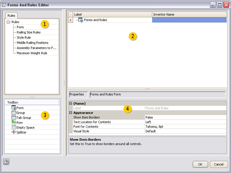
Add or edit controls to launch forms and trigger rules from the iLogic Browser.
|
Access: |
On the iLogic Browser, right-click an empty area, and click Edit. |

 Rules
Rules
Drag and drop a rule to the Form design tree to add a button on the iLogic Browser. Use the button to trigger the rule.
 Form design tree
Design the iLogic Browser in the form design tree area.
- Drag and drop rules and Toolbox items on to the form design tree to design and organize the iLogic Browser.
- Click in a label to edit the text.
- Highlight an item to define the properties in the properties area.
 Toolbox
Drag and drop an item to the form design tree.
 |
Form |
Adds a blank user interface form. Customize the form using the Form Editor dialog box. |
 |
Group |
Groups items together on the iLogic Browser. Groups are boxed and collapsible. |
 |
Tab Group |
Creates a tabbed group within the iLogic Browser. |
 |
Row |
Creates a row so that you can organize controls horizontally. Controls are organized vertically by default. |
 |
Empty Space |
Adds a blank space on the iLogic Browser tab. |
 |
Label |
Adds a text label on the iLogic Browser tab. |
 |
Splitter |
Adds a resizable splitter bar on the iLogic Browser tab. |
 Properties
Define the properties for the highlighted item in the form design tree. Properties vary depending on the item selected.
|
Enabling Parameter Name |
Defines the name of an Inventor true/false parameter. To enable this control, set to True. |
|
Font |
Defines the font for this control. |
|
Font for Contents |
Defines the font for the controls that are within this form or group. |
|
Image |
Defines the image file to display in this control. |
|
Label |
Defines the text to display for this element in the form. |
|
Maximum Width |
Defines the maximum width for this control. The number indicates the number of characters in the specified font. |
|
Minimum Width |
Defines the minimum width for this control. The number indicates the number of characters in the specified font. |
|
On Click Action |
Defines what this button does when it is clicked. Select from a list of options. |
|
Show Borders |
If set True, displays all borders around controls. |
|
Show Text |
If set True, the label text displays on the button. To show only a picture on the button, set to False. |
|
Text Location for Contents |
Defines the text location for the controls that are within this form or group. |
|
Tooltip |
Defines the tooltip text to display when the you pause the cursor over the control. |
|
Visual Style |
Defines the visual style or skin for the form. Select from a list of options. |