Common Definitions
Ribbon
The horizontally-tabbed user interface across the top of (the application frame in) Revit 2010 and later.
Ribbon Tab
The ribbon is separated into tabs. The Add-Ins ribbon tab, which only appears when at least one add-in is installed, is available for third party developers to add a panel.
Ribbon Panel
A ribbon tab is separated into horizontal groupings of commands. An Add-In panel represents the commands available for a third party developer's application. The Add-In panel is equivalent to the toolbar in Revit 2009.
Ribbon Button
The button is the mechanism for launching a command. They can either be large, medium or small (Both large and small buttons can either be a simple push button or a drop-down button.
Menu button
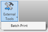
The default first panel on the Add-Ins tab is the External Tools panel that contains one button titled "External Tools." The External Tools menu-button is equivalent to the Tools > External Tools menu in Revit 2009. Any External Commands registered in a .addin manifest file will appear in this menu button.

Figure 240 - External Tools menu-button on Add-Ins tab
Drop-down button
A drop-down button expands to show two or more commands in a drop-down menu. Each sub-command can have its own large icon.
Vertical Separator
A vertical separator is a thin vertical line that can be added between controls on a panel.
Tooltip
A tooltip is a small panel that appears when the user hovers the mouse pointer over a ribbon button. Tooltips provide a brief explanation of the commands expected behavior.