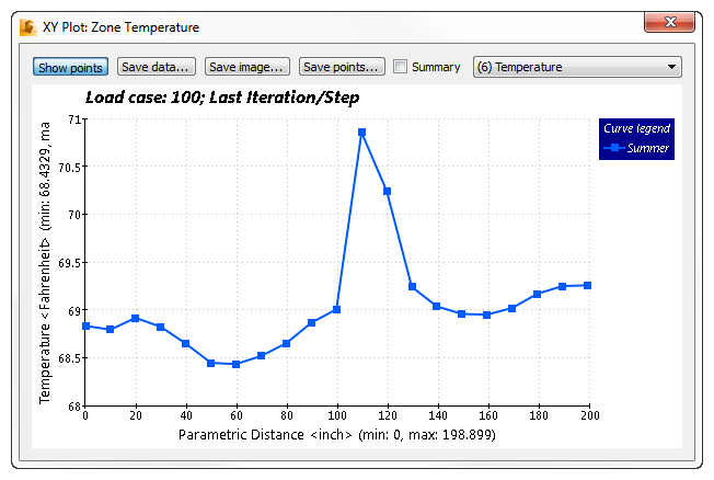
In this step, we'll use the XY Plot that we created earlier to compare the Summer and Winter temperature profiles across the upper bound of the occupied zone.

1. In the Decision Center, click on Zone Temperature.

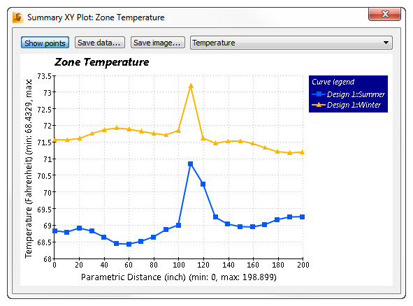
Note: The XY Temperature plot for both scenarios should look like this:

Note: Your plot may look a little different, depending on where you clicked on the results plane, but the trends should be similar to this plot.
Note: As expected, the higher temperature curve is from the Winter scenario, and the lower temperature curve is from Summer. In the middle of the Summer curve, we see an abrupt temperature rise (about 2 °F in 40 inches). This means the occupant's back is quite a bit cooler than his front, and may indicate a potentially uncomfortable situation!
2. Close the Summary Plot dialog by clicking the X in the upper right corner of the dialog.
