DCL offers a number of predefined tiles and tile clusters that represent many of the common Windows controls.
The following predefined tile and tile cluster definitions are available for use in a DCL file:
- Buttons
-
A button tile provides a control for the user to click. Many dialog boxes offer at least one button used to close or cancel the dialog box. The action associated with a button should be visible to the user and should take place immediately. The label of a button should be unambiguous. Usually, it should be a verb that describes the effect of pushing the button, though another label—such as OK or Options—is acceptable if its meaning is clear.
Buttons in a column should be the same width. In other cases, buttons should have a fixed width (either fixed_width = true;, or children_fixed_width = true;) in their common parent cluster.

- Clusters
-
A boxed cluster (row or column) is called a group box, frame, or an area. An area provides a visual cue to users by isolating and naming controls that work together. The area can contain as many tiles, rows, and columns (unboxed) as necessary. The label of an area should indicate its purpose.
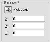
If controls relate to each other, put them in an area. The Base Point cluster in the following illustration demonstrates this technique with an area formed from a cluster with a label and border:

However, do not overuse areas. White space is also an effective way to group tiles. Do not put a box around a list box; this results in the dialog box looking too busy.
- Edit Boxes
-
An edit box allows the user to freely enter a string of text in the text-entry portion and optionally display a label to its left. The length of the text-entry portion of an edit box should roughly equal the length of an average entry. When in doubt, use a character width of 10 for real number fields and 20 for text fields.
The label of an edit box should end with a colon ( : ).
If there are restrictions on what users can enter in the edit box, put a text tile to the right of the edit box that briefly explains these restrictions. If users need to enter a file name, for example, there is no need to explain what a file name is. But if the string is a number that cannot exceed 100, a reminder of this limit is a good idea.
For data, such as points, provide two or three edit boxes rather than require users to remember the Command line syntax of point entry. One exception is an edit box intended specifically for entering advanced syntax, such as the wild-card pattern edit box in the AutoCAD File Search dialog box.

- Image Buttons and Image Tiles
-
An image button or tile allows you to display a slide image. You can use image buttons to represent selections, supplement the image with text that briefly describes it, especially if the color of the image (or part of the image) is a factor in selecting it. An image tile can be used to display an icon to alert the user—for example, a warning signal such as a stop sign—use it consistently in all dialog boxes.

- List Boxes
-
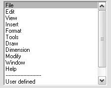
A list box allows you to choose a single or multiple items from a list. Because list boxes cannot be scrolled horizontally, the width of the list box should accommodate the longest item in the list. An optional label can be provided (or a text tile) to explain the contents of the list box. The items in the list can appear in the order they are added, but you can use the AutoLISP acad_strlsort function to alphabetize the items in a list before adding them to the list box. If you only have a few items to display, consider using a radio column instead of a list box.

- Radio Buttons, Radio Rows, and Radio Columns
-
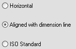
Radio buttons allow you to present multiple options to a user, but the user can only make a single choice. Radio columns have a better esthetic look and are easier to use than radio rows.

Radio rows are appropriate only when they contain a small number of buttons (usually, two to four) or if the labels are short. If an option selected elsewhere makes the choices in the radio row or radio column invalid or irrelevant, then disable the whole row or column. In some situations, an option selected elsewhere may make certain radio buttons invalid or irrelevant. In situations like this, you can disable buttons individually.
- Sliders
-
A slider allows the user to choose a value within a specified range. The granularity of a slider should not be too coarse. For example, if a slider is assigned only four incremental values but is laid out in a two-inch section of the dialog box, users would have to move half an inch to see a change. Avoid jumpiness like this by scaling the size of the slider.
If users need to know the value controlled by the slider, your dialog box should also display the slider's current value. Update this value whenever the slider is moved. It is recommended you also display an edit box that enables users to enter the value rather than use the slider. If you use an edit box this way, update its value; otherwise, display the value in a text tile.
The following illustration shows a typical combination of edit box and slider:

- Text
-
Text tiles are used to identify the purpose of individual tiles or dialog box areas. You can also use text tiles to display status messages or reminders, including error messages and warnings. Text should be direct and unambiguous. Describe options and entry fields in terms your users would use. Align messages with the control tiles they describe, and put text that identifies a group of control tiles or a section of the dialog box above the tiles that the text describes.
For example, the error message “Invalid entry” in a list box conveys little information. A message such as “Layer does not exist” is more helpful.
- Toggles
-
Toggle or check boxes allow you to present the user with multiple options, and the user can select one or more of the options. When the options controlled by toggles are related to the same topic, group them together.
Use a single toggle to control whether other tiles, often in a row or column, are active. In this case, the toggle should be prominent. When the toggle controls only one other tile, you can also place it to the right of that tile. The toggle in the following dialog box enables or disables another tile:
