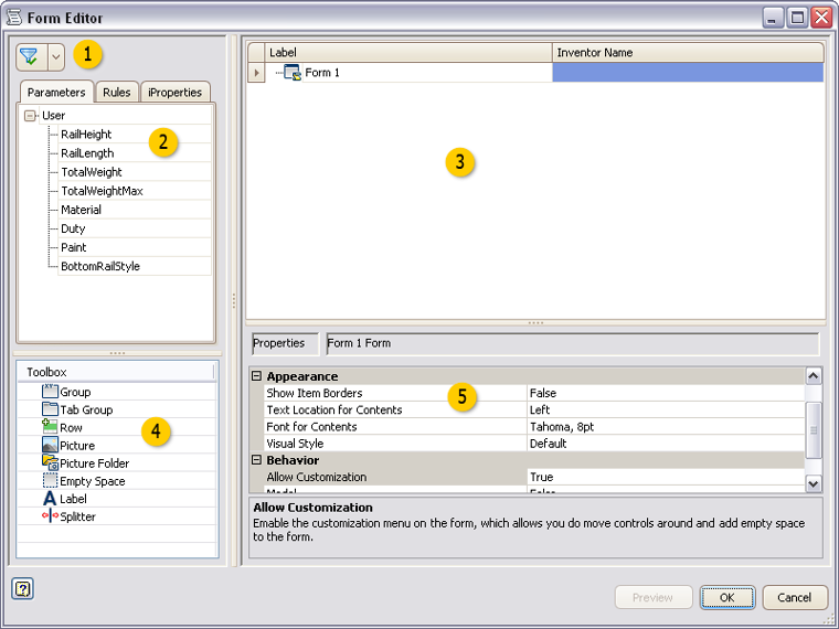
Create or edit a custom user interface form.
|
Access: |
Ribbon:
Manage tab
 iLogic panel drop-down arrow
 Add Form

|

 Filter
Filter the list on the Parameters, Rules, and iProperties tabs for:
- All
- Key
- Renamed
 Tabs
Tabs
Drag and drop items from the tabs to the Form design tree to add controls on the user interface design. Only existing parameters and rules display on the tabs.
 Form design tree
Design the user interface in the form design tree area.
- Drag and drop parameters, rules, iProperties, and Toolbox items on to the form design tree to design and organize the user interface.
- Drag and drop items on the tree to organize the controls.
- Click in a label to edit the text.
- Highlight an item to define the properties in the properties area.
 Toolbox
Drag and drop an item to the form design tree.
 |
Group |
Groups items on the user interface. Groups are boxed and collapsible. |
 |
Tab Group |
Creates a tab on the user interface. |
 |
Row |
Creates a row so that you can organize controls horizontally. Controls are organized vertically by default. |
 |
Picture |
Adds a picture to the user interface. Pictures are informational only. Select the picture item in the Form design tree and define the image file in the properties. |
 |
Picture Folder |
Adds a folder for alternate pictures. |
 |
Empty Space |
Adds a blank space on the user interface form. |
 |
Label |
Adds a text label on the user interface form. |
 |
Splitter |
Adds a resizable splitter bar on the user interface. |
 Properties
Define the properties for the highlighted item in the form design tree. Properties vary depending on the item selected.
|
Allow Control Resizing |
If set True, enables the Resize Controls right-click option on the form. This option allows you to resize controls and groups. |
|
Edit Control Type |
Defines the control type to use to edit this parameter. |
|
Enabling Parameter Name |
Defines the name of an Inventor true/false parameter. Setting this parameter to True enables this control. |
|
Font |
Defines the font for this control. |
|
Font for Contents |
Defines the font for the controls that are within this form or group. |
|
Image |
Defines the image file to display in this control. |
|
Label |
Defines the text to display for this element in the form. |
|
Maximum Width |
Defines the maximum width for this control. The number indicates the number of characters in the specified font. |
|
Minimum Width |
Defines the minimum width for this control. The number indicates the number of characters in the specified font. |
|
Modal |
If set False, you can interact with the model and use other functions while the form is active. |
|
Picture Parameter Name |
Defines a picture control that changes based on the parameter value. Assign a parameter to the picture control instead of assigning an image. Use with a Picture Folder containing pictures with images assigned to the parameter values. |
|
Predefined Buttons |
Defines the buttons to show at the bottom of the form. Select from a list of predefined sets. |
|
ReadOnly |
If set True, sets the parameter as not editable from the form. |
|
Show Item Border |
If set True, displays all borders around controls. |
|
Show on Place Component (not available in Inventor LT) |
If set True, displays the form when placing this model as a component in an assembly. This setting affects Place Component and Place iLogic Component. If the template file has a form, this setting also affects Create In-Place Component. |
|
Text Location for Contents |
Defines the text location for the controls that are within this form or group. |
|
Tooltip |
Defines the tooltip text to display when the mouse hovers over the control. |
|
Visual Style |
Defines the visual style or skin for the form. Select from a list of options. |