TabStrip ActiveX Control
"Microsoft TabStrip Control 6.0 (SP4)" "MSComctlLib.TabStrip.2" "{1EFB6596-857C-11D1-B16A-00C0F0283628}"  ActiveX Controls have been deprecated by Microsoft in the latest versions of the
Windows operating system in favor of the DotNet framework and its controls.
While MAXScript still supports ActiveX controls, these have to be installed and registered on the system to be accessible to MAXScript.
As a replacement of ActiveX controls, MAXScript supports DotNet controls in 3ds Max 9 and higher.
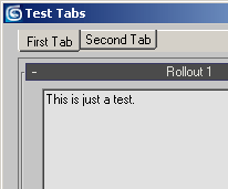
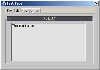
The TabStrip ActiveX Control creates a strip of tabs that can be used to manage multi-page dialogs similar to the Tabbed Render Scene Dialog or the Preferences dialog in 3ds Max.
Get/Set the array of tabs represented in the TabStrip.
Get/Set the text displayed on the tab.
Get/Set the Tooltip text of the tab.
Get/Set the height of the tab.
Get/Set the top position of the tab.
Get/Set the left position of the tab.
Get/Set the selected state of the tab.
Get/Set the highlighted state of the tab.
Get/Set the enabled state of the TabStrip. When set to false, the tabs cannot be switched.
Accesses the Font to be used to label the tabs.
Accesses the Windows OLE handle of the TabStrip.
Get/Set the mouse icon to be displayed.
Get/Set the multi-row mode. When set to true, tabs will be ordered in multiple rows when the width of the strip does not provide enough space to show all tabs. When set to false, the excessive tabs will be off-screen, and a set of Left and Right arrows will be displayed to allow the scrolling of the tabs.
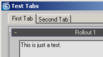
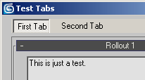
#TabTabs, #TabButtons and #TabFlatButtons styles.
Get/Set the fixed width of the tabs when .TabWidthStyle property is set to #tabFixed . The value is expressed in Twips.
Get/Set the width style of the tabs.
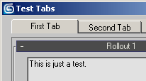
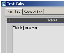
#TabJustified vs. #TabFixed with TabFixedWidth set to 2400 twips.
Get/Set the Client Top, Left coordinates and the Width and Height.
.MousePointer : MousePointerConstants( #ccDefault | #ccArrow | #ccCross | #ccIBeam | #ccIcon | #ccSize | #ccSizeNESW | #ccSizeNS | #ccSizeNWSE | #ccSizeEW | #ccUpArrow | #ccHourglass | #ccNoDrop | #ccArrowHourglass | #ccArrowQuestion | #ccSizeAll | #ccCustom )
Get/Set the Mouse Pointer style when hovering over the TabStrip.
Get/Set the fixed height of the tabs.
Returns the currently selected item.
Get/Set whether to hot-track the tabs when the mouse is hovering over the TabStrip.
Get/Set whether to allow multiple tabs to be selected at the same time.
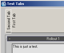
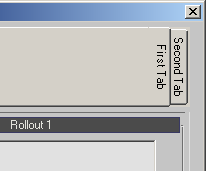
.Placement : PlacementConstants( #tabPlacementTop | #tabPlacementBottom | #tabPlacementLeft | #tabPlacementRight )
Get/Set the placement of the tabs.
Get/Set whether to use separators.
Get/Set the min. width of the tabs.
Called when the user clicks inside the TabStripc ontrol (right after the mouse button has been released). This event does not return specific Tab, but it could be used to query the selection state or other properties of all Tabs. It is a general notification that the user clicked a tab, the actual actions performed by the event are up to the script developer.
Called when the user presses a key. The KeyCode argument will contain the integer code of the key that has been pressed, the Shift argument will contain an integer whose bits represent the pressed state of the Shift, Control and Alt keys - bit 1 represents Shift, bit 2 represents Control, bit 3 represents Alt.
1 - Left or Right Shift key pressed
2 - Left or Right Control key pressed
3 - Control + Shift keys pressed simultaneously
4 - Left or Right Alt key pressed
6 - Control + Alt keys pressed simultaneously
7 - Control, Alt and Shift keys pressed simultaneously
Called when the user presses a key. The KeyAscii argument will contain the ASCII integer code of the key that has been pressed. For example, pressing Space Bar will return 32, pressing Shift+A will return 65 etc.
Called when the user releases a key. The KeyCode argument will contain the integer code of the key that has been released, the Shift argument will contain an integer whose bits represent the pressed state of the Shift, Control and Alt keys - see keyDown event above.
on <control_name> MouseDown Button:integer Shift:integer x:OLE_XPOS_PIXELS y:OLE_YPOS_PIXELS do ( ... )
Called when the user moves the mouse inside the TabStrip control.
The Button argument will contain an integer whose bits will correspond to the mouse buttons: bit 1 represents Left Mouse Button, bit 2 represents Right Mouse Button, bit 3 represents Middle Mouse Button / Wheel.
1 - Left Mouse Button pressed.
2 - Right Mouse Button pressed.
4 - Middle Mouse Button / Wheel pressed.
The Shift argument will contain the state of the Shift, Control and Alt keys as described earlier on this page.
The x and y arguments will contain the location of the click in TabStrip pixel coordinates (NOT twips!), where 0,0 is the upper left corner of theTabStripControl.
on <control_name> MouseMove Button:integer Shift:integer x:OLE_XPOS_PIXELS y:OLE_YPOS_PIXELS do ( ... )
Called when the user releases the mouse over the TabStrip control.
The Button argument will contain an integer whose bits will correspond to the mouse buttons: bit 1 represents Left Mouse Button, bit 2 represents Right Mouse Button, bit 3 represents Middle Mouse Button / Wheel.
1 - Left Mouse Button pressed.
2 - Right Mouse Button pressed.
4 - Middle Mouse Button / Wheel pressed.
The Shift argument will contain the state of the Shift, Control and Alt keys as described earlier on this page.
The x and y arguments will contain the location of the click in TabStrip pixel coordinates (NOT twips!), where 0,0 is the upper left corner of the TabStrip Control.
on <control_name> MouseUp Button:integer Shift:integer x:OLE_XPOS_PIXELS y:OLE_YPOS_PIXELS do ( ... )
Called when the user releases the mouse over the TreeView control.
The Button argument will contain an integer whose bits will correspond to the mouse buttons: bit 1 represents Left Mouse Button, bit 2 represents Right Mouse Button, bit 3 represents Middle Mouse Button / Wheel.
1 - Left Mouse Button pressed.
2 - Right Mouse Button pressed.
4 - Middle Mouse Button / Wheel pressed.
The Shift argument will contain the state of the Shift, Control and Alt keys as described earlier on this page.
The x and y arguments will contain the location of the click in TreeView pixel coordinates (NOT twips!), where 0,0 is the upper left corner of the TreeView Control.
Called when the user clicks a new tab. The Cancel argument returns 0 when the tab has been changed. Clicking the selected tab does not call this event.
Called when OLE Drag is started.
Called when OLE Drag needs to specify the drag effect and cursor.
Called when OLE Drag needs to specify the drag effect and cursor.
Called when OLE Drag is complete.
on <control_name> OLEDragOver &Data:DataObject &Effect:integer &Button:integer &Shift:integer &x:float &y:float &State:integer do ( ... )
Called when the OLE Drag object is being dragged over the ActiveX control.
on <control_name> OLEDragDrop &Data:DataObject &Effect:integer &Button:integer &Shift:integer &x:float &y:float do ( ... )
Called when the OLE Drag object has been dropped.
