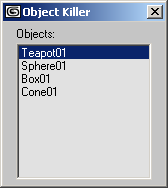
Listbox UI Control
| User Interface Controls > Common Properties > Layout > Types > Listbox |
A Listbox control is used to place a list box in the rollout.
This is another variant of the drop-down list in which the list is always fully displayed in the rollout.
Unlike Combobox it has no edit-text field at the top and it is just a simple scrollable list. The user can scroll the list or click to select an item.
listbox <name> [<caption>] [items:<array_of_strings>] [selection:<number>] [height:<number>] [readOnly:<boolean>] [toolTip:<string>]
The default alignment of listbox items is #left .
The array of text strings that are the items in the list.
The 1-based number of the currently selected item in the list. The default selection value is 1.
The overall height of the listbox in number of item lines. Defaults to 10 lines. To have a listBox display exactly N items, set height to N .
The minimum height value is clamped to 1 line.
When set to true, the user cannot pick items from the list. When false or not specified, the user can pick items from the list.
toolTip:
Provides text for a tooltip for the listbox; no tooltip if unsupplied.
The currently selected item number, 1-based. If the items list is an empty array, this value is 0.
The text of the currently selected item. Can be used to replace individual items with resetting the entire items array. If the items list is an empty array, this value is undefined .
When set to true , the user cannot pick items from the list. When false , the user can pick items from the list.
Get/set the width of the listbox list window in pixels.
Get/set the height of the listbox list window in pixels.
Called when the user selects an item in the list. The <arg> argument contains the new current selection item number.
Called when the user double-clicks on an item in the list. Note that the on selected handler is always called on single clicks and on the first click of a double-click. The <arg> argument contains the number of the item double-clicked.
Called when the user right-clicks an item in the list.
If the optional <arg> argument is specified, it will contain the index of the right-clicked item.
Available in 3ds Max 2010 and higher.


