Available Custom Controls
Custom Edit Controls
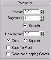
This control is a simple text input control. The user may type any string into the field and the plugin is notified when the user presses the ENTER key. There are also methods to parse and return integer and floating point values entered in the control. If the edit control is to be used with numeric values, it is typically used in conjunction with a custom spinner control.
Spinner Controls
 (Edit control and Spinner control)
The spinner control is used (usually in conjunction with the custom edit control) to provide input of values limited to a fixed type. For example, the control may be limited to the input of only positive integers. The input options are integer, float, universe (world space units), positive integer, positive float, positive universe, and time. This control allows the user to increment or decrement a value by clicking on the up or down arrows. The user may also click and drag on the arrows to interactively adjust the value. The Ctrl key may be held to accelerate the value changing speed, while the Alt key may be held to decrease the value changing speed. The user may also right click on the arrows to reset the value its default.
Slider Controls
This control is available in release 3.0 and later only.
The custom slider control is functionality similar to the custom spinner control with some additional functionality. The slider control is used (sometimes in conjunction with the custom edit control) to provide input of values limited to a fixed type.
Custom Button Controls
Custom Buttons allow the developer to have extra control of the way buttons appear and behave in the dialog box. These custom buttons have the following features:
The button can be either a check button (which stays pressed in until the user selects it again), or a push button (which pops back out immediately).
The highlight color of the check button may be specified.
A button may function as a fly-off. Any number of additional buttons may be specified to fly off. The direction of the fly off may be specified or computed automatically.
The buttons may be labeled with text or images. Four images may be specified allowing precise control over how the button appears when enabled or disabled and pressed in or released.
Custom Status Control
This control provides a recessed area of the dialog which the developer may use as a status prompt area.
Custom Toolbar Control
This control allows the creation of toolbars containing buttons (push, check, and fly-offs), status fields, separators (spacers), and other Windows or user defined controls. 3ds Max toolbar button icons can be of either 16x15 or 16x16 pixels.
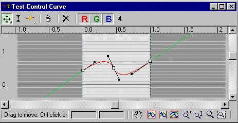
Custom Curve Control
This is a spline based control which returns output values from a user adjustable curve. An example of this control in the 3ds Max user interface can be seen in the Color Map section of the Output rollup of a 2D Texture map. Sample code using these APIs is available in \MAXSDK\SAMPLES\UTILITIES\CCUTIL\CCUTIL.CPP.
Custom Image Control
The custom image control provides a recessed area in the dialog to display a bitmap image.
Color Swatch Control
The Color Swatch control presents the user with the standard 3ds Max modeless color selector when the user clicks on the control. The color swatch control displays the currently-selected color and may be continuously updated as the user interactively selects new colors. Color Swatches also handle drag and drop between color swatches.
Rollup Window Control
This control is used if you are creating a dialog box which will not be used in the command panel. This control adds a container area for rollup pages to be added to the dialog, and provides a scroll bar just like the command panel itself.
Note that this is a special case. Normally, adding rollup pages to the command panel is done using the simple AddRollupPage() method of the Interface class. This control is only used when you want to have a scrolling region for rollup pages in a dialog box.
Window Thumb Tack Control
This control installs a thumb tack into a window title bar which allows the user to make the window 'Always On Top'.
Off Screen Buffer Control
This control provides an off-screen buffer which the developer may draw into, then quickly blit onto the actual display for flicker-free image updates.
Drag and Drop Window Control
This kind of custom control is used to provide drag and drop to and from things other than Custom Buttons.

 (Spinner control)
 (Slider Control)
 ('Bracketed' Slider Control)


