Revit provides API solutions to integrate custom ribbon panels and controls.
Ribbon Panels and Controls
These APIs are used with IExternalApplication. Custom ribbon panels can be added to the Add-Ins tab, the Analyze tab or to a new custom ribbon tab.
Panels can include buttons, both large and small, which can be either simple push buttons, pulldown buttons containing multiple commands, or split buttons which are pulldown buttons with a default push button attached. In addition to buttons, panels can include radio groups, combo boxes and text boxes. Panels can also include vertical separators to help separate commands into logical groups. Finally, panels can include a slide out control accessed by clicking on the bottom of the panel.
Please see Ribbon Guidelines in the API User Interface Guidelines section for information on developing a user interface that is compliant with the standards used by Autodesk.
Create a New Ribbon Tab
Although ribbon panels can be added to the Add-Ins or Analyze tab, they can also be added to a new custom ribbon tab. This option should only be used if necessary. To ensure that the standard Revit ribbon tabs remain visible, a limit of 20 custom ribbon tabs is imposed. The following image shows a new ribbon tab with one ribbon panel and a few simple controls.

Below is the code that generated the above ribbon tab.
|
Code Region: New Ribbon tab |
public Result OnStartup(UIControlledApplication application)
{
    // Create a custom ribbon tab
    String tabName = "This Tab Name";
    application.CreateRibbonTab(tabName);

    // Create two push buttons
    PushButtonData button1 = new PushButtonData("Button1", "My Button #1",
        @"C:\ExternalCommands.dll", "Revit.Test.Command1");
    PushButtonData button2 = new PushButtonData("Button2", "My Button #2",
        @"C:\ExternalCommands.dll", "Revit.Test.Command2");

    // Create a ribbon panel
    RibbonPanel m_projectPanel = application.CreateRibbonPanel(tabName, "This Panel Name");

    // Add the buttons to the panel
    List<RibbonItem> projectButtons = new List<RibbonItem>();
    projectButtons.AddRange(m_projectPanel.AddStackedItems(button1, button2));

    return Result.Succeeded;
}
|
Create a New Ribbon Panel and Controls
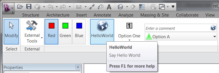
The following image shows a ribbon panel on the Add-Ins tab using various ribbon panel controls. The following sections describe these controls in more detail and provide code samples for creating each portion of the ribbon.

Figure 14: New ribbon panel and controls
The following code outlines the steps taken to create the ribbon panel pictured above. Each of the functions called in this sample is provided in subsequent samples later in this section. Those samples assume that there is an assembly located at D:\ Sample\HelloWorld\bin\Debug\Hello.dll which contains the External Command Types:
- Hello.HelloButton
- Hello.HelloOne
- Hello.HelloTwo
- Hello.HelloThree
- Hello.HelloA
- Hello.HelloB
- Hello.HelloC
- Hello.HelloRed
- Hello.HelloBlue
- Hello.HelloGreen
|
Code Region: Ribbon panel and controls |
public Result OnStartup(Autodesk.Revit.UI.UIControlledApplication app)
{
        RibbonPanel panel = app.CreateRibbonPanel("New Ribbon Panel");

        AddRadioGroup(panel);
        panel.AddSeparator();
        AddPushButton(panel);
        AddSplitButton(panel);
        AddStackedButtons(panel);
        AddSlideOut(panel);

        return Result.Succeeded;
}
|
Ribbon Panel
Custom ribbon panels can be added to the Add-Ins tab (the default) or the Analyze tab, or they can be added to a new custom ribbon tab. There are various types of ribbon controls that can be added to ribbon panels which are discussed in more detail in the next section. All ribbon controls have some common properties and functionality.
Ribbon Control Classes
Each ribbon control has two classes associated with it - one derived from RibbonItemData that is used to create the control (i.e. SplitButtonData) and add it to a ribbon panel and one derived from RibbonItem (i.e. SplitButton) which represents the item after it is added to a panel. The properties available from RibbonItemData (and the derived classes) are also available from RibbonItem (and the corresponding derived classes). These properties can be set prior to adding the control to the panel or can be set using the RibbonItem class after it has been added to the panel.
Tooltips
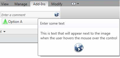
Most controls can have a tooltip set (using the ToolTip property) which is displayed when the user moves the mouse over the control. When the user hovers the mouse over a control for an extended period of time, an extended tooltip will be displayed using the LongDescription and the ToolTipImage properties. If neither LongDescription nor ToolTipImage are set, the extended tooltip is not displayed. If no ToolTip is provided, then the text of the control (RibbonItem.ItemText) is displayed when the mouse moves over the control.

Figure 15: Extended Tooltip
Contextual Help
Controls can have contextual help associated with them. When the user hovers the mouse over the control and hits F1, the contextual help is triggered. Contextual help options include linking to an external URL, launching a locally installed help (chm) file, or linking to a topic on the Autodesk help wiki. The ContextualHelp class is used to create a type of contextual help, and then RibbonItem.SetContextualHelp() (or RibbonItemData.SetContextualHelp()) associates it with a control. When a ContextualHelp instance is associated with a control, the text "Press F1 for more help" will appear below the tooltip when the mouse hovers over the control, as shown below.

The following example associates a new ContextualHelp with a push button control. Pressing F1 when hovered over the push button will open the Autodesk homepage in a new browser window.
|
Code Region: Contextual Help |
private void AddPushButton(RibbonPanel panel)
{
    PushButton pushButton = panel.AddItem(new PushButtonData("HelloWorld",
        "HelloWorld", @"D:\Sample\HelloWorld\bin\Debug\HelloWorld.dll", "HelloWorld.CsHelloWorld")) as PushButton;

    // Set ToolTip and contextual help
    pushButton.ToolTip = "Say Hello World";
    ContextualHelp contextHelp = new ContextualHelp(ContextualHelpType.Url,
        "http://www.autodesk.com");
    pushButton.SetContextualHelp(contextHelp);

    // Set the large image shown on button
    pushButton.LargeImage =
        new BitmapImage(new Uri(@"D:\Sample\HelloWorld\bin\Debug\39-Globe_32x32.png"));
}
|
The ContextualHelp class has a Launch() method that can be called to display the help topic specified by the contents of this ContextualHelp object at any time, the same as when the F1 key is pressed when the control is active. This allows the association of help topics with user interface components inside dialogs created by an add-in application.
Associating images with controls
All of these controls can have an image associated with them using the LargeImage property. The best size for images associated with large controls, such as non-stacked ribbon and drop-down buttons, is 32×32 pixels, but larger images will be adjusted to fit the button. Stacked buttons and small controls such as text boxes and combo boxes should have a 16×16 pixel image set. Large buttons should also have a 16×16 pixel image set for the Image property. This image is used if the command is moved to the Quick Access Toolbar. If the Image property is not set, no image will be displayed if the command is moved to the Quick Access Toolbar. Note that if an image larger than 16×16 pixels is used, it will NOT be adjusted to fit the toolbar.
The ToolTipImage will be displayed below the LongDescription in the extended tooltip, if provided. There is no recommended size for this image.
Ribbon control availability
Ribbon controls can be enabled or disabled with the RibbonItem.Enabled property or made visible or invisible with the RibbonItem.Visible property.
Ribbon Controls
In addition to the following controls, vertical separators can be added to ribbon panels to group related sets of controls.
Push Buttons
There are three types of buttons you can add to a panel: simple push buttons, drop-down buttons, and split buttons. The HelloWorld button in Figure 14 is a push button. When the button is pressed, the corresponding command is triggered.
In addition to the Enabled property, PushButton has the AvailabilityClassName property which can be used to set the name of an IExternalCommandAvailability interface that controls when the command is available.
|
Code Region: Adding a push button |
private void AddPushButton(RibbonPanel panel)
{
        PushButton pushButton = panel.AddItem(new PushButtonData("HelloWorld",
                "HelloWorld", @"D:\HelloWorld.dll", "HelloWorld.CsHelloWorld")) as PushButton;

        pushButton.ToolTip = "Say Hello World";
        // Set the large image shown on button
        pushButton.LargeImage =
                new BitmapImage(new Uri(@"D:\Sample\HelloWorld\bin\Debug\39-Globe_32x32.png"));
}
|
Drop-down buttons
Drop-down buttons expand to display two or more commands in a drop-down menu. In the Revit API, drop-down buttons are referred to as PulldownButtons. Horizontal separators can be added between items in the drop-down menu.
Each command in a drop-down menu can also have an associated LargeImage as shown in the example above.
Split buttons
Split buttons are drop-down buttons with a default push button attached. The top half of the button works like a push button while the bottom half functions as a drop-down button. The Option One button in Figure 14 is a split button.
Initially, the push button will be the top item in the drop-down list. However, by using the IsSynchronizedWithCurrentItem property, the default command (which is displayed as the push button top half of the split button) can be synchronized with the last used command. By default it will be synched. Selecting Option Two in the split button from Figure 14 above yields:

Figure 16: Split button synchronized with current item
Note that the ToolTip, ToolTipImage and LongDescription properties for SplitButton are ignored. The tooltip for the current push button is shown instead.
|
Code Region: Adding a split button |
private void AddSplitButton(RibbonPanel panel)
{
        string assembly = @"D:\Sample\HelloWorld\bin\Debug\Hello.dll";

        // create push buttons for split button drop down
        PushButtonData bOne = new PushButtonData("ButtonNameA", "Option One",
         assembly, "Hello.HelloOne");
        bOne.LargeImage =
                new BitmapImage(new Uri(@"D:\Sample\HelloWorld\bin\Debug\One.bmp"));

        PushButtonData bTwo = new PushButtonData("ButtonNameB", "Option Two",
                assembly, "Hello.HelloTwo");
        bTwo.LargeImage =
         new BitmapImage(new Uri(@"D:\Sample\HelloWorld\bin\Debug\Two.bmp"));

        PushButtonData bThree = new PushButtonData("ButtonNameC", "Option Three",
         assembly, "Hello.HelloThree");
        bThree.LargeImage =
                new BitmapImage(new Uri(@"D:\Sample\HelloWorld\bin\Debug\Three.bmp"));

        SplitButtonData sb1 = new SplitButtonData("splitButton1", "Split");
        SplitButton sb = panel.AddItem(sb1) as SplitButton;
        sb.AddPushButton(bOne);
        sb.AddPushButton(bTwo);
        sb.AddPushButton(bThree);
}
|
Radio buttons
A radio button group is a set of mutually exclusive toggle buttons; only one can be selected at a time. After adding a RadioButtonGroup to a panel, use the AddItem() or AddItems() methods to add toggle buttons to the group. Toggle buttons are derived from PushButton. The RadioButtonGroup.Current property can be used to access the currently selected button.
Note that tooltips do not apply to radio button groups. Instead, the tooltip for each toggle button is displayed as the mouse moves over the individual buttons.
|
Code Region: Adding radio button group |
private void AddRadioGroup(RibbonPanel panel)
{
        // add radio button group
        RadioButtonGroupData radioData = new RadioButtonGroupData("radioGroup");
        RadioButtonGroup radioButtonGroup = panel.AddItem(radioData) as RadioButtonGroup;

        // create toggle buttons and add to radio button group
        ToggleButtonData tb1 = new ToggleButtonData("toggleButton1", "Red");
        tb1.ToolTip = "Red Option";
        tb1.LargeImage = new BitmapImage(new Uri(@"D:\Sample\HelloWorld\bin\Debug\Red.bmp"));
        ToggleButtonData tb2 = new ToggleButtonData("toggleButton2", "Green");
        tb2.ToolTip = "Green Option";
        tb2.LargeImage = new BitmapImage(new Uri(@"D:\Sample\HelloWorld\bin\Debug\Green.bmp"));
        ToggleButtonData tb3 = new ToggleButtonData("toggleButton3", "Blue");
        tb3.ToolTip = "Blue Option";
        tb3.LargeImage = new BitmapImage(new Uri(@"D:\Sample\HelloWorld\bin\Debug\Blue.bmp"));
        radioButtonGroup.AddItem(tb1);
        radioButtonGroup.AddItem(tb2);
        radioButtonGroup.AddItem(tb3);
}
|
Text box
A text box is an input control for users to enter text. The image for a text box can be used as a clickable button by setting the ShowImageAsButton property to true. The default is false. The image is displayed to the left of the text box when ShowImageAsButton is false, and displayed at the right end of the text box when it acts as a button, as in Figure 14.
The text entered in the text box is only accepted if the user hits the Enter key or if they click the associated image when the image is shown as a button. Otherwise, the text will revert to its previous value.
In addition to providing a tooltip for a text box, the PromptText property can be used to indicate to the user what type of information to enter in the text box. Prompt text is displayed when the text box is empty and does not have keyboard focus. This text is displayed in italics. The text box in Figure 14 has the prompt text "Enter a comment".
The width of the text box can be set using the Width property. The default is 200 device-independent units.
The TextBox.EnterPressed event is triggered when the user presses enter, or when they click on the associated image for the text box when ShowImageAsButton is set to true. When implementing an EnterPressed event handler, cast the sender object to TextBox to get the value the user has entered as shown in the following example.
|
Code Region: TextBox.EnterPressed event handler |
void ProcessText(object sender, Autodesk.Revit.UI.Events.TextBoxEnterPressedEventArgs args)
{
        // cast sender as TextBox to retrieve text value
        TextBox textBox = sender as TextBox;
        string strText = textBox.Value as string;
}
|
The inherited ItemText property has no effect for TextBox. The user-entered text can be obtained from the Value property, which must be converted to a string.
See the section on stacked ribbon items for an example of adding a TextBox to a ribbon panel, including how to register the event above.
Combo box
A combo box is a pulldown with a set of selectable items. After adding a ComboBox to a panel, use the AddItem() or AddItems() methods to add ComboBoxMembers to the list.
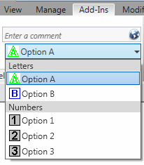
Separators can also be added to separate items in the list or members can be optionally grouped using the ComboBoxMember.GroupName property. All members with the same GroupName will be grouped together with a header that shows the group name. Any items not assigned a GroupName will be placed at the top of the list. Note that when grouping items, separators should not be used as they will be placed at the end of the group rather than in the order they are added.

Figure 17: Combo box with grouping
ComboBox has three events:
- CurrentChanged - triggered when the current item of the ComboBox is changed
- DropDownClosed - triggered when the drop-down of the ComboBox is closed
- DropDownClosed - triggered when the drop-down of the ComboBox is opened
See the code region in the following section on stacked ribbon items for a sample of adding a ComboBox to a ribbon panel.
Stacked Panel Items
To conserve panel space, you can add small panel items in stacks of two or three. Each item in the stack can be a push button, a drop-down button, a combo box or a text box. Radio button groups and split buttons cannot be stacked. Stacked buttons should have an image associated through their Image property, rather than LargeImage. A 16×16 image is ideal for small stacked buttons.
The following example produces the stacked text box and combo box in Figure 14.
|
Code Region: Adding a text box and combo box as stacked items |
private void AddStackedButtons(RibbonPanel panel)
{
        ComboBoxData cbData = new ComboBoxData("comboBox");

        TextBoxData textData = new TextBoxData("Text Box");
        textData.Image =
                new BitmapImage(new Uri(@"D:\Sample\HelloWorld\bin\Debug\39-Globe_16x16.png"));
        textData.Name = "Text Box";
        textData.ToolTip = "Enter some text here";
        textData.LongDescription = "This is text that will appear next to the image"
                + "when the user hovers the mouse over the control";
        textData.ToolTipImage =
                new BitmapImage(new Uri(@"D:\Sample\HelloWorld\bin\Debug\39-Globe_32x32.png"));

        IList<RibbonItem> stackedItems = panel.AddStackedItems(textData, cbData);
        if (stackedItems.Count > 1)
        {
                TextBox tBox = stackedItems[0] as TextBox;
                if (tBox != null)
                {
                        tBox.PromptText = "Enter a comment";
                        tBox.ShowImageAsButton = true;
                        tBox.ToolTip = "Enter some text";
                        // Register event handler ProcessText
                        tBox.EnterPressed +=
                new EventHandler<Autodesk.Revit.UI.Events.TextBoxEnterPressedEventArgs>(ProcessText);
                }

                ComboBox cBox = stackedItems[1] as ComboBox;
                if (cBox != null)
                {
                        cBox.ItemText = "ComboBox";
                        cBox.ToolTip = "Select an Option";
                        cBox.LongDescription = "Select a number or letter";

                        ComboBoxMemberData cboxMemDataA = new ComboBoxMemberData("A", "Option A");
                        cboxMemDataA.Image =
                                new BitmapImage(new Uri(@"D:\Sample\HelloWorld\bin\Debug\A.bmp"));
                        cboxMemDataA.GroupName = "Letters";
                        cBox.AddItem(cboxMemDataA);

                        ComboBoxMemberData cboxMemDataB = new ComboBoxMemberData("B", "Option B");
                        cboxMemDataB.Image =
                                new BitmapImage(new Uri(@"D:\Sample\HelloWorld\bin\Debug\B.bmp"));
                        cboxMemDataB.GroupName = "Letters";
                        cBox.AddItem(cboxMemDataB);

                        ComboBoxMemberData cboxMemData = new ComboBoxMemberData("One", "Option 1");
                        cboxMemData.Image =
                                new BitmapImage(new Uri(@"D:\Sample\HelloWorld\bin\Debug\One.bmp"));
                        cboxMemData.GroupName = "Numbers";
                        cBox.AddItem(cboxMemData);
                        ComboBoxMemberData cboxMemData2 = new ComboBoxMemberData("Two", "Option 2");
                        cboxMemData2.Image =
                                new BitmapImage(new Uri(@"D:\Sample\HelloWorld\bin\Debug\Two.bmp"));
                        cboxMemData2.GroupName = "Numbers";
                        cBox.AddItem(cboxMemData2);
                        ComboBoxMemberData cboxMemData3 = new ComboBoxMemberData("Three", "Option 3");
                        cboxMemData3.Image =
                                new BitmapImage(new Uri(@"D:\Sample\HelloWorld\bin\Debug\Three.bmp"));
                        cboxMemData3.GroupName = "Numbers";
                        cBox.AddItem(cboxMemData3);
                }
        }
}
|
Slide-out panel
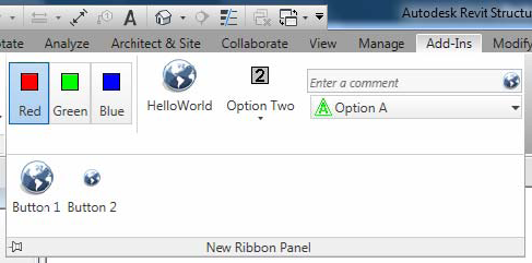
Use the RibbonPanel.AddSlideOut() method to add a slide out to the bottom of the ribbon panel. When a slide-out is added, an arrow is shown on the bottom of the panel, which when clicked will display the slide-out. After calling AddSlideOut(), subsequent calls to add new items to the panel will be added to the slide-out, so the slide-out must be added after all other controls have been added to the ribbon panel.

Figure 18: Slide-out
The following example produces the slide-out shown above:
|
Code Region: TextBox.EnterPressed event handler |
private static void AddSlideOut(RibbonPanel panel)
{
        string assembly = @"D:\Sample\HelloWorld\bin\Debug\Hello.dll";

        panel.AddSlideOut();

        // create some controls for the slide out
        PushButtonData b1 = new PushButtonData("ButtonName1", "Button 1",
                assembly, "Hello.HelloButton");
        b1.LargeImage =
                new BitmapImage(new Uri(@"D:\Sample\HelloWorld\bin\Debug\39-Globe_32x32.png"));
        PushButtonData b2 = new PushButtonData("ButtonName2", "Button 2",
                assembly, "Hello.HelloTwo");
        b2.LargeImage =
                new BitmapImage(new Uri(@"D:\Sample\HelloWorld\bin\Debug\39-Globe_16x16.png"));

        // items added after call to AddSlideOut() are added to slide-out automatically
        panel.AddItem(b1);
        panel.AddItem(b2);
}
|