Built-in metadata properties
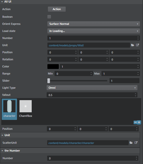
You can use the editor's Property Editor panel to view and modify a wide range of different types of properties -- both simple types like strings, booleans, and numbers, and compound types like colors and rotations. You also have a lot of control over the way the Property Editor displays these values. Many property types can be represented using a variety of UI widgets -- like, a number could be edited using a text field, a slider, a spinner box, etc.; you can control display labels, tooltips, ordering, etc.
To tell the Property Editor how it should visually represent the data it is editing, you can give your data some metadata. There are two main ways to do this:
If your data is described in a type file, you can use an editor block for each type in the data to describe how that type should be represented in the editor. See also The 3ds Max Interactive Type System.
Or, you can use a compact notation that is expressed purely in JavaScript. See Use the Property Editor component in your UI.
This reference details the different kinds of built-in metadata the Property Editor understands, and shows how to use them in both SJSON type files and in JavaScript.
These parameters are available for all property control types.
| Property | Type | Default | Description |
|---|---|---|---|
| order | Number | Infinity | Controls the ordering of properties in ascending order. |
| control or displayType | String | null | Specify a control to use when editing the property. See below for additional control specific properties. |
| label | String | null | Set a custom label for the property. |
| suffixLabel | String | null | Set a suffix to be displayed after the property value. Only shown for some widget types. |
| description | String | null | Set a description for the property. Shown in tooltips. |
| isReadOnly | Boolean | false | If true, prevents the user from editing the property. |
| isMultiEditSupported | Boolean | true | If false, prevents the user from editing the property if several objects are selected (i.e. consensus editing). |
| showLabel | Boolean | true | If false, hides the label of the property in editor. |
| showValue | Boolean | true | If false, hides the value of the property in editor. |
{
    type = ":number"
    min = 0
    max = 100
    default = 50
    editor = {
        order = 140
        label = "Health"
        suffix = "HP"
        description = "Initial health of the entity"
        control = "adskPropertySlider"
        step = 10
    }
}
var numberProperty = props.slider("Health", m.prop(50), {
    order: 140,
    suffix: "HP",
    description: "Initial health of the entity",
    min: 0,
    max: 100,
    increment: 10
})
The following sections describe the different values you can use for the control or displayType metadata field. Each one defines a different kind of built-in widget for viewing and interacting with the value of the corresponding type -- like sliders, textfields, checkboxes, etc.

The compact property editor notation in the following examples uses a Mithril getter/setter function mechanism to encapsulate access to the property model. For more information, see Use the Property Editor component in your UI.
This is a quick example of a property model function:
var _propertyData = "This is my data";
function propertyModel (value) {
    if (arguments.length) {
        _propertyData = value;
    }
    return _propertyData;
}
Most examples below use the following function which generates a property model on the fly:
function genModel (value) {
    return function (newValue) {
        if (arguments.length) {
            value = newValue;
        }
        return value;
    };
}
A simple button that triggers a custom function.

| Property | Type | Default | Description |
|---|---|---|---|
| action (compact notation only) | Function | null | Function with no arguments. |
| trigger (type file only) | action (see Register an action) | null | Action to execute. |
| text | string | "" | Button text. |
| color | color | Button background color. Any html color is valid. | |
| iconName | string | See Font Awesome Icons for a list of supported icons name. |
{
    type = ":string"
    editor = {
        order = 140
        text = "Compute"
        description = "Initial health of the entity"
        control = "Action"
        trigger = {
            type = "js"
            module = "generic_asset/generic-asset-actions"
            function_name = "triggerAction"
        }
    }
}
var actionProperty = props.action("Action", function () {
                        console.log('Action is triggered!');
                    }, {iconName: "fa-star-o"}),
A checkbox control.

{
    type = ":boolean"
    editor = {
        order = 140
        control = "Boolean"
        isReadOnly = true
    }
}
var actionProperty = props.bool("Boolean", genModel(true));
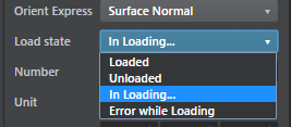
A combobox that can map to either an enum type or a string.

| Property | Type | Default | Description |
|---|---|---|---|
| options | object | {} | This is a javascript object where the keys are the "pretty label" for the different choices and the values are the actual enum values. See below for an example. |
| fetch_options (type file only) | action (see Register an action) | null | Action that will return dynamically generated options. |
| defaultValueName | String | null | Default label if no choice. |
| defaultValue | String | null | Default value if no choice. |
Enum = {
    type = ":enum"
    value = ":string"
    default = "InLoading"
    cases = [
        "Loaded"
        "Unloaded"
        "InLoading"
        "ErrorLoading"
    ]
    editor = {
        control = "Choice"
        label  = "Load state"
        case_labels = {
            "Loaded" = "Loaded"
            "Unloaded" = "Unloaded"
            "In Loading..." = "InLoading"
            "Error while Loading" = "ErrorLoading"
        }
    }
}
// This effectively creates a string that will use a Combobox control to select between
// a specific list of string values.
ChoiceString = {
    type = ":string"
    default = "SurfaceNormal"
    editor = {
        control = "Choice"
        label  = "Orient Express"
        fetch_options = {
            type = "js"
            module = "generic_asset/generic-asset-actions"
            function_name = "populateActions"
        }
    }
}
var options {
    'Beer': 1,
    'Scotch': 2,
    'Rhum': 3,
    'Wine': 4
};

var choiceProperty = props.choice("Tough choice", genModel(2), options, {defaultValueName: "Choose a drink"});
A color swatch with an accompanying intensity slider.

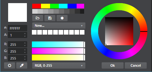
Clicking the swatch brings up a color picker dialog:

Color = {
    type = "core/types/color"
}
// see core/types/color.type
export = "#color"
types = {
    color = {
        type = ":struct"
        fields = {
            rgb = {
                type = ":array"
                value = "#component"
                size = 3
                default = [0, 0, 0]
            }
            alpha = {
                type = "#component"
                default = 1
            }
            intensity = {
                type = ":number"
                default = 1
                min = 0
            }
        }
        editor = {
            control = "adskPropertyColor"
        }
    }
    component = {
        type = ":number"
        min = 0
        max = 1
    }
}
// Simple color:
var colorProperty = props.color("Color", genModel([1,1,1]));

// HDR color:
var hdrColorProperty = props.hdrColor("Color", genModel([1,1,1]), genModel(1));
A spinner control that allows editing of a number value. Comes with lots of nifty features:
- Right-clicking the spinner resets it to its default value.
- Holding Shift while spinning modifies the data more quickly.
- Holding Ctrl while spinning modifies the data more slowly.

| Property | Type | Default | Description |
|---|---|---|---|
| min | number | -2147483648 | Minimal value of the number |
| max | number | 2147483647 | Maximal value of the number |
| step (in type file) | number | 0.1 | When pressing the spinner button how much should it increment/decrement |
| increment (in javascript) | number | 0.1 | When pressing the spinner button how much should it increment/decrement |
| decimal | number | 4 | Number of decimals to show. If 0, the number is assumed to be an integer. |
| numericDefaultValue | number | 0 | Value to reset to whrn right clicking on the Spinner. |
Number = {
    type = ":number"
    editor = {
        // Use min/max/default in the editor block instead of the type specification
        default = 1
        min = 0
        max = 1
        control = "Number"
        step = 0.3
        priority = 4
    }
}
var numberProperty = props.number("A Numeric Value", genModel(42.111), {
    increment: 0.5,
    min: -9,
    max: 56.9
});
A slider control allows editing of a number using a left-to-right slider. Most of its parameters are similar to the number property (see above).

| Property | Type | Default | Description |
|---|---|---|---|
| min | number | -2147483648 | Minimal value of the number |
| max | number | 2147483647 | Maximal value of the number |
| step (in type file) | number | 0.1 | When pressing the spinner button how much should it increment/decrement |
| increment (in javascript) | number | 0.1 | When pressing the spinner button how much should it increment/decrement |
| decimal | number | 4 | Number of decimals to show. If 0, the number is assumed to be an integer. |
Number = {
    type = ":number"
    editor = {
        // Use min/max/default in the editor block instead of the type specification
        default = 1
        min = 0
        max = 1
        control = "Slider"
        step = 0.3
        priority = 4
    }
}
var sliderProperty = props.slider("Percentable", genModel(50), {min: 0, max: 100, increment: 1});
String properties are edited by default through simple text boxes.

| Property | Type | Default | Description |
|---|---|---|---|
| isMultiline | boolean | false | Defines if the textbox should span over multiple lines. |
| lineRows | number | 0 | If isMultiline is true you can specify the number of lines of the textbox (between 1 and 8). |
SingleLine = {
    type = ":string"
    editor = {
        label = "Single Line"
    }
}
MultiLine = {
    type = ":string"
    default = "pow"
    editor = {
        label = "Multi Line"
        isMultiline = true
        lineRows = 4
    }
}
var stringProperty = props.color("Color", genModel([1,1,1]));

var colorModel = genModel([1,1,1]);
var intensityModel = genModel(1);
var hdrColorProperty = props.hdrColor("Color", colorModel, intensityModel);
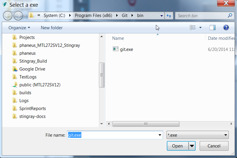
The path property allows a user to select either a folder or a file on disk, using a window provided by the operating system.


| Property | Type | Default | Description |
|---|---|---|---|
| browserType | string | Can be either File or Folder. Defines what type of native path selector will be popped. | |
| browseTitle | string | Title of the native dialog. | |
| browseFilter | string | File filter to only show files with a specific extension. |
FilePath = {
    type = ":string"
    editor = {
        control = "PathProperty"
        browseType = "File"
        browseTitle = "Select an exe"
        browseFilter = "*.exe"
    }
}
DirPath = {
    type = ":string"
    editor = {
        control = "PathProperty"
        browseType = "Folder"
        browseTitle = "Select a folder"
    }
}
var fileProperty = props.file("File", genModel('c:/Pogram Files (x86)/Git/bin/git.exe'), "Pick an exec", "*.exe"),
var dirProperty = props.directory("Folder", genModel('c:/Pogram Files (x86)/Git'), "Pick a folder"),
A control that contains two numeric min and max value fields.


Range = {
    type = "core/types/range"
}
var range1= props.range("Range [-100, 100]", "mini", genModel(25), 'maxi', genModel(75), {min: -100, max: 100, increment: 0.5}),
var range2 = props.range("Read Only", "MIN", genModel(25), 'Max', genModel(75), {min: -100, max: 100, increment: 0.5, isReadOnly: true})
A control that can be used to display a list of 2, 3 or 4 components -- but not a rotation (see Rotation below).

Position = {
    type = "core/types/vector3"
}
// see core/types/vector3.type
export = "#vector3"
types = {
    vector3 = {
        type = ":array"
        value = ":number"
        size = 3
        default = [0, 0, 0]
        editor = {
            control = "adskPropertyVector3"
        }
    }
}
var vec2 = props.vector2("Vector2", genModel([34, 78]), {min: -100, max: 100, increment: 0.5});

var vec3 = props.vector3("Vector3", genModel([1,2,3]));

var vec4 = props.vector4("Vector4", genModel([34, 78, 67, -90]));
A control that that uses as its data model a vector made up of three radian values, and that shows three spinners with the values converted to degrees.

Rotation = {
    type = "core/types/rotation"
}
// see core/types/rotation.type
export = "#rotation"
types = {
    rotation = {
        type = ":array"
        value = ":number"
        size = 3
        default = [0, 0, 0]
        editor = {
            control = "adskPropertyRotation"
        }
    }
}
var rotation = props.rotation("Rotation", genModel(0, -1.52, 3.14));