|
User Interface Controls > Common Properties > Layout > Types > Label |
A label control is used to place non-editable text on the rollout, perhaps a label for another item or a text message.
The syntax is:
label <name> [<string>] [style_sunkenedge:<bool>] [toolTip:<string>]
The default alignment of label items is #center .
When supplied and set to true , the style_sunkenedge: optional keyword parameter available in 3ds Max 2009 and higher lets the label draw a half-sunken border around the control.
The toolTip: parameter provides text for a tooltip for the label; no tooltip if unsupplied. Available in in 3ds Max 2017 and higher.
|
EXAMPLES: |
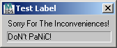
rollout test "Test Label" ( label lab1 "Sorry For The Inconveniences!" label lab2 "DoN't PaNiC!"style_sunkenedge:true width:150 height:16 ) createDialog test |
rollout my_rollout "My Rollout" ( label my_label "ABCDEFGHIJ" ) createdialog my_rollout my_rollout.my_label.text += "\nXXX" my_rollout.my_label.height *=2 -- start to see the "XXX" line my_rollout.height *=2 -- expand dialog so can see the "XXX" line my_rollout.my_label.width -= 20 -- crops end of text display |
Properties
<label>.height Integer
 NEW in 3ds Max 2020: Gets or sets the label height. Note that changing the label's dimensions does not affect the parent rollout size.
<label>.width Integer
NEW in 3ds Max 2020: Gets or sets the label width. Note that changing the label's dimensions does not affect the parent rollout size.
Events
No events exposed.