- On the Windows
Start menu, click
All Programs
 Microsoft Visual Studio
.
Microsoft Visual Studio
Microsoft Visual Studio.
-
Create Visual C# Project:
- In the Visual Studio Development Environment, on the
File menu, click
New
Project.
- In the left toolbar, expand the Visual C# Templates, and click InventorETO.
- In the list of templates, click Inventor ETO Addin.
- Enter a name for the project.
- Click OK to create the project.
- In the Visual Studio Development Environment, on the
File menu, click
New
-
Build Project
Several source files that generate automatically hook up to Inventor and Inventor ETO at the correct times. Build the project and verify that the build succeeds. As a part of the build process, it registers itself with Inventor. For help with registering the Add-in, see the ReadMe file that the Visual C# project generates.
-
Run Inventor
- Open an inventor project, and an assembly.
On the ribbon, a tab with the name of the Addin displays three buttons: Render, Export, and Import.
- Close Inventor without saving.
- Open an inventor project, and an assembly.
-
Define custom button
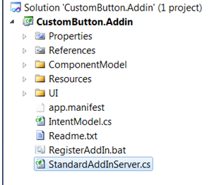
- In the Addin Visual Studio project, expand the "UI" organizational folder, and open the file "UserInterfaceComponents.cs." This file defines the class UserInterfaceComponents, which handles creating the Ribbon and Buttons.
- Add a ButtonDefinitionWrapper object to this class to define the custom button.
- Below the constructor for the class, add the new button to the existing button definitions.
To remove the existing buttons, delete or comment out their definitions. Add the following line below the other button definitions:internal ButtonDefinitionWrapper MyButton { get; privateset; }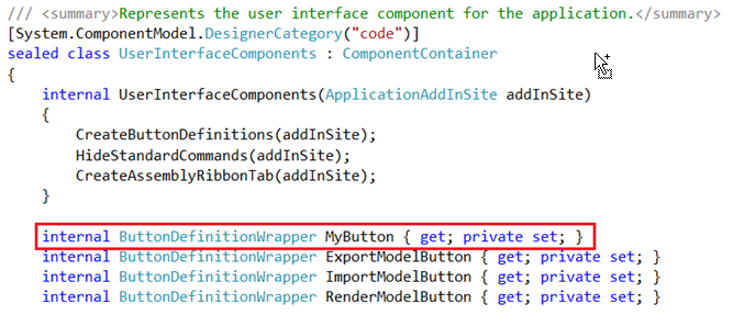
-
Create button instance:
- In the method
"CreateButtonDefinitions," add the line:
MyButton = CreateButtonDefinition(buttons, addInSite, "MyButton" , CommandTypesEnum .kNonShapeEditCmdType);
An instance of a button displays with the name "MyButton", and the classification of "kNonShapeEditCmdType." Select the appropriate classification, depending on your intended use.
The CreateButtonDefinition method calls a constructor in the ButtonDefinitionWrapper class to create the button. The constructor registers the resources necessary to display the button.
- To remove the existing buttons from the view, remove the instantiation of the other buttons.
- In the method
"CreateButtonDefinitions," add the line:
-
Add custom button to ribbon:
- In UserInterfaceComponents.cs, locate the CreateAssemblyRibbonTab method. This method adds each component to the Addin Ribbon to display. The buttons are added to the ribbon at the bottom of this method. Add our new button by adding the line:
- Add the new button by adding the line:
controls.AddButton(MyButton.Target, true );
Buttons add into the ribbon from left to right, so consider where you want your buttons to display.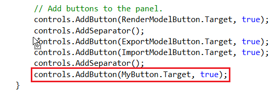
-
Create Button OnExecute Handler:
- Open the file IntentModel.cs in the root of the project.
- Add a method to handle clicks on the new button. The following snippet generates a MessageBox on each click to demonstrate when the
OnExecute method is called.
 void MyButton_OnExecute( object sender, ButtonDefinitionWrapper . ExecuteEventArgs e)
 {
// TODO Implement OnExecute Method
MessageBox .Show( "MyButton's OnExecute Method" );
}
If removing the existing buttons, you can remove their respective OnExecute handlers.
-
Register OnExecute handler:
- In the constructor for the
IntentModel class, register the event handler with the GUI by adding the line:
gui.MyButton.OnExecute += new EventHandler < ButtonDefinitionWrapper. ExecuteEventArgs >(MyButton_OnExecute);
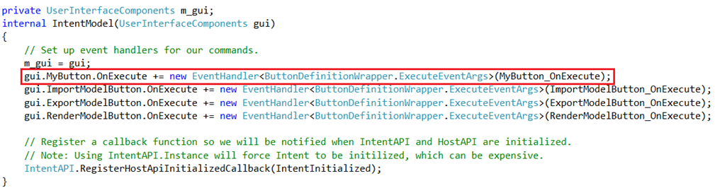
- In the constructor for the
IntentModel class, register the event handler with the GUI by adding the line:
-
Build project:
- Build the project, cleaning up any errors.
- Open an inventor project, and choose any assembly. The add-in ribbon contains the custom button. Click the button to display the message box created in the OnExecute method handler.
- Close Inventor without saving.
-
Add text to button:
- To add a custom icon and help text to the button, edit the
Resources.resx
design in the Resources organizational folder of the project.
This file defines a set of strings and images for each button.
- To add the necessary
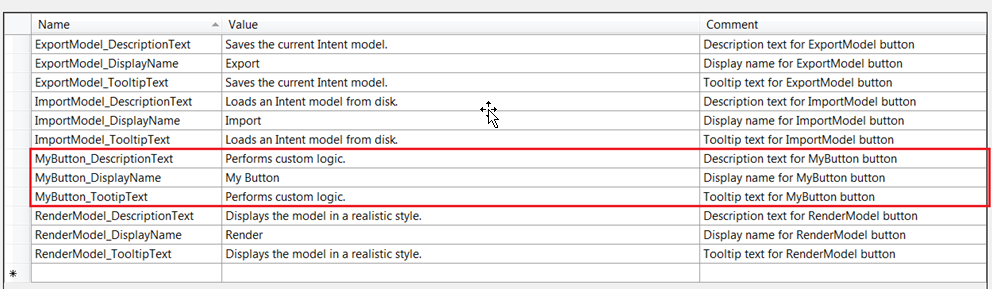
strings for a button, follow the model of the other buttons closely. For the prefix of each resources name, use the same
string you used to instantiate the button.
The <name>_DisplayName string defines the name that displays below the icon for the custom button.
<name>_DescriptionText defines the pause-over text of the custom button.
<name>_ToolTip matches the DescriptionText string .
- To add a custom icon and help text to the button, edit the
Resources.resx
design in the Resources organizational folder of the project.
-
Add custom icon:
- In the Resources.resx file, on the drop-down menu currently showing "Strings," select "Images."
This view defines the icons for each button. Name your images <name>_LargeIcon and <name>_StandardIcon to ensure that the ButtonDefinitionWrapper class adds them. Size Large icons at 32x32 pixels, and standard icons at 16x16 pixels.
As an example, reuse the Render icon set, and rename them to MyButton_LargeIcon, and MyButton.StandardIcon, or use any images.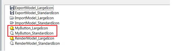
-
Build the solution:
- Save the resource file, and build the solution.
- Open your inventor project and assembly again. The Add-in ribbon contains an icon with the custom button. The new display text replaces the name given to the button.
- If any of the resources do not load, verify that you named each resource with the prefix you used to instantiate the button.