Button UI Control
A button control is used to place a press button on the rollout which the user can click, typically to perform some task.
The syntax is:
button <name> [<caption>] [images:<image_spec_array>] [toolTip:<string>] [border:<boolean>] [iconName:<filename> iconSize:<point2>]The default alignment of button items is #center .
EXAMPLE:
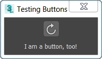
   rollout test_buttons "Testing Buttons"
   (
     button theButton iconName:@"PolyTools\TransformTools\PB_CW" iconSize:[20,20]
     button theBorderlessButton "I am a button, too!" border:false
     on theButton pressed do
       messagebox "Remember: Never press unknown buttons!"
   )
   createDialog test_buttons 150 60

Parameters:
images: An image-specification array for providing bitmap images for the button. If this is specified, the <caption> is ignored and the contents of the button are replaced with the bitmaps.
toolTip: Provides text for a tooltip for the button; there is no tooltip if not supplied.
border: When set to true or not specified, the button will be drawn with a border. This was the default behavior prior to 3ds Max 2009.
When set to false, the button will be drawn without a border, making it one with the UI background. If the button is enabled, the border will appear when the button is pressed, or upon mouseover.
iconName:The filename of an icon to use as an image on the button. If iconName is specified, the caption is ignored. The iconSize specifies the iconName size at 100% DPI scaling. If not specified, the default [24,24] is assumed.
iconSize:The size of the icon specified by iconName at 100% DPI scaling.
Properties:
<button>.images <Array> Sets the image-specification array for the button.
This property is write-only.
Setting the value to undefined will set the control back to displaying its caption rather than images in .
<button>.tooltip <String> Gets or sets the tooltip string of the button.
<button>.height <Integer> Gets or sets the button height, in pixels. Available in 3ds Max 2019 and higher.
<button>.width <Integer> Gets or sets the button width, in pixels. Available in 3ds Max 2019 and higher.
EXAMPLE:
   rollout test "Test"
   (
     button btn_test "Test" tooltip:"This is a tooltip"
   )
   createDialog test
   --> Rollout:test
   --> true
   test.btn_test.tooltip -- get the tooltip string
   --> "This is a tooltip"
   test.btn_test.tooltip = "Now you can get and set the tooltip!"
   --> "Now you can get and set the tooltip!"
   test.btn_test.tooltip -- get the new tooltip string
   --> "Now you can get and set the tooltip!"
Events
on <button> pressed do <expr> Called when the user clicks the button.
on <button> rightclick do <expr> Called when the right mouse button is released over the button.