![]()
In general, the Slate interface is more versatile when you are designing materials, while the Compact interface is more convenient when you just need to apply materials that have already been designed.

The Compact Material Editor has a couple of options that the Slate Material Editor does not; in particular:
- Video Color Check
- Custom Sample objects
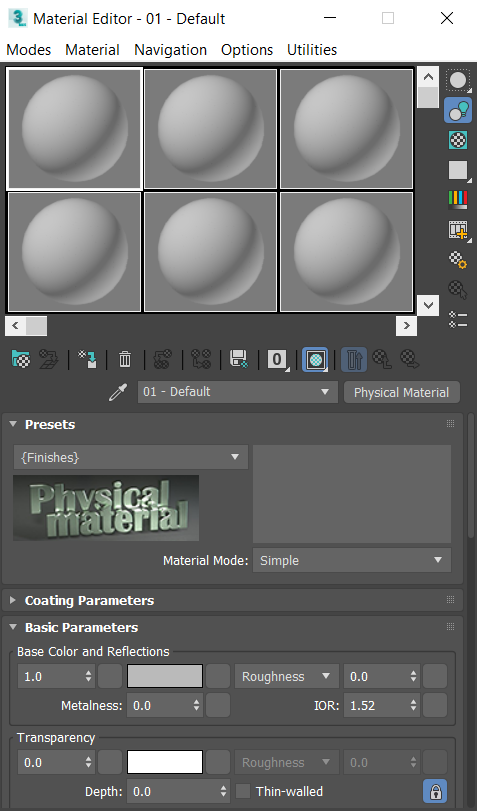
The Material Editor interface consists of a menu bar at the top, sample slots (the spheres) below the menu bar, and toolbars along the bottom and side of the sample slots.
The Material Editor interface also includes a number of rollouts whose contents depend on the active material (click a material's sample slot to make it active). Each rollout contains standard controls such as drop-down lists, checkboxes, numeric fields with spinners, and color swatches.
In many cases, associated with a control (typically to its right) is a map shortcut button: a small, square, blank button, which you can click to apply a map to the control. If you have assigned a map to a control, the button displays the letter M. An uppercase M means that the corresponding map is assigned and active. A lowercase m means that the map is assigned but inactive (turned off). You turn maps on and off with the checkboxes on the Maps rollout. You can also right-click the map shortcut button to access functions such as copy and paste.