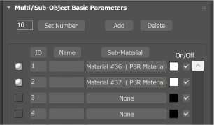
You can configure how paths appear when they are larger than the available space on push buttons in the 3ds Max user interface. By default, paths that are too long are left-aligned on the button, and extra text is cut off on the right. You can change this behavior by using the PushButtonLabelOverflowBehavior in the [CuiConfiguration] of the 3dsmax.ini file.

Default overflow alignment
This property can have one of three values:
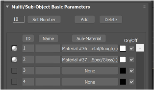
- align-right
- Text that overflows the space is aligned to the right, so that the end of the path is visible.

Align Right
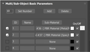
- align-center
- Text that overflows is center aligned.

Align Center
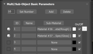
- elide-text
- Text that overflows is center aligned and center elided so that the beginning and end of the path is visible.

Elide Text