The same standard settings are available in each of the Edit Label Style Defaults dialog boxes.
Label
- Text Style
-
Specifies a default text style for all label text components in a drawing. The default is Standard.
Select a text style from the list of all AutoCAD text styles defined in the current drawing.
- Visibility
-
Specifies whether all label styles in a drawing are visible.
Tip: Use this setting to quickly turn all labels in the drawing off or on. - Layer
-
Specifies the default layer for all label styles in a drawing.
The default layer is 0. When the layer is set to 0, the labels use the properties of the parent object layer specified on the Object Layers tab of the Drawing Settings dialog box.
Click
 to display the Layer Selection dialog box. Note: This setting specifies the layer from which the labels obtain their display properties. The labels are drawn on the parent object layer.
Behavior
- Orientation Reference
-
Specifies the orientation reference of the labels.
- Object: Rotates labels relative to the zero direction of the object. You can determine the zero direction of the object based on its start and end points. If the object vector changes at the anchor point on the label, the orientation updates automatically. This is the default setting.
- View: Forces labels to realign to a screen-view orientation in both model and layout views. Always assumes the zero angle is horizontal, regardless of UCS or Dview twist. If the view changes, the label orientation updates with it.
- World Coordinate System: Adjusts the labels with respect to the angle between the current view and world view. Changing the view or current UCS does not affect label rotation with respect to the world coordinate system.
For more information, see To Specify Label Orientation.
- Forced Insertion
-
Specifies the position of a label relative to an object. Applies only when the Orientation Reference option is set to Object and the objects are lines, arc segments, or spline segments.
- None: Maintains label position as composed relative to the object. This is the default setting.
- Top: Adjusts label position to above an object.
- Bottom: Adjusts label position to below an object.
Note: Plan Readable should be set to True when using the Top or Bottom settings. - Force Inside Curve
-
Specifies whether labels are placed inside or outside a curve. Available only for curve label styles. This setting has precedence over any forced insertion setting.
- None: Leaves the components as composed.
- Inside : Moves label components on the outside of curve to the inside of curve. The components maintain the same offset and rotation.
- Outside : Moves label components on the inside of curve to the outside of curve. The components maintain the same offset and rotation.
Note: These settings apply only when the Orientation Reference option is set to Object.
Plan Readability
- Plan Readable
-
Specifies the text rotation to insure that all text components in labels can be read easily in plan view.
- True: Rotates text to insure that it can be read easily in plan view or as if viewed from an angle at the bottom or right side of the screen/paper. This is the default setting.
Any text with an angle greater than the angle specified in the Readability Bias setting, or with an angle less than the Readability Bias plus 180 degrees, is in violation of plan readability, and is adjusted automatically.
For more information about plan-readable text, see To Specify that Labels Are Plan-Readable.
- False: Displays text as inserted.
This option applies only to text components in labels.
- True: Rotates text to insure that it can be read easily in plan view or as if viewed from an angle at the bottom or right side of the screen/paper. This is the default setting.
- Readability Bias
-
Specifies the angle at which label text flips 180 degrees to remain plan readable.
- Flip Anchors With Text
-
- True: Ensures that if text is rotated to make plan-readable, the anchors will also be flipped.
- False: The flipped label always looks like a mirror of the original.
Components
- Text Height
-
Specifies the plotted height for label text. Enter a positive value greater than zero. The value is applied to all text components.
- Color
-
Specifies the color for label components. Click
 to open the Select Color dialog box.
 - Linetype
-
Specifies the linetype for label components. Click
to open the Select Linetype dialog box. - Lineweight
-
Specifies the lineweight for label components. Click
to open the Lineweight dialog box. - Span Outside Segments
-
Specifies whether the label style component should span outside segments.
Note: This setting applies to parcel line and curve label styles only).- True: Labels the outer boundary of parcels, rather than the individual parcel segments. For example, if four parcels share an outer boundary, use this option to label the combined outer boundary.
- False: Labels individual parcel segments.
Leader
- Arrow Head Style
-
Specifies an arrow head style for a leader.
Select an arrow head style from the list. Or, select None to display leaders without arrow heads. The default arrow head style is Closed Filled.
For more information about arrow head styles, see “Choose Dimension Arrowheads” in AutoCAD Help.
- Arrow Head Size
-
Specifies the size of the arrow head. The default arrow head size is defined in plot units (either inches or millimeters). The plot units are determined by the drawing units established in the drawing settings.
Enter zero or a positive number. A value of zero means that a leader is displayed without an arrow head.
- Visibility
-
Specifies whether leaders are visible when you drag a label from its original position.
- Type
-
Specifies the shape of the leader.
- Straight Leader: Draws a straight leader when you drag a label. This is the default leader type.
- Spline Leader: Draws a spline (or smooth curve) leader.
- Color
-
Specifies the color for leaders. Click
to open the Select Color dialog box. - Linetype
-
Specifies the linetype for leaders. Click
to open the Select Linetype dialog box. - Lineweight
-
Specifies the lineweight for leaders. Click
to open the Lineweight dialog box.
Dragged State Components
- Display
-
Specifies how label content is displayed after it is dragged from its default position.
- As Composed: Maintains the original settings for orientation and composition. When selected, all other properties in the Dragged State Components category are unavailable for editing. This is the default.
- Stacked Text. Reformats labels based on the settings in this Dragged State Components category.
Note: When Display is set to Stacked Text, all blocks, lines, and direction arrows are removed. The text components are stacked vertically based on the order in which the text components were created in the label style. - Border Visibility
-
Specifies whether a border is visible for dragged labels.
- Border Type
-
Specifies the shape of the border.
- Rectangular: Draws a rectangle.
- Rounded Rectangular: Draws a rectangle with rounded corners.
The radius used to create a rounded rectangle is calculated by adding the border and leader gap value and half the overall text height (including descending characters, and subscript and superscript characters).
- Circular: Draws a circular border.
- Border and Leader Gap
-
Specifies the distance between the leader and the label text. Enter a positive value greater than zero.
The gap value is also used to define the space between the border and the label text.
- Text Height
-
Specifies the plotted height for all text components. Enter a positive value greater than zero.
Note: When Display is set to As Composed, this property is unavailable for editing. - Leader Attachment
-
Specifies the location where a leader hook is drawn in relation to label content.
- Top Of Top Line (of multiple lines of text)
- Middle Of Top Line (of multiple lines of text)
- Middle (of single line of text)
- Middle Of Bottom Line (of multiple lines of text)
- Bottom Of Bottom Line (of multiple lines of text)
Middle is the default setting.
- Leader Justification
-
Specifies how label text is justified in relation to the leader.
- True. Text is left-justified when the leader is on the left, and right-justified when the leader is on the right, as shown in the following illustration. This is the default setting.
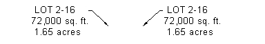
- False. Text is left-justified regardless of leader location, as shown in the following illustration:

- Color
-
Specifies the color for dragged components. Click
to open the Select Color dialog box. - Linetype
-
Specifies the linetype for dragged components. Click
to open the Select Linetype dialog box. - Lineweight
-
Specifies the lineweight for dragged components. Click
to open the Lineweight dialog box. -
 Collapse All Categories
-
Collapses the property categories to show only the top-level item.
-
 Expand All Categories
-
Expands categories to show all properties.
-
 Override All Dependencies
-
Selects all the check boxes in the Override column, which prevents the setting from being changed if the value is changed at a higher level setting. This option is not available at the drawing level.