Mapbutton UI Control
A Mapbutton control is used to place a button in the rollout that will display the 3ds Max Material/Map Browser dialog when clicked. Only texture maps will be displayed in the Material/Map Browser dialog.
The syntax is:
mapbutton <name> [<caption>] [map:<texturemap>] [images:<image_spec_array>] [toolTip:<string>] [border:<boolean>] [iconName:<filename> iconSize:<point2>]The default alignment of mapbutton items is #center .
EXAMPLE:
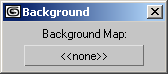
   rollout test_mapbutton "Background"
   (
     label sbm_lbl "Background Map:"
     mapbutton choosemap "<<none>>" tooltip:"Select Background Map" width:120
     on choosemap picked texmap do
     (
       environmentmap = texmap
       choosemap.text=classof texmap as string
     )
   )
   createDialog test_mapbutton
Parameters:
map: The initial textureMap value returned by the map property before the user has selected a texture map using the mapbutton . Defaults to undefined .
images: An image-specification array for providing bitmap images for the mapbutton . If this is specified, the <label> is ignored and the contents of the mapbutton are replaced with the bitmaps.
The form is:
images:#(<image>, <maskImage>, <count_integer>, <enabled_out_image_index>, <enabled_in_image_index>, <disabled_out_image_index>, <disabled_in_image_index>) where <image> and <maskImage> can be either a bitmap file-name string or a MAXScript bitmap value. <count_integer> specifies the number of sub-images in the bitmaps, and the image_index values specify which sub-image in the bitmaps is to be used for each of the four mapbutton states.
FOR EXAMPLE:
   bm1 = render camera:$cam01 outputSize:[80,60]
   ...
   mapbutton foo images:#(bm1, undefined, 1, 1, 1, 1, 1)
would use a rendering as the
mapbuttonimage, andmapbutton decay images:#("dcybtns.bmp", "dcymask.bmp", 6, 1, 4, 1, 4)would use sub-images 1 and 4 of bitmaps
dcybtns.bmpanddcymask.bmpfor the out and in states of themapbutton, respectively.See also Image Buttons.
toolTip: Provides text for a tooltip for the mapbutton . No tooltip if unsupplied.
border: When set to true or not specified, the mapbutton will be drawn with a border. This was the default behavior prior to 3ds Max 2009.
When set to false, the mapbutton will be drawn without a border, making it one with the UI background. If the mapbutton is enabled, the border will appear when the material button is pressed, or upon mouseover.
Available in 3ds Max 2009 and higher.
iconName:The filename of an icon to use as an image on the button. If iconName is specified, the caption is ignored. The iconSize specifies the iconName size at 100% DPI scaling. If not specified, the default [24,24] is assumed.
iconSize:The size of the icon specified by iconName at 100% DPI scaling.
Properties:
<mapbutton>.map TextureMap The current textureMap value for the mapbutton , or the textureMap value specified by the map parameter if the user has not yet selected a texture map.
<mapbutton>.images Array Sets the image-specification array for the mapbutton . This property is write-only.
FOR EXAMPLE:
   -- re-render, update button
   bm1 = render()
   foo.images = #(bm1, undefined, 1, 1, 1, 1, 1)
<mapbutton>.tooltipString Get/set the tooltip string of the mapbutton.
Available in 3ds Max 9 and higher.
FOR EXAMPLE:
   rollout test "Test"
   (
   mapbutton map_test "Map Button" tooltip:"This is a map button"
   )
   createDialog test
   test.map_test.tooltip = "The tooltip has changed!"
Events:
on <mapbutton> picked <arg> do <expr> Called when the user selects a texture map from the Material/Map Browser dialog while in the mapbutton pick command mode. The <arg> argument will contain the selected textureMap value. The handler is not called if the user cancels out of the Material/Map Browser dialog.
on <mapbutton> rightclick do <expr> Called when the right mouse button is released over the button. Available in 3ds Max 8 and higher.
mapButton is used in a rollout in a scripted material or textureMap plug-in, and so turn up the Material Editor, it behaves with the same functionality as sub-map buttons do in other materials and maps. This includes supporting drag-and-drop with instance/copy, and opening sub-maps if they have been assigned.