VRED New User Experience
The new VRED user experience was a huge undertaking and can be seen throughout the software. Icons, tree layouts, and QuickActions Bars have been redesigned, new docking functionality and color themes have been implemented, along with updates to the View Cube design and functionality.
Color Themes
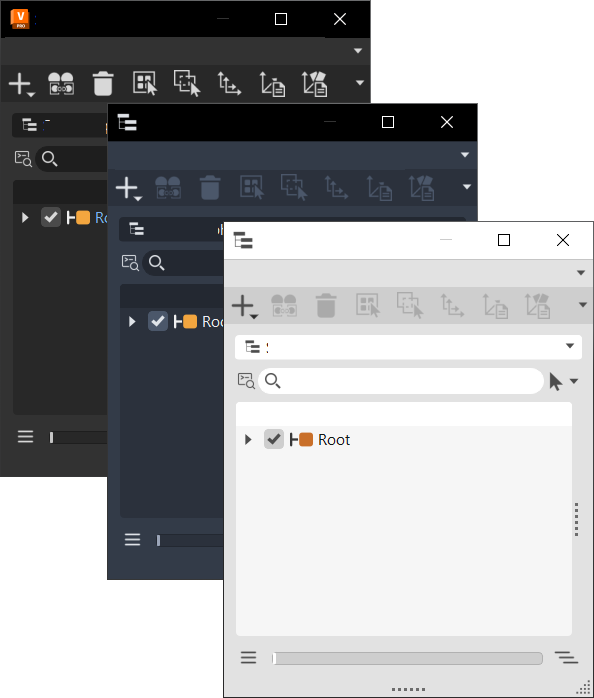
You can now change the color theme used in VRED. Choose from dark grey, dark blue, and light.

In the Window menu, select Color Themes and choose a theme color. Since VRED uses colors throughout the UI to help to indicate states or to differentiate one field from another, these will vary slightly from one theme to the next.
Button/Checkbox/Field Coloring
In modules, button, checkbox, and field coloring indicates changes to indicate its state.
When active, these are framed or underlined pale blue.

When hovered, these are framed or underlined pale blue.

Tab Coloring
When a tab is selected, a blue line appears above it, indicating it's active.

Toolbar Icon Coloring
Toolbar icon coloring indicates changes to indicate its state.
![]()
- When active, icons are gold and underlined blue.
- When inactive, icons are white.
- When hovered, icons are underlined pale blue.
Multi-field Coloring
Options with multiple fields use color to differentiate one field from another.
For fields with XYZ values, X fields have a red line, Y have a green, and Z have a blue.

For fields with UV values, U fields have a red line and V have a green.

Tree Coloring
The coloring in the various tree views can indicate the state, hierarchy, or even whether something is a clone.
When tree items are selected, these are highlighted blue.

When tree items are cloned, the selected clone is underlined and white and others are underlined and orange.

Icon and QuickActions Bar Redesign
The QuickActions Bar in all modules and editors has been moved to below the Menu Bar.

Tree Layout Redesign
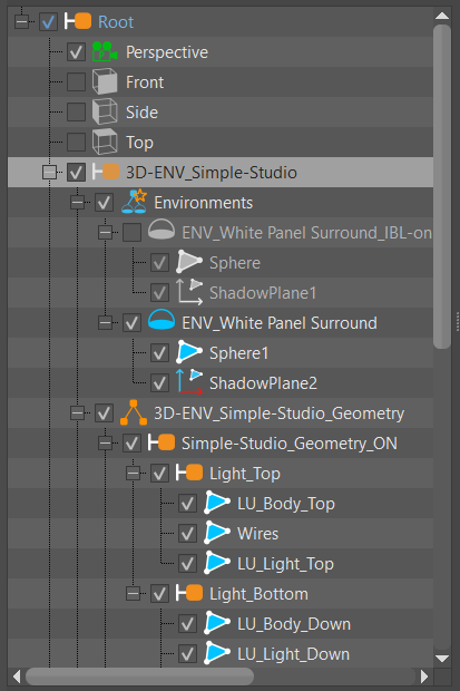
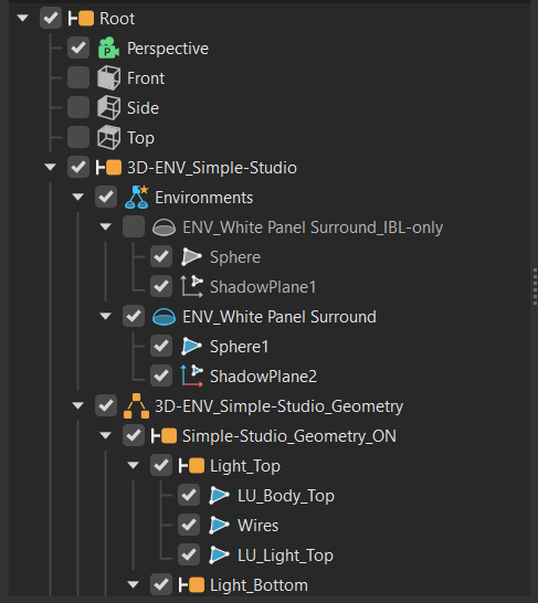
In the Scenegraph, you will notice the tree has been refreshed, making it easier to read and displaying more content in less space to reduce scrolling.
| 2023 | 2024 |
|---|---|
 |
 |