UI Improvements
Find UI layout improvements, such as side-by-side sliders, to help reduce the length of module sections, fields that extend the width of the window, and more, in various modules and editors. Icons have also been added to context menus, updated in warning dialogs, and those used as buttons, such as ![]() , now have a visible disabled state,
, now have a visible disabled state, ![]() .
.
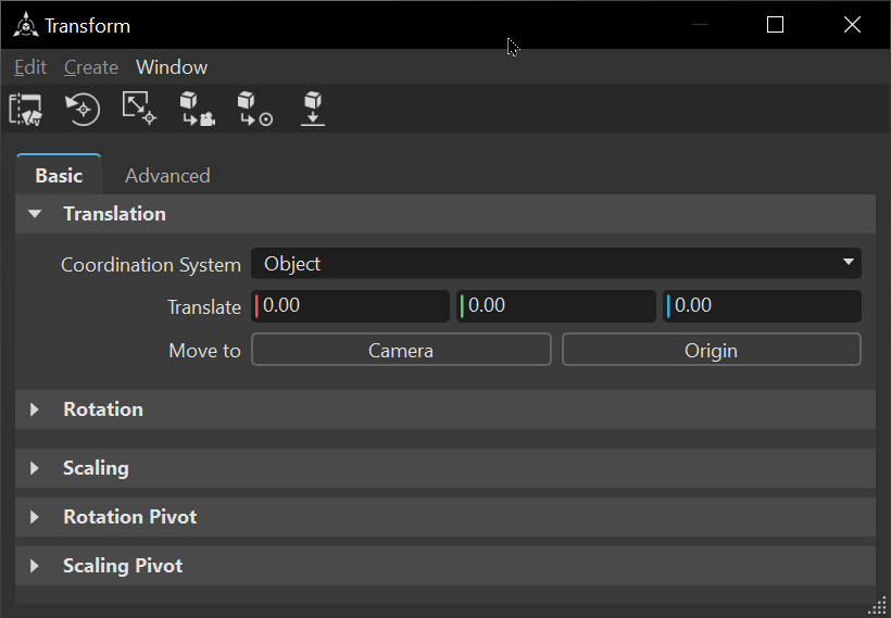
Video captions: Within VRED, we have optimized the Transform Editor, so that the x, y, and z values are now horizontally placed, which brings more consistency to other modules and a horizontal reading direction tends to be more user-friendly.
Along with other changes like adding more missing icons to some context menus, we added now a unified renaming for decoupled modules like the Light Editor. So you can select multiple nodes and rename them in one go. This can save you a lot of time when dealing with similar or the same nodes.
You can also do this using the context menu or use Ctrl + R.
Bake Light and Shadows
Push buttons and dropdown menus now extend the width of the editor, and some options have been renamed and/or rearranged.
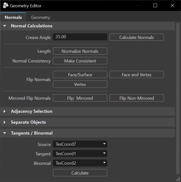
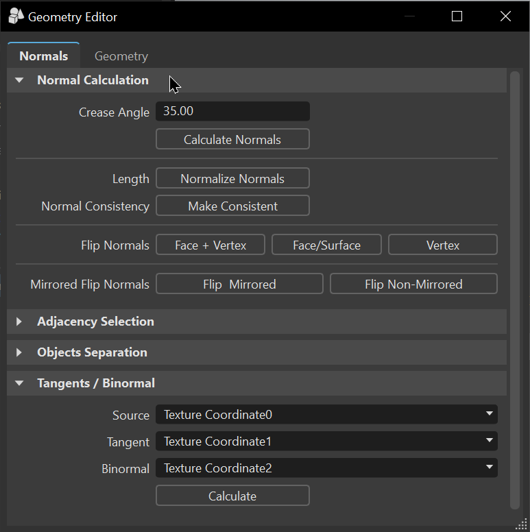
Geometry Editor
Push buttons and dropdown menus now extend the width of the editor.
| 2024 | 2024.2 |
|---|---|
 |
 |
Import Dialog
We added a General section that houses file types. When a file in the Import File List is selected, parameters appear to the right. Use the File Type dropdown menu to load parameters for that specific file type.
We also extended dropdown menus the width of the dialog.
Render Settings
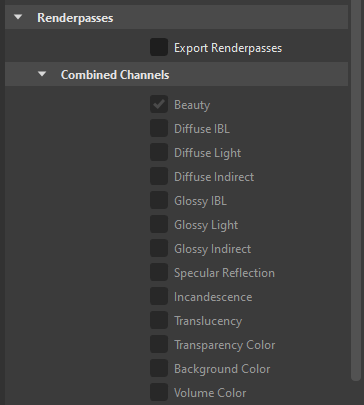
We've made changes to the layout of the Render Settings module, so that the Renderpasses section is now laid out more like Visualization > Renderpass Rendering. And, better yet, we added Depth Mode, Depth Range, and Occlusion Range options to the Renderpasses section to provide more artistic freedom in post processing. See Render Settings and Renderpasses for the full details.
Transform Editor and Transform Variants Window
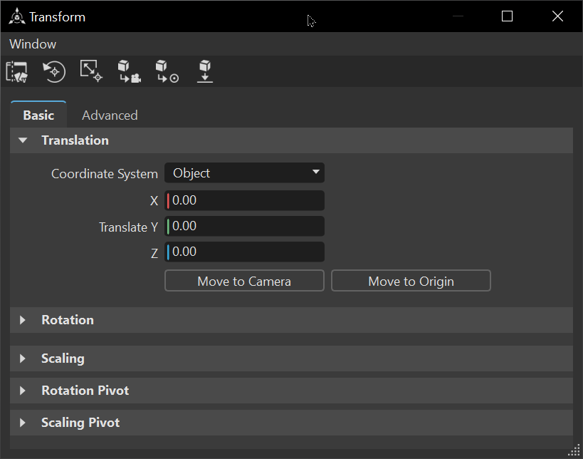
You will find the following changes in the Transform Editor:
| 2024 | 2024.2 |
|---|---|
 |
 |
 |
- Sliders are now side-by-side to reduce the length of sections.
- Push buttons, such as Camera (previously Move to Camera) and Origin (previously Move to Origin) for Move to and fields now extend the width of the editor.
- Some options have been rearranged and others renamed.
- Icons were added to the Transform Variants window.