VRED Experience
Find many improvements and additions to further enhance your VRED experience, such as Open Examples and Tile View in the Onboarding and new categories, highlighting, and searchability in the Preferences. See layout alignment improvements in the Preferences, Render Layer module, and UV Editor. For selection, we've added multi-selection highlighting for locked items and one-click text selection for single-line text inputs.
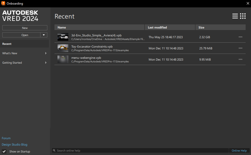
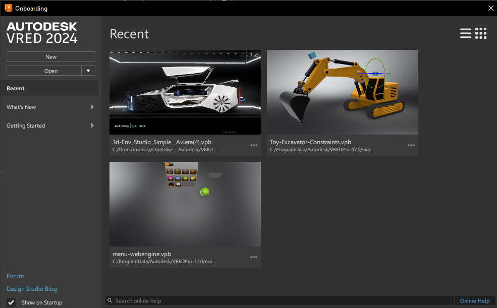
Video captions: With our efforts on the UI Modernisation, we added several new enhancements. At the start of VRED, you will recognize that we did some changes on the onboarding screen. Here you see a list of recently opened files, which you also can change to a tiled view, to get a better and faster visual overview of your files. You also can open our examples files directly from the Onboarding screen now. And we improved the preference menu. As you see, we have rearranged and categorized the entries. And additionally, when you are searching for specific entries in the preferences, and you don’t know anymore where to find them, we’ve added now a search bar where you can have direct access to the entries you need. This shortens up the time searching for entries massively and makes you faster.
We also improved the UI on some modules like the UV Editor, where you can now scale the windows more dynamically. Also, the Render Layer dialog is now better scalable and changes to icons, instead of text only when scaled down. This is much better when this window needs to fit into a smaller area for example.
Additionally, we implemented a single line edit on some modules, so you can just click into the name filed once to change the naming. Which makes it much faster. And we did some more user interface changes on the Stream App and implemented the possibility to activate Nvidia's Deep Learning Super Sampling from there. Additionally, we added different view modes, which gives you more flexibility to adjust the user interface to your needs or to your device you are using.
Thanks for watching the video!
Onboarding
In 2025, we've added Open Examples to Open button for opening sample projects, as well as a way to change how recent files are displayed. For first time VRED users, we added New File and Open File options to the recent screen.
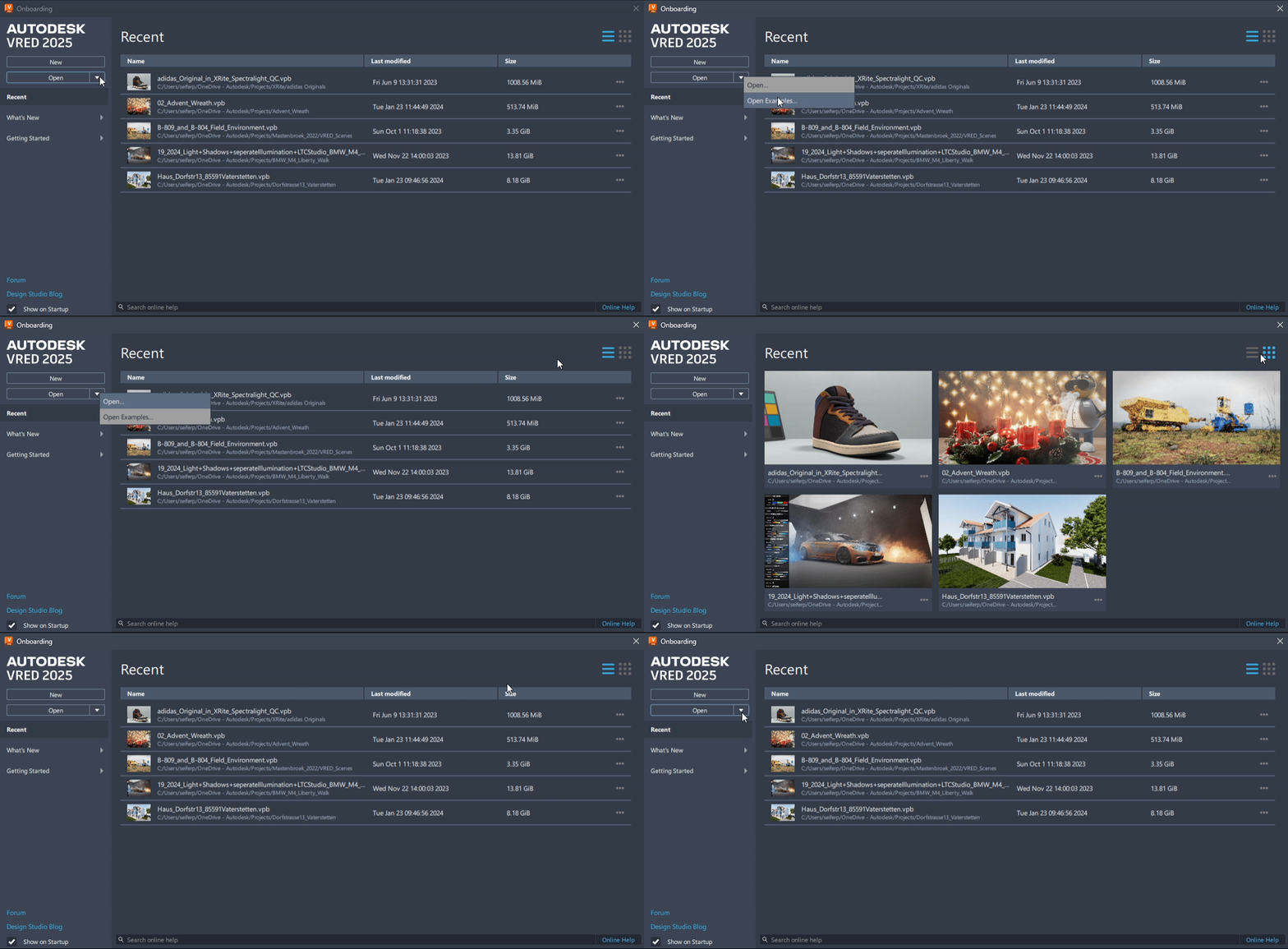
Open Examples
The Open button has changed to include a dropdown menu containing the following options:
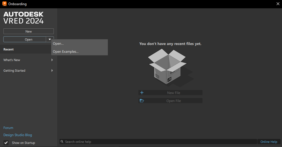
- Open - Opens a specified scene in VRED amd closes the onboarding dialog.
- Open Examples - Opens the VRED example folder containing sample projects showing how to set up simple constraints, Python scripts, tracking, touch sensors, VR hands, and more. Double-click a file to open it in VRED and begin working.
New File and Open File
When opening VRED for the first time, there are no recent files to list; therefore, you are presented with these options:
- New File - Creates a new scene file with four camera views and a default environment, after the existing scene is saved or destroyed.
- Open File - Opens only VRED files, such as .vpb and .vpe. If you want to load other file types into VRED, use File > Import or File > Import Scene Data.
List and Tile View
We added these options to change how recent files are displayed.
Click
 to view your recent files as a list.
Click
 to view your recent files as larger tiled images.
New in Preferences
We've reorganized the tree view along the left, updated the layout, added a search field at the top to quickly and easily find a specific preference, and made some changes to the buttons along the bottom.
New Categories
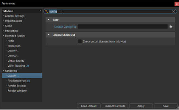
The tree view to the side has been reorganized into six main categories:
- General Settings - Find color management, copy/paste, device, interaction, navigation, OpenPDM, plugins, script, search, selection, web interface, and web shop preferences.
- Import/Export - Find cube image, file option, file type, and tessellation import and export preferences.
- Scene - Find animation, asset, bake, camera, material, metadata, references, Scenegraph, and UV preferences.
- Interaction - Find annotation and collaboration preferences.
- Extended Reality - Find HMD and an assortment of different VR and MR preferences.
- Rendering - Find cluster, final renderpass, render settings, and render window preferences.
Search
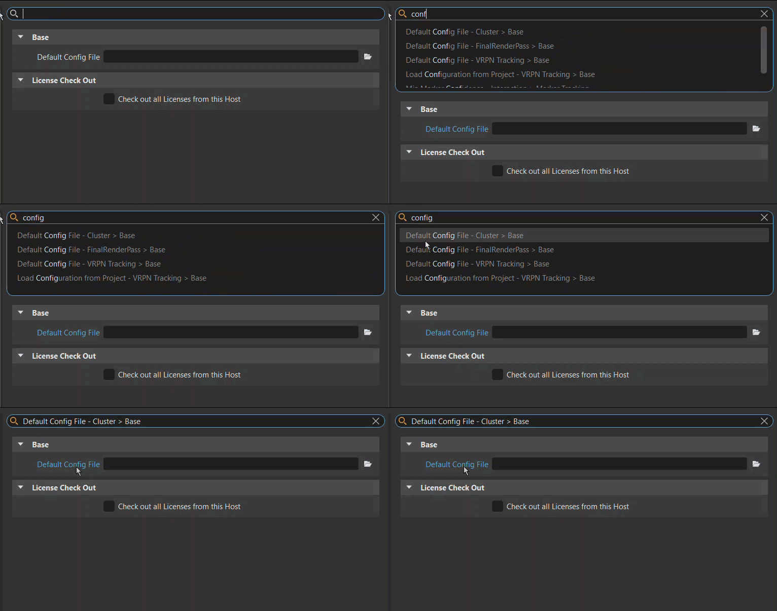
In the Search field to the right, once there are two characters, VRED starts to generate a list of search results. The matching part in each search result is highlighted. Click an entry to load the module preferences, with matches highlighted blue. If only one module matches the search, it is displayed.
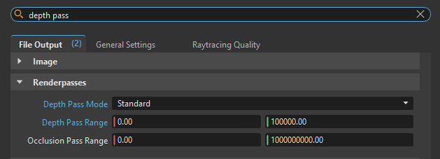
For modules with multiple tabs, the number of matches highlighted blue appears next to the tab name.
When a search is performed, the tree view expands, displaying the number of search hits next to modules containing matches. Click one of these to display that module's preferences, with matches highlighted blue.
Button Changes
These are the changes made to the buttons along the bottom:
- We removed the Cancel button. Now, to close the Preferences window without saving any changes, click the x.
- We replaced OK with Save. To save changes made within the Preferences window and use them as the default future values and behavior, click Save.
UV Editor Layout
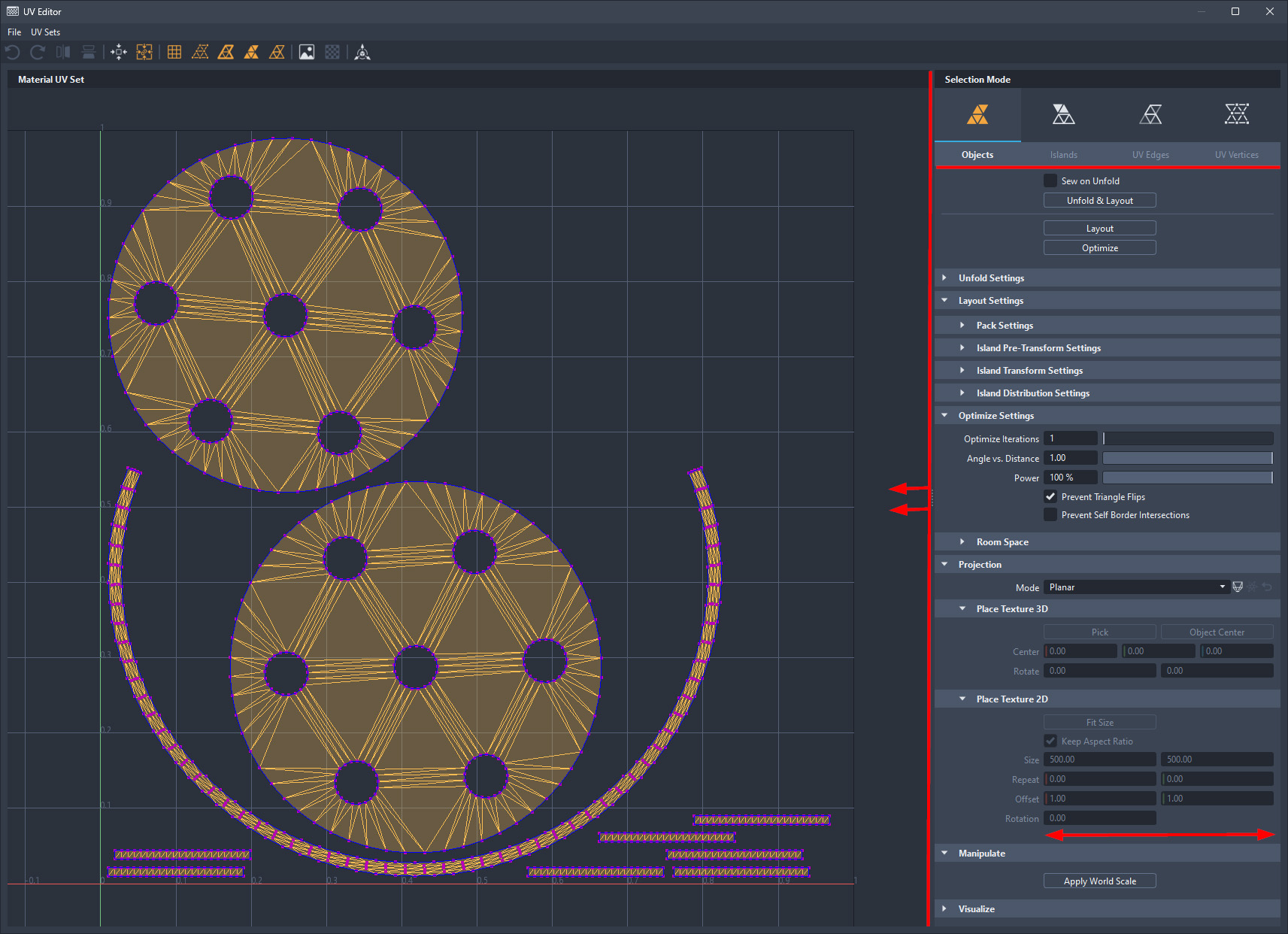
We've improved the layout and dynamic responsiveness of the UV Editor. All X, Y, Z input fields are horizontally aligned and the width of the tool panel to the right can easily be resized.
Render Layer UI
We've made changes to the layout and added some functionality of the Render Layer module.

When there is no assigned overflow material and the module is extended, "Drop Material here" now appears in the once blank cell. However, when the module is reduced in width, a greyed out material ball replaces this message.
When there are override materials, they are now represented with the icon of their respective material type.
When the module is extended, column labels and icons are displayed. However, when the module is reduced in width, these labels, as well as all checkboxes, are replaced with icons. The module is still readable, yet this reduced width allows for better integration and docking into the overall layout.
When renaming a layer, single click the name to make it editable.
We have not decoupled the Render Layer module itself; therefore, Python access remains limited.
Line Edit

When you LMB-click a single line text input field in the Attributes, it is now editable like that of value input fields. The entire text is selected with a single click, which is handy for renaming a material Name field.
Note that multi-line text input fields, such as the description of annotations or the Text field in frontplates, did not change and behave the same as before.
Multi-selection and Locked Values
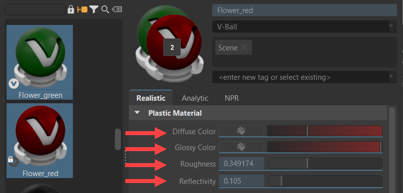
During multi-selection, it is now possible to identify selected locked options with different values that cannot be modified, as they are now underlined and tinted blue.