This dialog lets you control the display of data on scatter plots on the custom graph or graph view . A scatter graph is a statistical diagram drawn to compare two sets of data. It can be used to look for a correlation between the two sets of data. It will also help to identify rogue values in related data sets.
The dialog is displayed
if you right click on the
graph view, and choose Create Scatter Graph from the popup menu (this menu item will only be available if there is more than one sub-plot on the graph). Or, for custom graphs, click on the scatter graph toolbar button from the
custom graph toolbar).
from the
custom graph toolbar).
An example of the extended version of the dialog:
An example of the basic version of the dialog:
Scatter graph options
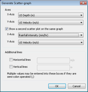
Axes
Select at least one pair of variables to display on the scatter graph. You have the option to display a second pair of variables on the same graph by checking the Show a Second Scatter Plot on the same graph box. The second plot will be shown using an alternate colour by default.
You can change the plot options in the Graph Properties dialog.
Additional lines
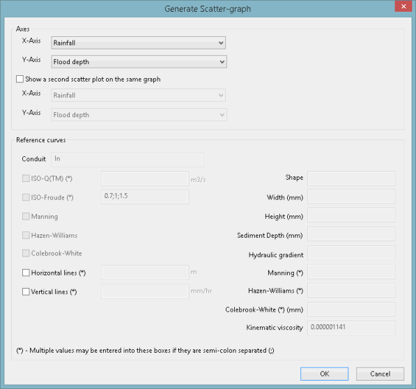
You can add additional gridlines to the view if required. Check the Horizontal Lines and/or Vertical Lines boxes. Then add one or more values for your additional gridlines. Multiple values should be separated by semi-colons.
Reference curves
An alternative link ID can be specified by entering it into the edit box. If there is a link specified then:
- The link's shape, width, height and gradient appear on the dialog
- You can generate the following curves:
- ISO-Q
- ISO-Froude
- Manning
- Hazen-Williams
- Colebrook-White
- All curve types require shape, width and height to be defined. All are affected by sediment depth. In addition:
- Manning requires hydraulic gradient and roughness
- Hazen-Williams requires hydraulic gradient and roughness
- Colebrook-White requires hydraulic gradient, roughness and kinematic viscosity
Generating scatter graphs
To display a scatter graph:
- Right-click on the custom graph or graph view and choose Create Scatter Graph from the popup menu (this menu item will only be available if there is more than one sub-plot on the graph). This displays the Generate Scatter Graph dialog.
- Select a pair of variables to display on the two axes.
You have the option to display a second pair of variables on the same graph
- Check Show a Second Plot and then choose another pair of variables. The second plot will be shown using an alternate colour by default.
- Check Horizontal Lines and/or Vertical Lines to add additional gridlines to the graph. Then add one or more values for your additional gridlines. Multiple values should be separated by semi-colons.
- Click OK when finished.
You can change the display options for the scatter graph. Right-click on the graph and choose Graph Properties from the popup menu. This displays the Graph Properties dialog.
More information on reference curves
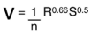
Manning Equation
|
|
Where n = Manning roughness coefficient S = Hydraulic gradient (m/m) V = Velocity (m/s) R = Hydraulic radius = D/4 (m) |
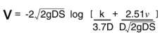
Colebrook White Equation
|
|
Where S = Hydraulic gradient (m/m) k = Hydraulic roughness (m) V = Velocity (m/s) D = Pipe internal diameter (m) g = Gravitational acceleration (m/s2) v = Kinematic viscosity of water (m2/s) |
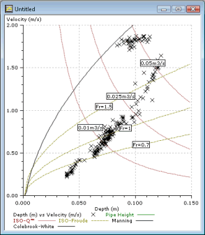
The following example shows a scatter graph with a number of reference curves applied: