Parametric Models - UI Appearance Tab Reference

UI Appearance: When you add or modify parametric bridge components, tunnel segements, or road decorations in the Parametric Models tab of the Style Palette, you can use the UI Appearance tab of the Configure Parametric Models dialogue to customise how attributes of the parametric components are displayed in the Stack.
Priority: Use the Set Priority up/down arrows to determine the top-to-bottom order of key dimensions that are displayed as attributes for the selected parametric component in the Stack. Most commonly, you will use the Priority field in tandem with the Group Name field, so that you can categorise attributes in the Stack to meet your project needs.
Name: The name of each dimension for the parametric component is defined by the name given to each key dimension when the .IPT parametric model file or .IAM parametric assembly filed was created using the Infrastructure Part Shape Utilities plug-in for Autodesk Inventor. Refit parameters are listed here as well. You can modify the name property for your own reference by double-clicking in the name field and inputting new text values.
Label: The label value for a key dimension represents the name that is assigned to the corresponding attribute in the Stack. For example, changing 'BottomColumnWidth' to 'Width' in the label column would update the display of 'BottomColumnWidth' to instead say 'Width' in the Stack.
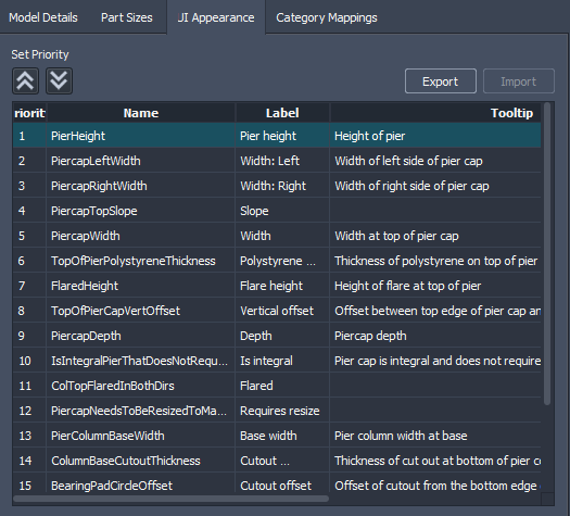
- UI Appearance label: ![] (../images/ill_label.png)
- Corresponding Stack label: ![] (../images/ill_label_in_stack.png)
Tooltip: You can create your own custom tooltip for each key dimension of a parametric component. These tooltips will display when you hover your cursor over the name of the corresponding attribute in the Stack.
- UI Appearance Tooltip:

- Corresponding Stack tooltip:

Visible: Checkmark this box to make the key dimension for this row visible in the Stack as an attribute of the selected parametric component.
Editable: Checkmark this box to make the key dimension for this row an editable attribute in the Stack for the selected parametric component. If you de-select this option, the attribute will be a read-only value in the Stack. This can be useful if the key dimension should not be modified in the Stack. For example, the PierHeight for a parametric bridge pier component is determined by the height of the bridge within the roadway. Modifying PierHeight in the Stack would not actually produce a change in pier height in-canvas.
Type: Double-click the Type value to view available options. The Type controls the permitted values that will be shown as attributes for the selected key dimension, in the Stack.

Min Value: Input a minimum numeric value to enforce a minimum value for the selected key dimension.
Max Value: Input a maximum numeric value to enforce a maximum value for the selected key dimension.
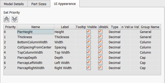
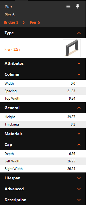
Group Name: Double-click the Group Name value and input text to define where key dimension attributes are displayed in the Stack. Most commonly, you will use the Priority field in tandem with the Group Name field, so that you can categorise attributes in the Stack to meet your project needs. For example, key dimensions for a Pier parametric component can be categorised into General, Column, and Cap attributes in the Stack using the Group Name and Priority fields, as shown below.
UI Appearance key dimensions configuration:

Corresponding Stack categories of attributes:
