Chart Views
Chart views display data in one of many different types of charts, and the different chart options are all displayed on the Charts page. A chart view has two components: an outline and a set of data series. A chart outline contains details about the display of the chart itself, and a data series is a variable or EL expression that the system plots on the chart. On the "Display As" section of the Queries & Reports page, the chart outline block appears to the left of the list of data series in the current chart.

Chart Outline
The chart outline block lists the display type of the chart, as well as its caption; the icon in this block reflects the chart's display type. The button in the top right of this block brings up the "Edit Chart Outline" panel.

There are two required fields on this panel: "Caption", which the system will display at the top of a chart view at runtime, and "Type", which controls the display type of the chart. The rest of the fields on this panel are optional, but can be helpful to provide extra information about the chart. The "Sub-Caption" field acts as a subtitle to the caption, and appears beneath it at runtime in a smaller font. The "Label Axis Name" and "Value Axis Name" label the horizontal and vertical axes of the chart, respectively.
Normally, the legend of a chart appears below the Label axis at runtime, displaying the name and color of each data series; a user can click on the name of any data series to render or hide it on the chart. There is no limit to the number of data series a chart can contain, however, and at greater numbers both the bottom legend and the chart itself can become unwieldy. To avoid this, the "Legend Selector Cap" field acts as an upper bound on the number of data series the bottom legend can contain; if there are more series than this upper bound, the bottom legend is replaced with a drop-down menu, from which the user can select a single data series to view at a time.
Bands
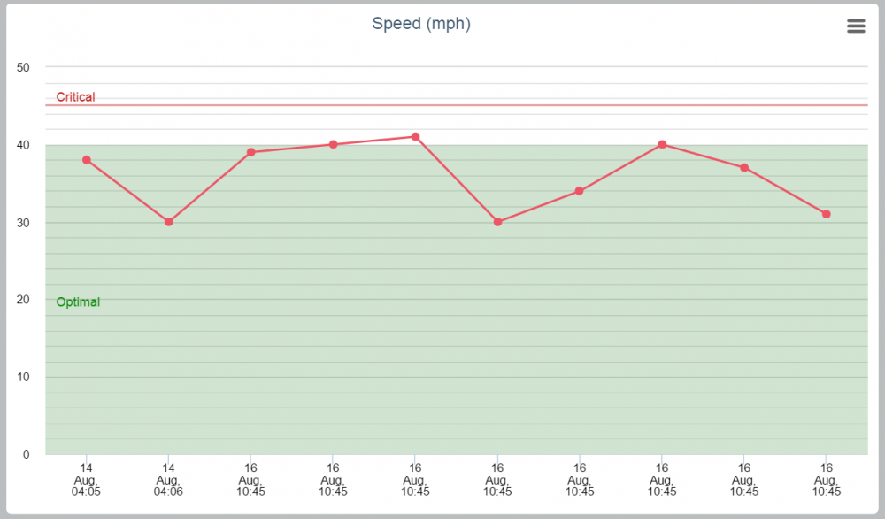
On the Edit Chart Outline panel, a user can create one or more Bands for the chart. A band is a range of y-values of the chart with a different background color and a label, and serves to provide context to the values displayed in the chart. In the below example, the chart contains two bands, one informing the user of the "Optimal" range of speed values, and the other marking a "Critical" level.

The "Edit Chart Outline" panel for this report contains the following section below the "Legend Selector Cap" field, which allows the user to add bands to the chart, edit or delete existing ones.

For each band, the user can set a "Band Minimum" and "Band Maximum", which define the range of y-values included in the band; if the "Band Maximum" field of a band is empty, the band will appear as a single colored line at the y-value of the "Band Minimum" field, such as the "Critical" band shown in the above chart. The "Band Color" field controls the color and opacity of the background color of the band. Intuitively, the "Label" and "Label Color" fields of a band control the label that appear inside (or above, if the band is too narrow) the band on the chart, and the color of the label's text. In the bottom right of each band in this table, the "Delete" button allows the user to delete a band, and the "Add Band" button below the table allows him or her to add a new band.
Chart Series
To the right of the chart outline block on the Queries & Reports page is a list of all existing data series in the chart. A data series has both a "Label" and a "Value", which are the values of each data point in that series on the Label (X) and Value (Y) axes, respectively. The list of data series displays both of these for each series, as well as each series's "Title" at the top of each series' column in this list. The standard edit and delete buttons allow the user to edit or delete an existing series, and the "Add Chart Series" button brings up a panel to add a new data series to the chart.
![]](..\..\..\images\DataChartView4.png)
On this panel, the user can set the Title, Label, and Value fields described above. On the final chart, if a user hovers over a point, column, etc. on the chart, a tooltip will appear showing the Value of the data series at that point. The "Description" field overrides this standard tooltip, to show any information or custom HTML instead of simply the Value at a point. The "Decimal Places" field controls how many decimal places are rendered when the chart displays this tooltip, regardless of whether it contains a custom Description.
The "Value X" field helps determine the spacing of data points in the horizontal direction. By default, data points on a chart are spread out uniformly in the horizontal direction, as the Label field typically gives no indication of how close one element should be to another. This can result in misleading display of data: for example, if the Label field is a formatted string representing the time an activity was created, and three data points exist with the labels "12:00 pm", "1:00 pm", and "11:00 pm", the chart would display them equally far apart on the x-axis. To avoid this, the user could convert the activity time into milliseconds from the epoch and enter it into the "Value X" field, and the distance between data points would be proportional to the difference in their times.
If you do not want to use the default theme colors for your chart, select a color using a variable or an expression in the Color field.
You can specify colors by:
- Name– Red, Green, Orange, or Pink
- HTML Color– #00c200 or #ff0000
- RGB color– RGB(0, 194, 0) or RGB (250, 0, 0)
- Variable– a color assigned to the object. Note: Fusion Connect can also color the series conditionally based on a result ${t.value<10?'green':'red'} using EL.
![]](..\..\..\images\DataChartView5.png)