Trend Viewer
Normally, a data query and a trend report are two sides of the same coin: when the user navigates to a report page, the system executes a single data query to generate a set of results, and that set populates the views of that report. Trend Reports, on the other hand, work differently: a single trend report can execute multiple data queries, generate multiple independent sets of results and package them as independent trend measures, but then render these trend measures on the same page, even overlaid on the same graph.
A trend report is not unlike the account dashboard, in that for every widget, the dashboard executes a data query. A dashboard widget can contain any kind or view of data, however, whereas each trend measure is guaranteed to be a variable or expression plotted against time.
So, where dashboard widgets cannot interact with one another, trend measures have a common basis on which to be compared and overlaid on one another. This additional functionality is why trend reports require a completely separate page from the View Report page, a unique environment of their own: the Trend Viewer page, accessible on the main menu from View > Trend Viewer.
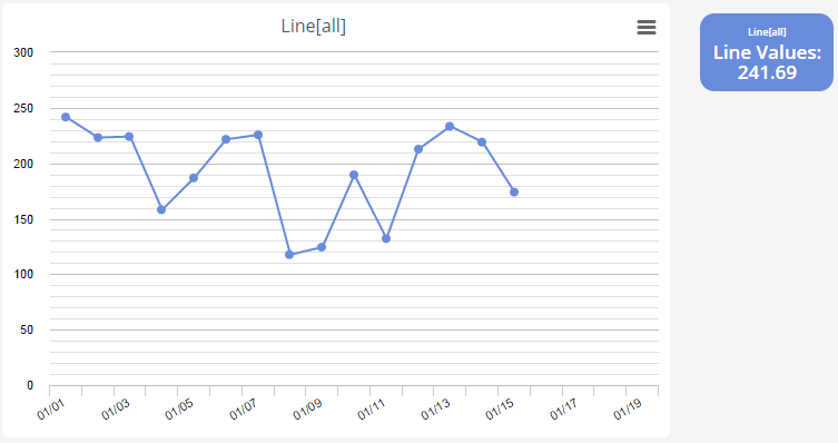
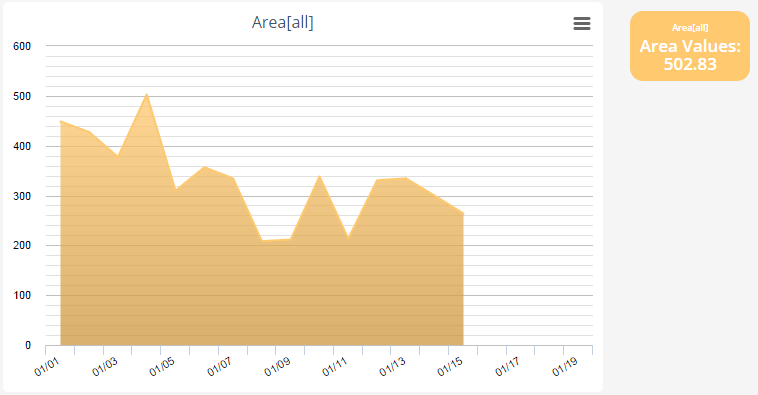
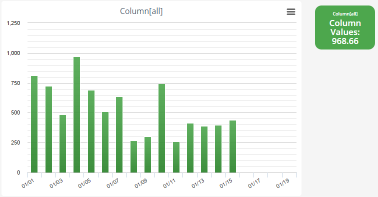
There are four visualization methods of trend reports: Line, Area, Area Gradient, and Column. An example of each is shown below.


As shown on the Charts page, several types of chart views can approximate the appearance of these trend reports, and for a trend report containing only a single trend measure, a chart view can even display roughly the same data. However, even if a chart view can display multiple data series, at the end of the day, each data series displays a different variable/expression of the same set of query results, different information about the same assets. Each trend measure in a trend report, on the other hand, each trend measure is calculated independently, and so a trend report can effortlessly overlay information from completely different sets of assets.
For example, consider a case in which an application monitors a "Truck" asset type, and has two independent activity types, "Temperature Alert" and "Mechanical Failure" pertaining to that asset type. There would be no good way to plot the occurrences of both activity types using a chart view, as attempting to select from multiple activity types in the same data query creates many difficulties with trying to join the targets so that the same alert doesn't appear in multiple query results.
With the trend viewer, however, this case is trivial; two separate data queries could fetch the data from one activity type apiece and package them into distinct trend measures, which could then be brought into a single trend report and displayed simultaneously without any attempt to join the result sets. This independence applies not only to trend measures from different data queries or views, but to trend measures from the same query and view, or even multiple copies of the same trend measure; these trend measures are calculated using copies of the same data set, but not the same data set.
As a result, different criteria values can be applied to different measures from the same view, which can then be superimposed on the same graph simultaneously as separate lines or columns. Using the same example as above, a user could want to plot the temperatures of all Temperature Alerts over time, and filter the alerts by the Truck to which they apply. A chart report could use the key of the parent Truck as a criterion, and at runtime a user could specify the truck for which they would like to see the historical alerts. By this approach, however, a standard report can only display the alerts for a single truck at a time, making it more difficult to compare the set of one truck's alerts versus another.
A trend view of the same report could include a measure on the same temperature field against time, same as the chart series, but a trend report would be able to include this measure twice, and specify one value for the Truck criterion of the first, and another for the second. As a result, the trend report would simultaneously show the data for each truck as separate data series, possibly on the same graph.
The criteria of each trend element are resolved when that element is added to a trend report, but the left filter of the Trend Viewer page still contains a single criterion, which it applies to all elements within the current report: "Time Span", which, self-evidently, defines the time range for which each graph will display the values of the trend measure.
The interval of the trend report also affects the granularity of the data it displays, however; for a time span of several months up to a couple of years, the trend will display a single X-value for each month; if the interval spans only a couple of months, each graph will display an X-value for each day; if the interval spans a couple of days, the graphs will display a data point for each hour, and so on. In the above screenshots, for example, the specified time span would be from January 1 - January 20. This granularity overrides any "Default Rows" attribute specified in any trend view, is unaffected by zooming in on a specific portion of a graph, and is imposed regardless of how many actual data points fall within the selected interval; the trend report simply groups together the real data points into a single data point displayed at the latest applicable interval.
The "Aggregation Function" field of a trend measure determines which value is displayed for that trend measure at each interval; it specifies the operation performed upon the data points that get grouped together at each interval, and whether the minimum, maximum, average, sum value, or simple count all of all data points within that interval is displayed.
Appearance of Trend Elements
The functionality of trend reports greatly influences the way in which trend elements appear on the Trend Viewer. When you add a new trend element to a trend report, it appears in its own graph on the page; as more elements are added, the page vertically stacks more graphs. An individual graph, when formulating its title, will take each trend element it contains and display the name of its origin trend view, as well as all criteria applied for that trend element, using the following format: Trend View Name [Criterion 1 = Value, Criterion 2 = Value, etc.] ; if no criteria are active for a trend element, these brackets simply contain "all". If the graph contains more than one trend element, the identifier of each is punctuated by "vs.", as in "Trend 1[all] vs. Trend 2[all] vs. Trend 3[all]". To the right of a graph, a box appears identifying each trend measure as well, once again listing the trend view name and criteria of the element in small text, but primarily displaying the name of the specific trend measure, as well as the maximum value displayed for that element.
The color of a box also corresponds to the color of its data set on the graph. Each box can be dragged and dropped between graphs (or below all graphs, still to the right, in order to create a new graph) to move its corresponding trend element from one graph to another, and hovering over a box reveals an "X" that can delete the element from the report. In the first screenshot above, the graph contains a single element, based on the "Line Values" measure of the "Line" trend view, with no criteria applied, and the maximum value displayed for that element is 241.69.
The time span of the trend report greatly impacts this maximum value, as it affects which values of a data set fall within the selected range as well as the granularity of the graph, meaning higher values that might normally appear on a more granular graph are averaged with others or rejected as non-minimal on a less granular one.
Building Trend Reports
On the top left corner of the Trend Viewer, the "Add View" button brings up the following panel, which allows the user to add a trend element to either a new, blank trend report, or an existing one.

Using the "Report View" drop-down, you can select from among all the Trends-type views defined in the account's data queries. The "Measurement" drop-down then allows you to choose one of the trend measures in the selected trend view, and the "Method" drop-down allows you to select one of the four visualization types listed above. The "Style" attribute of trend elements is currently in beta to further fine-tune the appearance of the element.
The optional "Default Value" attribute dictates the value shown on a graph when there are no data points available for one of the intervals in the time span; if no value is specified, any such intervals will appear completely blank.
Finally, the "Criteria" section lists all the criteria defined in the source data query of the selected report view, and you can specify a value against which to compare the value of the trend measure, and an operation to use in that comparison. Once a trend element has been created, you cannot edit any of these fields, so if you wish to change an element after the fact, you must delete the existing one and re-create it from scratch with the desired values.