Site Activity Monitor (SAM)
The Flow Production Tracking Site Activity Monitor (SAM) is a place where Flow Production Tracking Administrators can visit to see high-level activity on Flow Production Tracking sites and gain insight for troubleshooting. There are several ways in which the Site Activity Monitor can be used, including:
- Troubleshooting: Gain insight around incidents that occur (a Flow Production Tracking site is down or operating with an impact on performance)
- API script efficiency: Dig into script activity to help optimize API scripts
- Onboarding: Ensure the level of activity is expected while inviting and enabling new users and API scripts to Flow Production Tracking
Given that Flow Production Tracking has a customizable schema, is built on scalable infrastructure and that customer usage patterns significantly vary, it is hard to give general guidance on what normal activity should look like for any one Flow Production Tracking site. SAM is best used as part of a diagnostic toolset for Flow Production Tracking Administrators. If you need assistance interpreting activity on your site, please connect with the Autodesk support team.
Admins can view and interact with activity graphs displaying:
- The number of requests per minute per user
- Request times
- The passenger queue time
- Page visit counts
This experience enables admins to help manage Flow Production Tracking site environments, identify areas of contention, and troubleshoot performance issues.
 Contents
- Accessing the Site Activity Monitor
- Interacting with the graphs to find the right data
- Views
- Other functionality
- Data retention
- Limitations
- Other hosted site troubleshooting resources
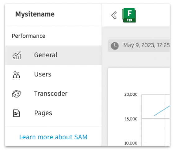
Accessing the Site Activity Monitor
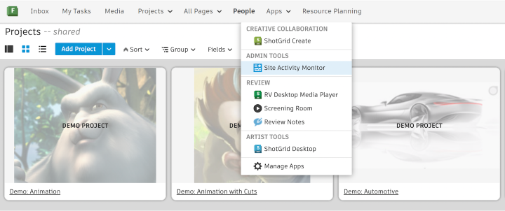
Every hosted Flow Production Tracking site is equipped with a Site Activity Monitor (SAM), accessible in-app through the Apps dropdown menu and outside Flow Production Tracking using your Flow Production Tracking site URL.
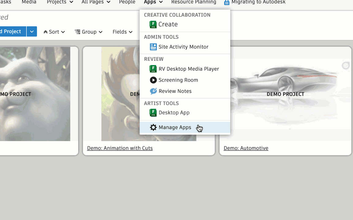
From the Apps dropdown menu in the Global Navigation, select Site Activity Monitor under ADMIN TOOLS.
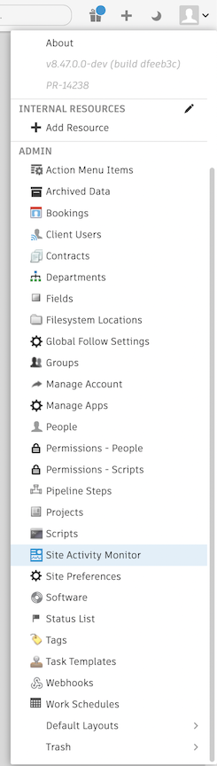
The Site Activity Monitor is also accessible through the Admin menu dropdown.
Requirements for access
To access the Site Activity Monitor, you must meet the following requirements:
- Access must be granted for your permission role in Flow Production Tracking
- To configure permissions, select Manage Apps from the Apps menu dropdown
- Then, select the CONFIGURE tab
- Under Permissions, you can select roles who can see the app
You can also control permission access through the Permissions page > App Permissions > Site Activity Monitor.
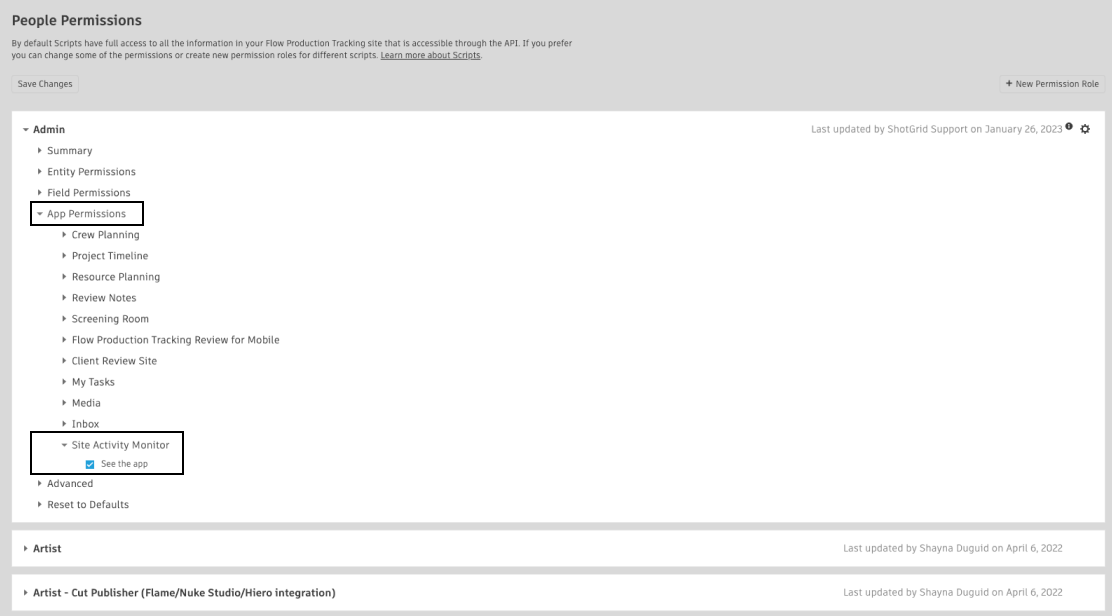
By default, the Admin permission role has access to SAM enabled. Access can be granted to other permission groups as well by configuring this permission on each role.
Interacting with the graphs to find the right data
Finding the right time
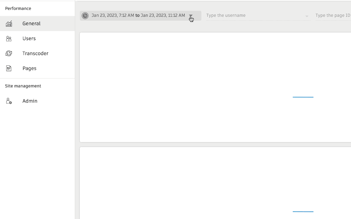
One of the key pieces of information you usually know about any incident is the rough time that it happens. Upon loading the Site Activity Monitor, the last 4 hours of data will load by default. It's easy to update the time frame depending on your investigative needs.
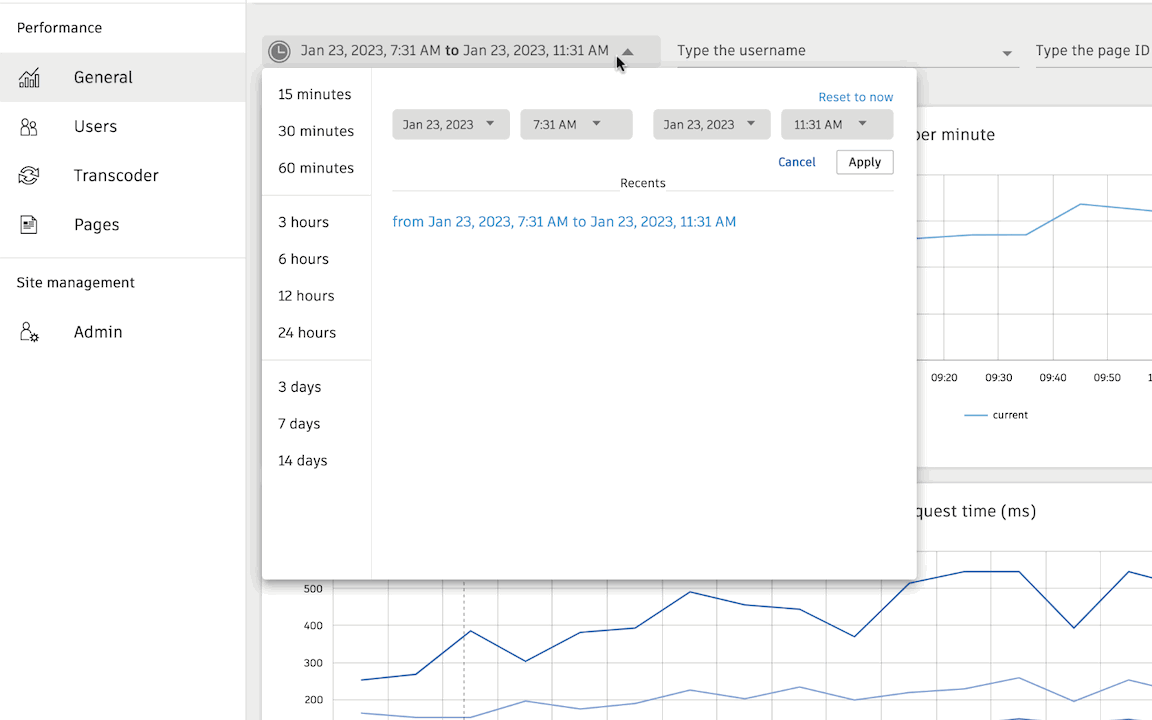
Pre-set options
You can quickly select one of the time frame presets and that will load the data range into your graphs.
Date/Time picker
If you have a specific time frame in mind, you can choose a range using the date/time pickers.
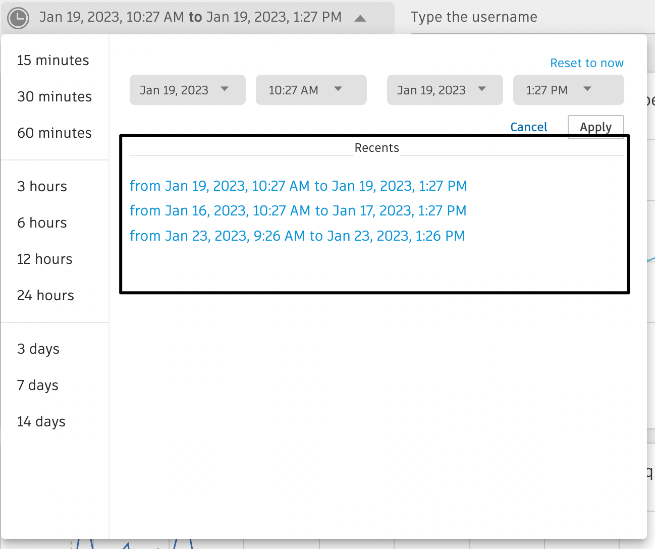
Recent
Recently selected ranges are available for quick selection.
Filtering by Username and Page ID
In addition to filtering by date and time, you can also filter graphs by Username and Page ID. Each of these filters will autocomplete as you start to type, and you can select multiple values per filter.
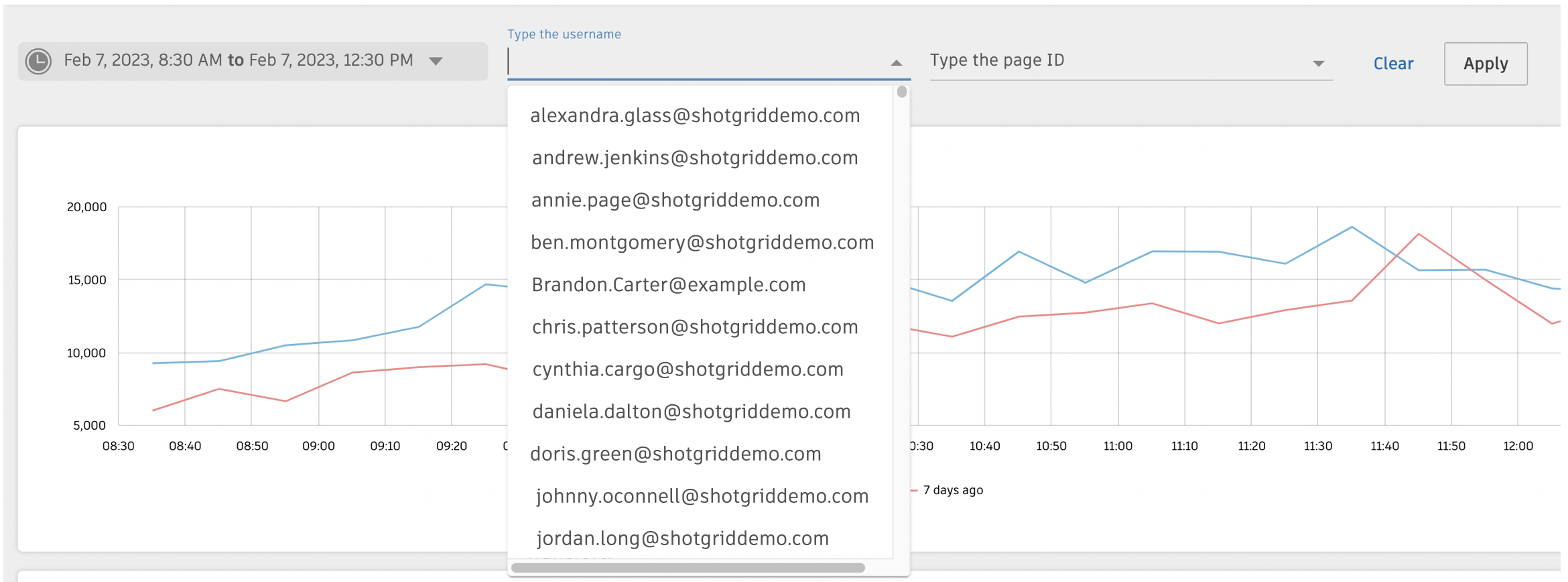
The Username and Page ID autocomplete menus are sorted by the highest to lowest requests during the selected time frame.
Clicking and dragging
You can interact with any of the line graphs by clicking and dragging on the graph to select a specific time range. Each graph will redraw to that time frame.
Zooming
After focusing on a time frame selection, you can zoom out ![]() to your original time range.
to your original time range.
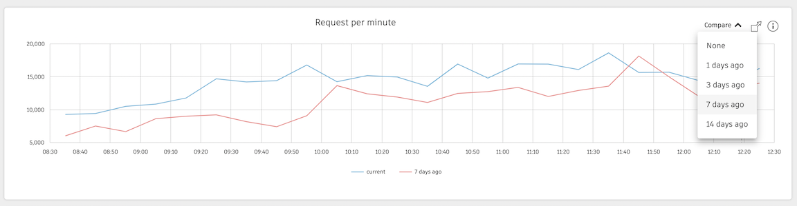
Compare
Using the Compare option, you can gain insight around patterns and irregularities specific to your site by comparing your graphs to a previous time frame, up to 14 days before the current time.
Expanding the graphs
Select the expand icon to expand each graph  .
.
Then, you can collapse the graph into the view by selecting  .
.
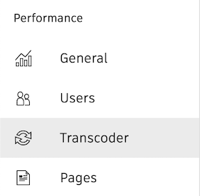
Views
You can show and hide views by selecting  and
and  .
.
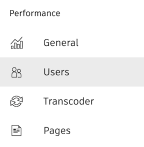
General
The General view will display graph information relating to general usage on your site:
- Requests per minute
- Request time
- Passenger Queue wait time
- Database System consumption
- Queuing system consumption
- CRUD activity
- Entity activity
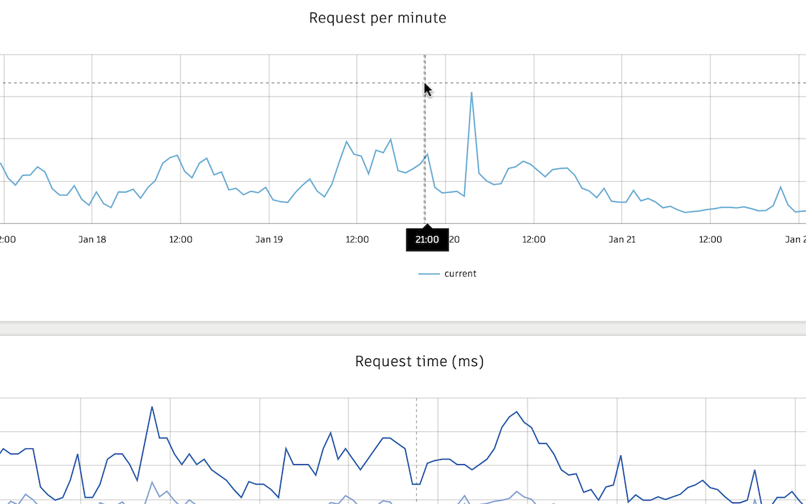
Requests per minute
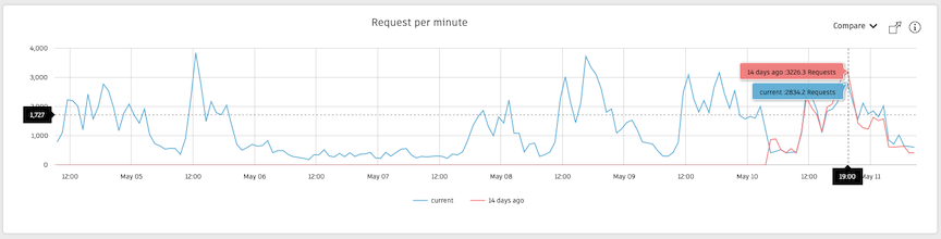
The Requests per minute graph displays the number of requests your studio sends to your Flow Production Tracking site.
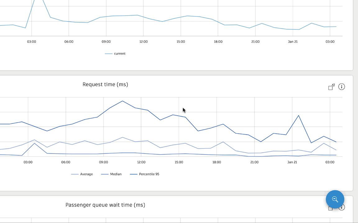
Request time
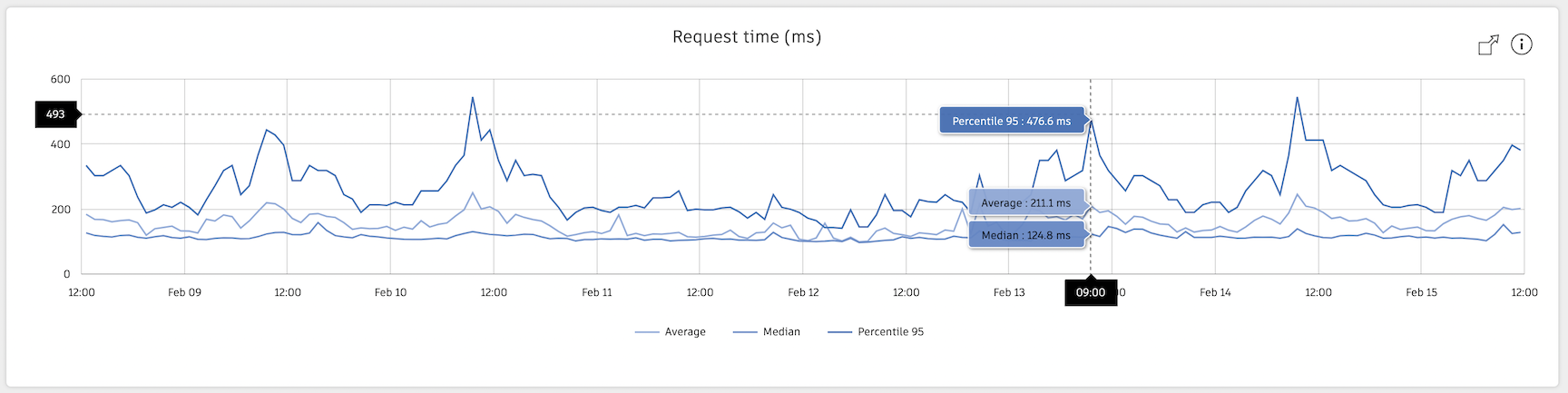
The Request time graph displays the time it takes on average, for a request to go through the Flow Production Tracking application stack components (not including network time). More database time is usually indicative of a complex schema or the complexity of the call to the Flow Production Tracking database.
Passenger Queue wait time (ms)
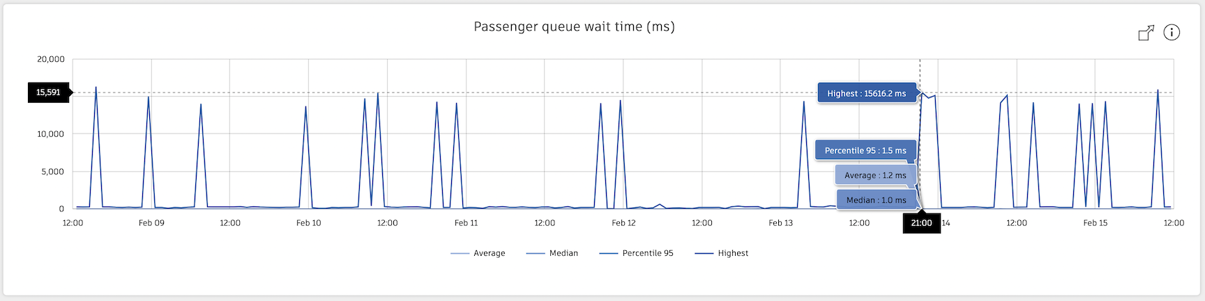
The Passenger Queue wait time (ms) displays the number of milliseconds a request spends in the queue before being processed by the application. Shorter, sharper spikes indicate that a single expensive query is creating a backlog on a passenger process and skewing the graphs upwards.
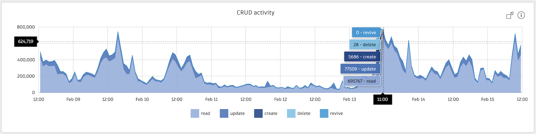
CRUD activity
The CRUD activity stacked graph displays the number of CRUD requests over time (create, read, update, delete).
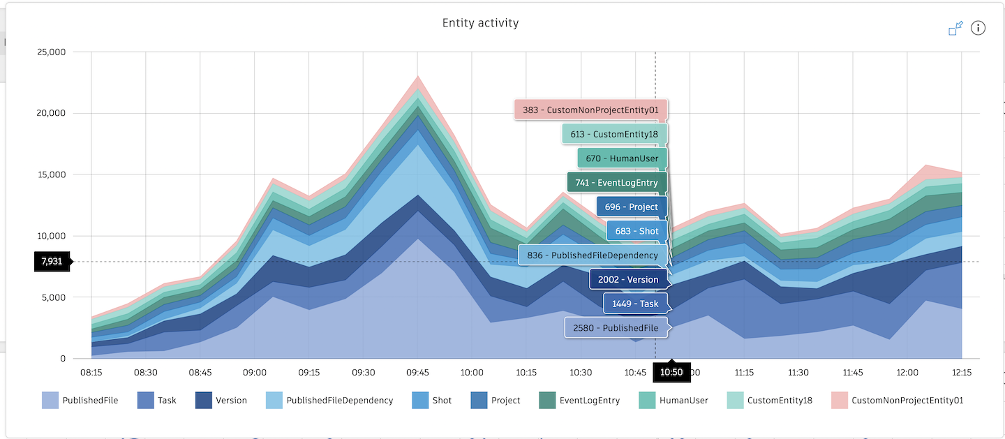
Entity activity
The Entity activity graph displays the number of entity requests over time, stacked by entity type (for example: Shot, Asset, Task, Version, PublishedFile).
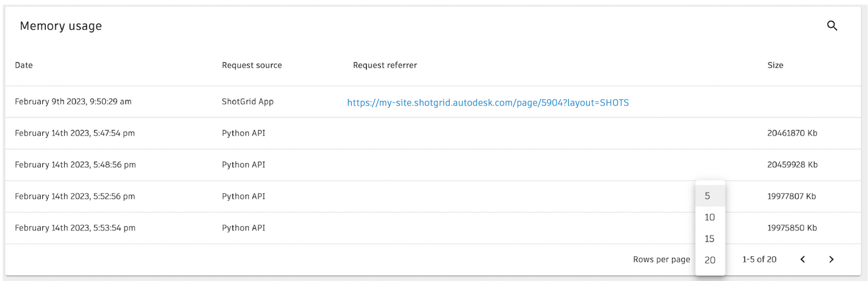
Memory usage
The Memory usage chart displays the date, request source, request referrer, and size for the time frame selected—all sortable with the column headers. You can also select the rows displayed per page which is set to 5 results by default.
Users
The User view is one of the more interesting views, displaying graphs about users—APIUser and HumanUser—on your site:
- Total time per user
- Total time per user type
- Request per minute per user
- Average time per user
Unauthenticated users are those who have expired sessions and need to sign in Flow Production Tracking again.
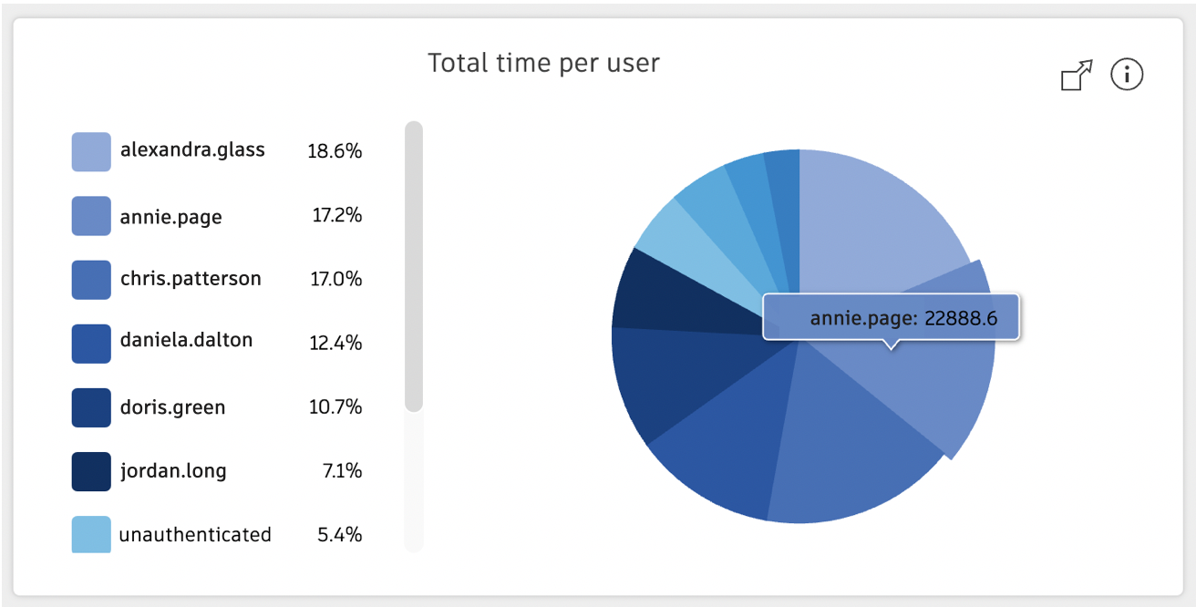
Total time per user
The Total time per user pie graph displays the top 10 highest relative database consumption time per user within the given time frame. You can narrow and isolate user data by selecting them in the key and graph.
Total time per user type
The Total time per user type pie graph displays the relative database consumption time per user type (APIUser and HumanUser) over the given time frame. You can narrow and isolate user data by selecting them in the key and graph.
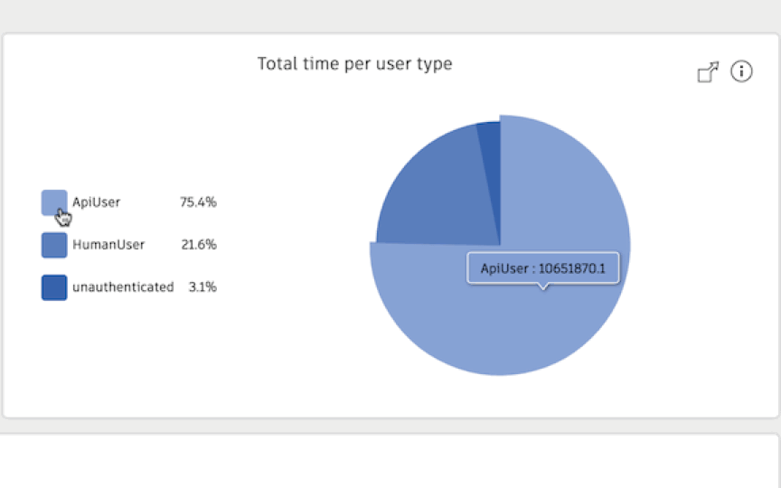
Unauthenticated requests are requests made without a valid login. For example, it could be a user restoring an old browser tab where their authentication token has expired, or someone navigating to the login page. If there is a consistently high background number, it is possible a regularly running script is failing authentication.
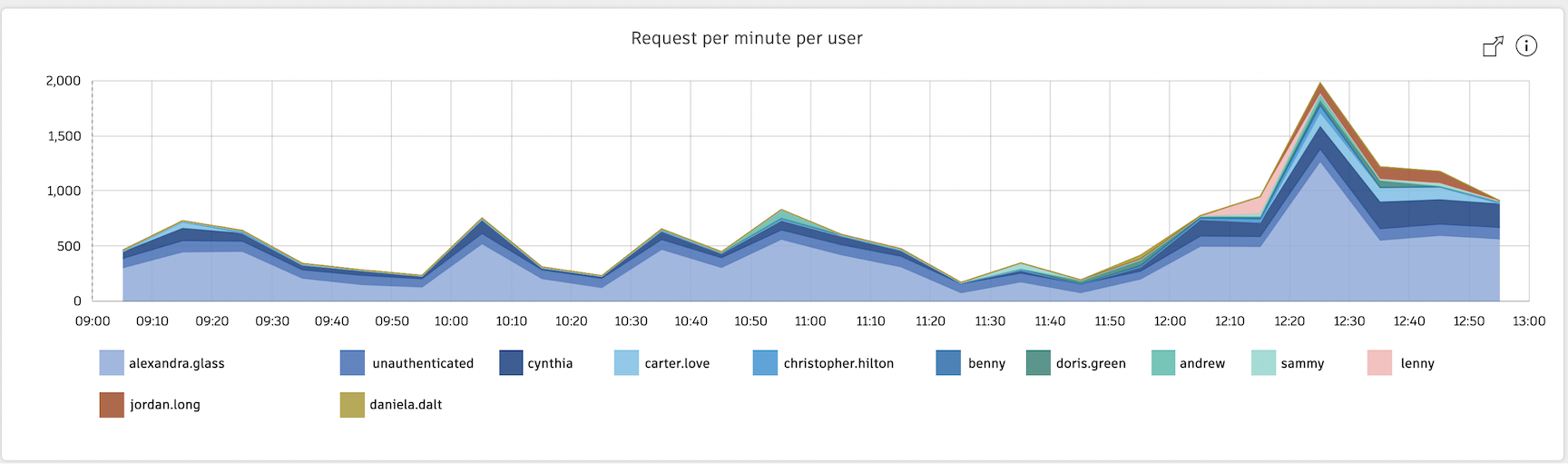
Request per minute per user
The Request per minute per user graph displays the top 12 highest number of requests per user that your studio sends to your Flow Production Tracking site over the given time frame. You can narrow and isolate user data by selecting them in the key and graph.
Transcoder
The Transcoder view will display graph information relating to transcoding media on your site, which includes:
- Total jobs submitted
- Jobs submitted per user
- Transcoder wait time
- Uploaded media
- Jobs failure rate
- Quantity of file per extension
- Error rate by file extension
For more information about the Flow Production Tracking transcoder, visit the Transcoding topic here.
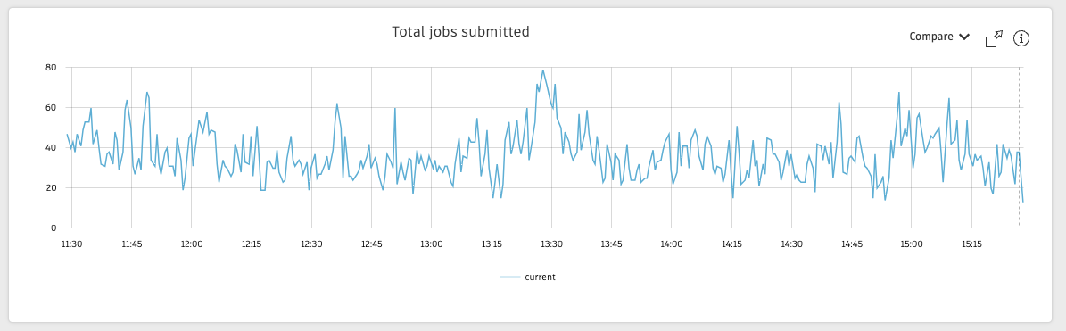
Total jobs submitted
The Total jobs submitted graph displays the number of jobs submitted to the transcoder by all users.
Use this graph to identify peak usage. Peaks are only an issue if they correlate with peaks in the wait times displayed in the Transcoder wait time graph. Submitting too many jobs to the transcoder can fill up the transcoder queue and slow down the processing of these jobs.
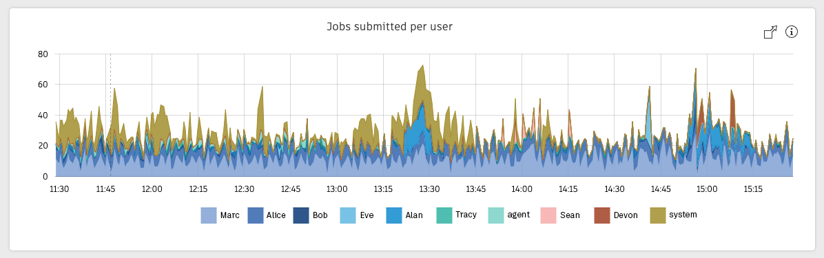
Jobs submitted per user
The Jobs submitted per user graph displays the top transcoder job submitters, listed with their Flow Production Tracking User ID.
Use this graph to identify users that are submitting too many jobs to the transcoder and filling up the transcoder queue.
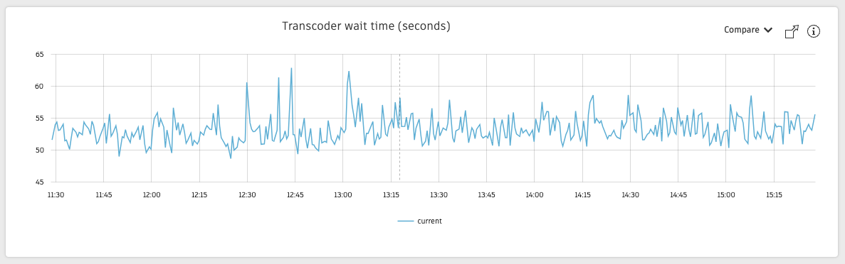
Transcoder wait time
The Transcoder wait time graph shows the time between when your media completes uploading and when the transcoder starts transcoding it. A wait time of a few minutes or less is expected, but jobs waiting longer than 5 minutes can point to the transcoder queue being full.
Use the Uploaded media and the Jobs submitted per user graphs to identify the source of the issue.
Use the Uploaded media to see if the media payload is high. Too large of a payload can strain the transcoder resources and slow down the processing of your media.
Use Jobs submitted per user to identify users that are submitting an inordinate number of jobs to the transcoder.
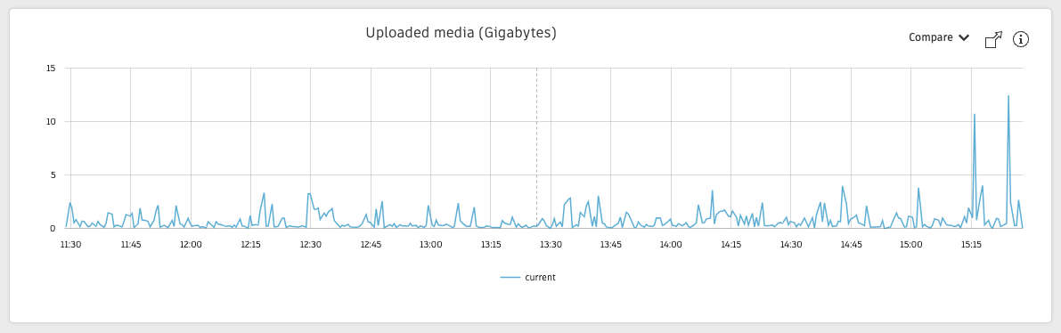
Uploaded media
The Uploaded media graph shows the total of the jobs (in gigabytes) waiting to be processed at any given time. Too large of a media payload can stress the transcoder resources and force the system into queueing your transcoding jobs.
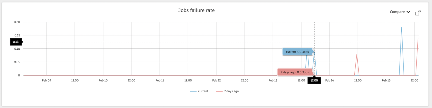
Jobs failure rate
The Jobs failure rate graph displays the number of transcoding job failures over the given time frame. You also have the ability compare data to another time frame.
Quantity of file per extension
The Quantity of file per extension pie graph displays the percentage of transcoded file types over the given time frame. You can narrow and isolate user data by selecting them in the key and graph.
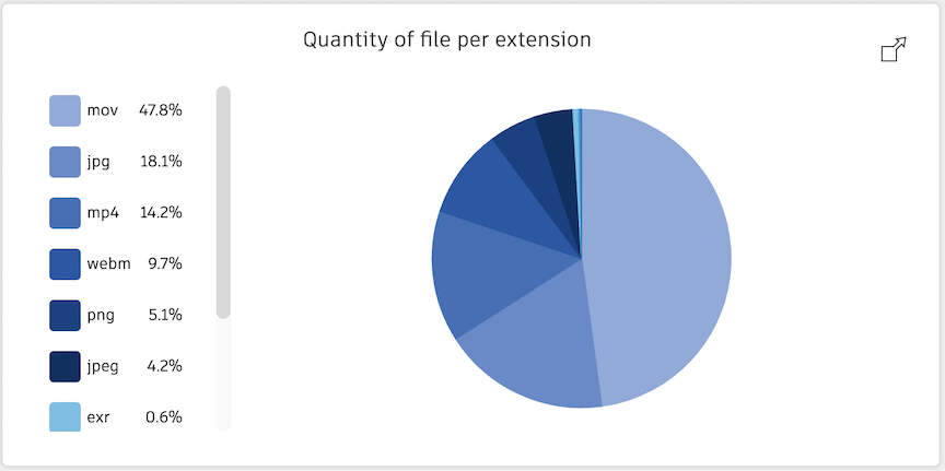
For a list of supported extensions, visit the Transcoding services topic here.
Error rate by file extension
The Error rate by file extension pie graph displays the percentage of transcoded file type errors over the given time frame. You can narrow and isolate data by selecting them in the key and graph.
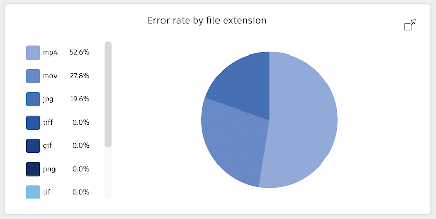
For a list of supported extensions, visit the Transcoding services topic here.
Transcoding resources
To learn more about the Flow Production Tracking transcoding service, visit the following topics:
- Transcoding
- Transcoding services
- Flow Production Tracking Software Server Status Page
- This includes the transcoding service status
Pages
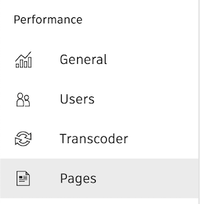
The Pages view will display graph information relating to:
- Visits per Page
- Total time per Page
Visits per Page
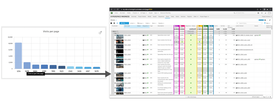
The Visits per Page graph displays the number of visits per Page ID over the given time frame. You can visit the page by selecting the Page ID on the graph.
Total time per Page
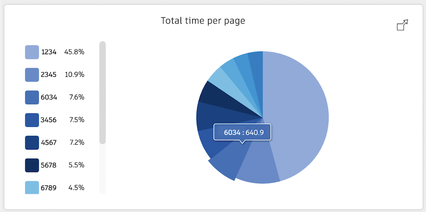
The Total time per Page pie graph displays the percentage of time spent on a Page over the given time frame. You can narrow and isolate Page data by selecting them in the key and graph.
Resources for troubleshooting Page performance
- Analyze Page Performance
- Optimizing filters and API scripts to make your Flow Production Tracking site faster
Other functionality
Light and dark modes
You can change from light to dark modes using the  and
and  in the top menu bar.
Exiting a session
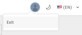
You can close your session and sign out of the Site Activity Monitor by selecting your profile dropdown and Exit.
Data retention
- The Flow Production Tracking Site Activity Monitor stores and displays up to 14 days worth of data.
Limitations
The Site Activity Monitor does not measure networking time, so we cannot analyze the health of the connection from your location to the Flow Production Tracking servers. Learn more about testing your network connection here.
Other hosted site troubleshooting resources
- Test Your Connection
- Flow Production Tracking server status page
- Diagnosing performance issues with hosted Flow Production Tracking sites
- Analyze Page Performance
- Optimizing filters and API scripts to make your Flow Production Tracking site faster
- Guide to Best Practices with Flow Production Tracking
- Transcoding
- Transcoding services