CheckBox
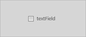
Figure 10: Unskinned CheckBox.
The CheckBox (scaleform.clik.controls.CheckBox) is a Button component that is set to toggle the selected state when clicked. CheckBox is used to display and change a true/false (Boolean) value. It is functionally equivalent to the ToggleButton, but sets the toggle property implicitly.
Clicking on the CheckBox component using the mouse or any equivalent keyboard control will continuously select and deselect it. In all other respects, the CheckBox behaves the same as the Button. ## Component structure A MovieClip that uses the CLIK CheckBox class must have the following named subelements. Optional elements are noted appropriately:
- textField: (optional) TextField type. The button’s label.
- focusIndicator: (optional) MovieClip type. A separate MovieClip used to display the focused state. If it exists, this MovieClip must have two named frames: “show” and “hide”.
Due to its toggle property, the CheckBox requires another set of keyframes to denote the selected state. These states include:
- an up or default state;
- an over state when the mouse cursor is over the component, or when it is focused;
- a down state when the button is pressed;
- a disabled state;
- a selected_up or default state;
- a selected_over state when the mouse cursor is over the component, or when it is focused;
- a selected_ down state when the button is pressed;
- a selected_disabled state.
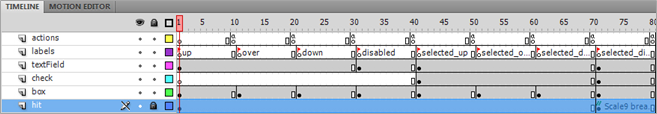
Figure 11: CheckBox timeline.
This is the minimal set of keyframes that should be in a CheckBox. The extended set of states and keyframes supported by the Button component, and consequently the CheckBox component, are described in the Getting Started with CLIK Buttons document.
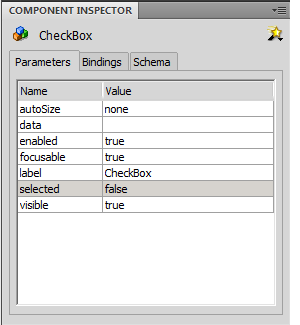
Since it derives from the Button control, the CheckBox contains the same inspectable properties as the Button with the omission of the toggle and autoRepeat properties.
| autoSize | Determines if the button will scale to fit the text that it contains and which direction to align the resized button. Setting the autoSize property to autoSize=TextFieldAutoSize.NONE will leave its current size unchanged. |
| data | Data related to the button. This property is particularly helpful when using buttons in a ButtonGroup. |
| enabled | Disables the button if set to false. Disabled components will no longer receive user input. |
| focusable | Enable/disable focus management for the component. Setting the focusable property to false will remove support for tab key, direction key and mouse based focus changes. |
| label | Sets the label of the Button. |
| selected | Set the selected state of the Button. Buttons can have two sets of mouse states, a selected and unselected. When a Button's toggle property is true the selected state will be changed when the button is clicked, however the selected state can be set using ActionScript even if the toggle property is false. |
| visible | Hides the button if set to false. |
All event callbacks receive a single Event or Event subclass parameter that contains relevant information about the event. The following properties are common to all events.
- type: The type of event.
- target: The event target.
- currentTarget: The object that is actively processing the Event object with an event listener.
- eventPhase: The current phase in the event flow. (EventPhase.CAPTURING_PHASE, EventPhase.AT_TARGET, EventPhase.BUBBLING_PHASE).
- bubbles: Indicates whether an event is a bubbling event.
- cancelable: Indicates whether the behavior associated with the event can be prevented.
The events generated by the CheckBox component are listed below. The properties listed next to the event are provided in addition to the common properties.
| ComponentEvent.SHOW | The visible property has been set to true at runtime. |
| ComponentEvent.HIDE | The visible property has been set to false at runtime. |
| FocusHandlerEvent.FOCUS_IN | The button has received focus. |
| FocusHandlerEvent.FOCUS_OUT | The button has lost focus. |
| Event.SELECT | The selected property has changed. |
| ComponentEvent.STATE_CHANGE | The button’s state has changed. |
| MouseEvent.ROLL_OVER | The mouse cursor has rolled over the button. mouseIdx: The index of the mouse cursor used to generate the event (applicable only for multi-mouse-cursor environments). uint type. Scaleform-only, requires that the event be cast to MouseEventEx. buttonIdx: Indicates for which button the event is generated (zero-based index). Scaleform-only, requires that the event be cast to MouseEventEx. |
| MouseEvent.ROLL_OUT | The mouse cursor has rolled out of the button. mouseIdx: The index of the mouse cursor used to generate the uint (applicable only for multi-mouse cursor environments). Number type. Scaleform-only, requires that the event be cast to MouseEventEx. buttonIdx: Indicates for which button the event is generated (zero-based index). Scaleform-only, requires that the event be cast to MouseEventEx. |
| ButtonEvent.PRESS | The button has been pressed. controllerIdx: The index of the controller used to generate the event (applicable only for multi-mouse cursor environments). uint type. isKeyboard: True if the event was generated by a keyboard/gamepad; false if the event was generated by a mouse. isRepeat: True if the event was generated by an autoRepeating button being held down; false the button is not currently repeating. |
| MouseEvent.DOUBLE_CLICK | The button has been double clicked. Only fired when the doubleClickEnabled property is true. mouseIndex: The index of the mouse cursor used to generate the event (applicable only for multi-mouse cursor environments). uint type. Requires that the event be cast to MouseEventEx.buttonIdx: Indicates for which button the event is generated (zero-based index). Scaleform-only, requires that the event be cast to MouseEventEx. |
| ButtonEvent.CLICK | The button has been clicked. controllerIdx: The index of the controller used to generate the event (applicable only for multi-mouse cursor environments). uint type. isKeyboard: True if the event was generated by a keyboard/gamepad; false if the event was generated by a mouse. isRepeat: True if the event was generated by an autoRepeating button being held down; false the button is not currently repeating. |
| ButtonEvent.DRAG_OVER | The mouse cursor has been dragged over the button (while the left mouse button is pressed). controllerIdx: The index of the controller used to generate the event (applicable only for multi-mouse cursor environments). uint type. |
| ButtonEvent.DRAG_OUT | The mouse cursor has been dragged out of the button (while the left mouse button is pressed). controllerIdx: The index of the controller used to generate the event (applicable only for multi-mouse cursor environments). uint type. |
| ButtonEvent.RELEASE_OUTSIDE | The mouse cursor has been dragged out of the button and the left mouse button has been released. controllerIdx: The index of the controller used to generate the event (applicable only for multi-mouse cursor environments). uint type. |
The following example code reveals how to handle a CheckBox toggle:
        myCheckBox.addEventListener(Event.SELECT, onCheckBoxToggle);
function onCheckBoxToggle(e:Event):void {
            // Do something
}