DropdownMenu
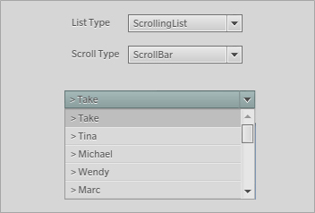
Figure 43: Unskinned DropdownMenu.
The DropdownMenu (scaleform.clik.controls.DropdownMenu) wraps the behavior of a button and a list. Clicking on this component opens a list that contains the elements to be selected. The DropdownMenu displays only the selected element in its idle state. It can be configured to use either the ScrollingList or the TileList, to which either a ScrollBar or ScrollIndicator can be paired with. The list is populated via an installed dataProvider. The DropdownMenu’s list element is populated via a dataProvider. The dataProvider is assigned via code, as shown in the example below:
dropdownMenu.dataProvider = new DataProvider(["item1", "item2", "item3", "item4"]);
By default the DropdownMenu uses the ScrollingList component for its contents. Therefore the ScrollingList and ListItemRenderer must also exist in the FLA file’s Library for it to work, unless the dropdown inspectable property is changed to another component. See the Inspectable properties section for more information.
Also note that by default the DropdownMenu does not attach a scrollbar to its list element. The ScrollBar or ScrollIndicator must be attached via code to the DropdownMenu’s list element. See the Tips and tricks section for more information.
Clicking on a DropdownMenu instance or pressing the (Enter) key or equivalent control will open the list of selectable elements. Focus is also transferred to the list when it is opened. The user can interact with the list as described in the User interaction sections of the ScrollingList, TileList and ScrollBar. Clicking on a list item will select it, close the list and display the selected item in the DropdownMenu component. Clicking outside the list boundary will automatically close the list and focus will be transferred back to the DropdownMenu component.
The DropdownMenu derives most of its functionality from the Button component. Consequently a MovieClip that uses the DropdownMenu class must have the following named subelements. The list and scrollbar are created dynamically. Optional elements are noted appropriately:
- textField: (optional) TextField type. The button’s label.
- focusIndicator: (optional) MovieClip type. A separate MovieClip used to display the focused state. If it exists, this MovieClip must have two named frames: “show” and “hide”.
The DropdownMenu is toggled when opened, and therefore needs the same states as a ToggleButton or CheckBox that denote the selected state. These states include:
- an up or default state;
- an over state when the mouse cursor is over the component, or when it is focused;
- a down state when the button is pressed;
- a disabled state;
- a selected_up or default state;
- a selected_over state when the mouse cursor is over the component, or when it is focused;
- a selected_ down state when the button is pressed;
- a selected_disabled state.
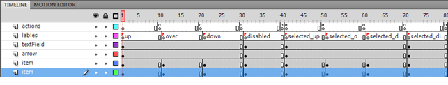
Figure 44: DropdownMenu timeline.
This is the minimal set of keyframes that should be in a DropdownMenu. The extended set of states and keyframes supported by the Button component, and consequently the DropdownMenu component, are described in the Getting Started with CLIK Buttons document.
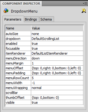
The inspectable properties of the DropdownMenu component are:
| autoSize | Determines if the closed DropdownMenu will scale to fit the text that it contains and which direction to align the resized button. Setting the autoSize property to autoSize="none" will leave its current size unchanged. |
| dropdown | Symbol name of the list component (ScrollingList or TileList) to use with the DropdownMenu component. |
| enabled | Disables the component if set to false. |
| focusable | By default, components can receive focus for user interactions. Setting this property to false will disable focus acquisition. |
| menuDirection | The direction that the drop down’s List will open. Valid values are "up" and "down". |
| menuMargin | The margin between the boundary of the list component and the list items created internally. This margin also affects the automatically generated ScrollBar. |
| menuOffset | Horizontal and vertical offsets of the dropdown list from the dropdown button position. A positive horizontal value moves the list to the right of the dropdown button horizontal position. A positive vertical value moves the list away from the button. |
| menuPadding | Extra padding at the top, bottom, left, and right for the list items. Does not affect the automatically generated scrollbar. |
| menuRowCount | The number of rows that the list should display. |
| menuWidth | If set, this number will be enforced as the width of the drop down’s list. |
| thumbOffset | Scrollbar thumb top and bottom offsets. This property has no effect if the list does not automatically create a scrollbar instance. |
| scrollBar | Symbol name of the dropdown list’s scroll bar. Created by the dropdown list instance. If value is empty, then the dropdown list will have no scroll bar. |
| visible | Hides the component if set to false. |
All event callbacks receive a single Event or Event subclass parameter that contains relevant information about the event. The following properties are common to all events.
- type: The type of event.
- target: The event target.
- currentTarget: The object that is actively processing the Event object with an event listener.
- eventPhase: The current phase in the event flow. (EventPhase.CAPTURING_PHASE, EventPhase.AT_TARGET, EventPhase.BUBBLING_PHASE).
- bubbles: Indicates whether an event is a bubbling event.
- cancelable: Indicates whether the behavior associated with the event can be prevented The events generated by the DropdownMenu component are listed below. They are the same as the Button component, with the exception of the change event. The properties listed next to the event are provided in addition to the common properties.
| ComponentEvent.SHOW | The visible property has been set to true at runtime. |
| ComponentEvent.HIDE | The visible property has been set to false at runtime. |
| ComponentEvent.STATE_CHANGE | The button’s state has changed. |
| Event.SELECT | The selected property has changed. |
| FocusHandlerEvent.FOCUS_IN | The button has received focus. |
| FocusHandlerEvent.FOCUS_OUT | The button has lost focus. |
| ListEvent.INDEX_CHANGE | The selected index has changed. itemRenderer: The list item that was double clicked. IListItemRenderer type. itemData: The data associated with the list item. This value is retrieved from the list’s dataProvider. ActionScript Object type. index: The new selected index of the list. int type. Values -1 (no selectedIndex set) to number of list items minus 1. controllerIdx: The index of the controller/mouse used to generate the event (applicable only for multi-mouse cursor environments). |
| MouseEvent.ROLL_OVER | The mouse cursor has rolled over the component. mouseIdx: The index of the mouse cursor used to generate the event (applicable only for multi-mouse-cursor environments). uint type. Scaleform-only, requires that the event be cast to MouseEventEx. buttonIdx: Indicates for which button the event is generated (zero-based index). Scaleform-only, requires that the event be cast to MouseEventEx. |
| MouseEvent.ROLL_OUT | The mouse cursor has rolled out of the component. mouseIdx: The index of the mouse cursor used to generate the uint (applicable only for multi-mouse cursor environments). Number type. Scaleform-only, requires that the event be cast to MouseEventEx. buttonIdx: Indicates for which button the event is generated (zero-based index). Scaleform-only, requires that the event be cast to MouseEventEx. |
| ButtonEvent.PRESS | The DropdownMenu has been pressed. controllerIdx: The index of the controller used to generate the event (applicable only for multi-mouse cursor environments). uint type. isKeyboard: True if the event was generated by a keyboard/gamepad; false if the event was generated by a mouse. isRepeat: True if the event was generated by an autoRepeating button being held down; false the button is not currently repeating. |
| MouseEvent.DOUBLE_CLICK | The component has been double clicked. Only fired when the doubleClickEnabled property is true. mouseIndex: The index of the mouse cursor used to generate the event (applicable only for multi-mouse cursor environments). uint type. Requires that the event be cast to MouseEventEx. buttonIdx: Indicates for which button the event is generated (zero-based index). Scaleform-only, requires that the event be cast to MouseEventEx. |
| ButtonEvent.CLICK | The DropdownMenu has been clicked. controllerIdx: The index of the controller used to generate the event (applicable only for multi-mouse cursor environments). uint type. isKeyboard: True if the event was generated by a keyboard/gamepad; false if the event was generated by a mouse. isRepeat: True if the event was generated by an autoRepeating button being held down; false the button is not currently repeating. |
| ButtonEvent.DRAG_OVER | The mouse cursor has been dragged over the DropdownMenu (while the left mouse button is pressed). controllerIdx: The index of the controller used to generate the event (applicable only for multi-mouse cursor environments). uint type. |
| ButtonEvent.DRAG_OUT | The mouse cursor has been dragged out of the DropdownMenu (while the left mouse button is pressed). controllerIdx: The index of the controller used to generate the event (applicable only for multi-mouse cursor environments). uint type. |
| ButtonEvent.RELEASE_OUTSIDE | The mouse cursor has been dragged out of the button and the left mouse button has been released. controllerIdx: The index of the controller used to generate the event (applicable only for multi-mouse cursor environments). uint type. |