ScrollBar
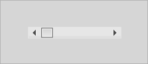
Figure 26: Unskinned ScrollBar.
The CLIK ScrollBar (gfx.controls.ScrollBar) displays and controls the scroll position of another component. It adds interactivity to the ScrollIndicator with a draggable thumb button, as well as optional up and down arrow buttons, and a clickable track.
The ScrollBar thumb can be gripped by the mouse or equivalent control and dragged between the bounds of the ScrollBar track. Moving the mouse wheel while the mouse cursor is on top of the ScrollBar performs a scroll operation. Clicking on the up arrow moves the thumb up, and clicking the down arrow moves the thumb down. Clicking the track can have two behaviors: the thumb continuously scrolls towards the clicked point, or immediately jumps to that point and is set to drag. This track mode is determined by the trackMode inspectable property (see Inspectable properties section). Regardless of the trackMode setting, pressing the (Shift) key and clicking on the track will immediately move the thumb to the cursor and set it to drag.
A MovieClip that uses the CLIK ScrollBar class must have the following named subelements. Optional elements are noted appropriately:
- upArrow: CLIK Button type. Button that scrolls up; typically placed at the top of the scrollbar.
- downArrow: CLIK Button type. Button that scrolls down; typically placed at the bottom of the scrollbar.
- thumb: CLIK Button type. The grip of the scrollbar.
- track: CLIK Button type. The scrollbar track whose boundary determines the extent to which the grip can move.

Figure 27: ScrollBar timeline. The ScrollBar, similar to the ScrollIndicator, does not have explicit states. It uses the states of its child elements: the thumb, up, down and track Button components.
The inspectable properties of the ScrollBar are similar to ScrollIndicator, with one addition:
| scrollTarget | Set a TextArea or normal multiline textField as the scroll target to automatically respond to scroll events. Non-textField types have to manually update the ScrollIndicator properties. |
| trackMode | When the user clicks on the track with the cursor, the scrollPage setting will cause the thumb to continuously scroll by a page until the cursor is released. The scrollToCursor setting will cause the thumb to immediately jump to the cursor and will also transition the thumb into a dragging mode until the cursor is released. |
| Visible | Hides the component if set to false. |
| disabled | Disables the component if set to true. |
| offsetTop | Thumb offset at the top. A positive value moves the thumb's top-most position higher. |
| offsetBottom | Thumb offset at the bottom. A positive value moves the thumb's bottom-most position lower. |
All event callbacks receive a single Object parameter that contains relevant information about the event. The following properties are common to all events.
- type: The event type.
- target: The target that generated the event. The events generated by the ScrollBar component are listed below. The properties listed next to the event are provided in addition to the common properties.
| Show | The component’s visible property has been set to true at runtime. |
| Hide | The component’s visible property has been set to false at runtime. |
| Scroll | The scroll position has changed. • position: The new scroll position. Number type. Values minimum position to maximum position. |
The following code example reveals how to listen for scroll events:
mySB.addEventListener("scroll", this, "onListScroll");
function onListScroll(event:Object) {
        trace("scroll position: " + event.position);
        // Do something
}
Set up a standalone scroll indicator instance manually:
scrollBar.setScrollProperties(pageSize, minPos, maxPos, pageScrollSz);
scrollBar.positon = currPos;
Set the scrolling direction. This is set automatically for components created on the Stage using their _rotation property. If the scroll bar component is not rotated and is horizontal by default, then this value should be set explicitly:
scrollBar.direction = "horizontal";
Set the number of positions scrolled when the track is pressed in scrollPage mode. By default the value is 1:
scrollBar.trackScrollPageSize = pageSize;