Button States
Each CLIK component is composed of what are referred to as states, or in the case of animated buttons, transitions (transitions will be explained in the animated buttons section). A state can be set via user interaction or code. These states include visual representations, which may or may not be different from other states of the component. The standard button has only four states. Each state’s location is indicated by keyframes on the Labels layer of the button’s timeline, and the corresponding graphics for that state live on the States and Border layers at the same spot.
The core button states are:
- up
- over
- down
- disabled
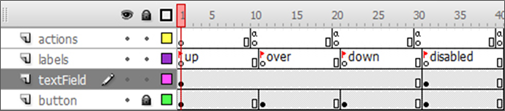
Figure 3: The button timeline with states clearly labeled on the Labels layer.
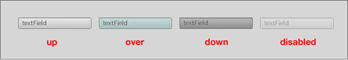
Figure 4: The button states' graphical wireframe representations side by side.
The up state is the normal “at rest” state of the button. It is the state in which no user interaction has occurred with the button and it is the state that the button will display by default.
Occurs: Default state of a button; no interaction has occurred.
Usage: Represents a button in its normal state.
The over state is the highlighted state of the button. It occurs when the user moves the mouse cursor over the button. Moving the cursor away from the button will return the button to the up state.
Occurs: When the user moves the mouse cursor over the button or when the button is focused via mouse press, keyboard arrow keys or game controller directional pads/analog sticks. Focus is described in Focus section.
Usage: Represents a button that the mouse is currently over or has focus.
The down state occurs when the user presses the button via a left mouse click, the (Enter) key on the keyboard or the appropriate button on a game controller. The button component will remain in the down state for as long as the mouse button, (Enter) key or game controller button is pressed. The button will return to the over state once released.
By default, the button will receive focus when the mouse button is pressed over it. When focused, the button will maintain its over state instead of the normal up state while “at rest,” even if the mouse is no longer over the button. The over state will be the button’s default state until focus is transferred elsewhere by selecting another component via mouse press, keyboard arrows or game controller. If the user moves the mouse cursor away from the button while the mouse button is still pressed, the button will revert to its over state and maintain focus; focus is transferred on mouse press.
Occurs: When the user presses the left mouse button while over the button component, presses the (Enter) key or presses the appropriate game controller button. Usage: Represents a button that is being clicked.
Focus
A focused component will be the target for all keyboard and controller events. This means when a button is focused, pressing the (Enter) key will affect only that button and no other component. Focus can be transferred by pressing the left mouse button or using the keyboard arrow keys to move the focus to a neighboring component. If a game controller’s directional pad and/or analog stick are mapped to the keyboard arrow keys, then they will also move the focus. Focus can also be transferred via AS code.
The disabled state represents a button that has been disabled. A disabled button cannot be pressed or focused, and does not react to mouseover events. A button may be disabled via the Component Inspector Parameters tab, or it may be disabled via ActionScript using the following code:
buttonInstanceName.disabled = true;
Occurs: Set via ActionScript or the Parameters tab.
Usage: Used to represent a button that is currently disabled and thus unusable.