組み込みメタデータのプロパティ
エディタの Property Editor パネルを使用すると、さまざまなタイプのプロパティを広範に表示して、変更することができます。文字列、ブール、数値などの単純なタイプと、カラーや回転などの複合タイプの両方が対象となります。また、Property Editor にこれらの値をどのように表示されるのかを詳細にコントロールすることもできます。さまざまな UI ウィジェットを使用して多くのプロパティ タイプを表現できます。たとえば、テキスト フィールド、スライダ、スピナー ボックスなどを使用して数値を編集したり、表示ラベル、ツールチップ、順序などをコントロールしたりできます。
Property Editor に編集中のデータを視覚的に表現する方法を指示するには、データにいくつかのメタデータを指定します。指定する方法は 2 つあります。
データが type ファイル内で記述されている場合は、データ内の各タイプの editor ブロックを使用して、エディタ内でのこのタイプがどのように表現されるのかを記述することができます。「Stingray タイプ システム」も参照してください。
JavaScript で純粋に表現されているコンパクト表記を使用することもできます。「UI で Property Editor コマンドを使用する」を参照してください。
このリファレンスでは、Property Editor で認識される各種の組み込みメタデータについて詳細に説明し、SJSON タイプ ファイルと JavaScript の両方でこれらをどのように使用するのかを示します。
これらのパラメータは、すべてのプロパティ コントロール タイプで使用できます。
| プロパティ | タイプ | 既定値 | 説明 |
|---|---|---|---|
| order | Number | Infinity | プロパティの順序を昇順でコントロールします。 |
| control または displayType | String | null | プロパティの編集時に使用するコントロールを指定します。その他のコントロール固有のプロパティについては、以下を参照してください。 |
| label | String | null | プロパティのカスタム ラベルを設定します。 |
| suffixLabel | String | null | プロパティ値の後に表示されるサフィックスを設定します。一部のウィジェット タイプにのみ表示されます。 |
| description | String | null | プロパティの説明を設定します。ツールチップに表示されます。 |
| isReadOnly | Boolean | false | true の場合、ユーザはプロパティを編集できません。 |
| isMultiEditSupported | Boolean | true | false の場合、複数のオブジェクト(合意の編集など)が選択されていれば、ユーザはプロパティを編集できません。 |
| showLabel | Boolean | true | false の場合、エディタ内のプロパティのラベルを非表示にします。 |
| showValue | Boolean | true | false の場合、エディタ内のプロパティの値を非表示にします。 |
{
    type = ":number"
    min = 0
    max = 100
    default = 50
    editor = {
        order = 140
        label = "Health"
        suffix = "HP"
        description = "Initial health of the entity"
        control = "adskPropertySlider"
        step = 10
    }
}
var numberProperty = props.slider("Health", m.prop(50), {
    order: 140,
    suffix: "HP",
    description: "Initial health of the entity",
    min: 0,
    max: 100,
    increment: 10
})
次のセクションでは、control または displayType メタデータ フィールドで使用できるさまざまな値について説明します。各値は、スライダ、テキストフィールド、チェックボックスなど、対応するタイプの値を表示して操作するためのさまざまな種類の組み込みウィジェットを定義します。

次の例に示すコンパクトな Property Editor 表記では、Mithril getter/setter 関数メカニズムを使用してプロパティ モデルへのアクセスをカプセル化します。詳細については、「UI で Property Editor コマンドを使用する」を参照してください。
これは、プロパティ モデル関数の簡単な例です。
var _propertyData = "This is my data";
function propertyModel (value) {
    if (arguments.length) {
        _propertyData = value;
    }
    return _propertyData;
}
以下に示すほとんどの例では、プロパティ モデルを即座に生成する次の関数を使用しています。
function genModel (value) {
    return function (newValue) {
        if (arguments.length) {
            value = newValue;
        }
        return value;
    };
}
カスタム関数をトリガするシンプルなボタンです。

| プロパティ | タイプ | 既定値 | 説明 |
|---|---|---|---|
| action (コンパクト表記のみ) | Function | null | 引数を伴わない関数です。 |
| trigger (type ファイルのみ) | action (「アクションを登録する」を参照) | null | 実行するアクションです。 |
| text | string | "" | ボタンのテキストです。 |
| color | color | ボタンの背景色です。任意の HTML カラーが有効です。 | |
| iconName | string | サポートされているアイコン名のリストについては、「Font Awesome Icons」を参照してください。 |
{
    type = ":string"
    editor = {
        order = 140
        text = "Compute"
        description = "Initial health of the entity"
        control = "Action"
        trigger = {
            type = "js"
            module = "generic_asset/generic-asset-actions"
            function_name = "triggerAction"
        }
    }
}
var actionProperty = props.action("Action", function () {
                        console.log('Action is triggered!');
                    }, {iconName: "fa-star-o"}),
チェックボックス コントロールです。

{
    type = ":boolean"
    editor = {
        order = 140
        control = "Boolean"
        isReadOnly = true
    }
}
var actionProperty = props.bool("Boolean", genModel(true));
列挙タイプまたは文字列にマップできるコンボボックスです。

| プロパティ | タイプ | 既定値 | 説明 |
|---|---|---|---|
| options | object | {} | これは、各選択肢に対応する「すてきなラベル」を表すキーと、実際の列挙値を表す値を含む JavaScript オブジェクトです。下記の例を参照してください。 |
| fetch_options (type ファイルのみ) | action (「アクションを登録する」を参照) | null | 動的に生成されたオプションを返すアクションです。 |
| defaultValueName | String | null | 選択されていない場合の既定のラベルです。 |
| defaultValue | String | null | 選択されていない場合の既定の値です。 |
Enum = {
    type = ":enum"
    value = ":string"
    default = "InLoading"
    cases = [
        "Loaded"
        "Unloaded"
        "InLoading"
        "ErrorLoading"
    ]
    editor = {
        control = "Choice"
        label  = "Load state"
        case_labels = {
            "Loaded" = "Loaded"
            "Unloaded" = "Unloaded"
            "In Loading..." = "InLoading"
            "Error while Loading" = "ErrorLoading"
        }
    }
}
// This effectively creates a string that will use a Combobox control to select between
// a specific list of string values.
ChoiceString = {
    type = ":string"
    default = "SurfaceNormal"
    editor = {
        control = "Choice"
        label  = "Orient Express"
        fetch_options = {
            type = "js"
            module = "generic_asset/generic-asset-actions"
            function_name = "populateActions"
        }
    }
}
var options {
    'Beer': 1,
    'Scotch': 2,
    'Rhum': 3,
    'Wine': 4
};

var choiceProperty = props.choice("Tough choice", genModel(2), options, {defaultValueName: "Choose a drink"});
強度スライダに付随するにカラー見本です。

この見本をクリックすると、カラー ピッカー ダイアログ ボックスが表示されます。

Color = {
    type = "core/types/color"
}
// see core/types/color.type
export = "#color"
types = {
    color = {
        type = ":struct"
        fields = {
            rgb = {
                type = ":array"
                value = "#component"
                size = 3
                default = [0, 0, 0]
            }
            alpha = {
                type = "#component"
                default = 1
            }
            intensity = {
                type = ":number"
                default = 1
                min = 0
            }
        }
        editor = {
            control = "adskPropertyColor"
        }
    }
    component = {
        type = ":number"
        min = 0
        max = 1
    }
}
// Simple color:
var colorProperty = props.color("Color", genModel([1,1,1]));

// HDR color:
var hdrColorProperty = props.hdrColor("Color", genModel([1,1,1]), genModel(1));
数値を編集できるスピナー コントロールです。便利な多数の機能が用意されています。
- 右クリックすると、スピナーが既定値にリセットされます。
- [Shift]を押しながら回転させると、データがすばやく変更されます。
- [Ctrl]を押しながら回転させると、データがゆっくり変更されます。

| プロパティ | タイプ | 既定値 | 説明 |
|---|---|---|---|
| min | number | -2147483648 | 数値の最小値です。 |
| max | number | 2147483647 | 数値の最大値です。 |
| step (type ファイル内) | number | 0.1 | スピナーボタンを押したときに増減する量 |
| increment (JavaScript 内) | number | 0.1 | スピナーボタンを押したときに増減する量 |
| decimal | number | 4 | 表示する小数点以下の桁数です。0 の場合は、数値が整数とみなされます。 |
| numericDefaultValue | number | 0 | スピナーを右クリックしたときにリセットされる値です。 |
Number = {
    type = ":number"
    editor = {
        // Use min/max/default in the editor block instead of the type specification
        default = 1
        min = 0
        max = 1
        control = "Number"
        step = 0.3
        priority = 4
    }
}
var numberProperty = props.number("A Numeric Value", genModel(42.111), {
    increment: 0.5,
    min: -9,
    max: 56.9
});
スライダ コントロールでは、左から右に動くスライダを使用して数値を編集できます。ほとんどのパラメータは number プロパティと似ています(上記を参照)。

| プロパティ | タイプ | 既定値 | 説明 |
|---|---|---|---|
| min | number | -2147483648 | 数値の最小値です。 |
| max | number | 2147483647 | 数値の最大値です。 |
| step (type ファイル内) | number | 0.1 | スピナーボタンを押したときに増減する量 |
| increment (JavaScript 内) | number | 0.1 | スピナーボタンを押したときに増減する量 |
| decimal | number | 4 | 表示する小数点以下の桁数です。0 の場合は、数値が整数とみなされます。 |
Number = {
    type = ":number"
    editor = {
        // Use min/max/default in the editor block instead of the type specification
        default = 1
        min = 0
        max = 1
        control = "Slider"
        step = 0.3
        priority = 4
    }
}
var sliderProperty = props.slider("Percentable", genModel(50), {min: 0, max: 100, increment: 1});
既定では、文字列プロパティはシンプルなテキスト ボックスを使用して編集します。

| プロパティ | タイプ | 既定値 | 説明 |
|---|---|---|---|
| isMultiline | boolean | false | テキスト ボックスが複数行にまたがるかどうかを定義します。 |
| lineRows | number | 0 | isMultiline が true の場合は、テキストボックスの行数を指定できます(1 ~ 8)。 |
SingleLine = {
    type = ":string"
    editor = {
        label = "Single Line"
    }
}
MultiLine = {
    type = ":string"
    default = "pow"
    editor = {
        label = "Multi Line"
        isMultiline = true
        lineRows = 4
    }
}
var stringProperty = props.color("Color", genModel([1,1,1]));

var colorModel = genModel([1,1,1]);
var intensityModel = genModel(1);
var hdrColorProperty = props.hdrColor("Color", colorModel, intensityModel);
パスのプロパティを使用すると、オペレーティング システムで提供されるウィンドウを使用して、ディスク上のフォルダやファイルを選択できます。


| プロパティ | タイプ | 既定値 | 説明 |
|---|---|---|---|
| browserType | string | File または Folder を指定できます。表示されるネイティブ パス セレクタのタイプを定義します。 | |
| browseTitle | string | ネイティブ ダイアログ ボックスのタイトルです。 | |
| browseFilter | string | 特定の拡張子を持つファイルのみを表示するためのファイル フィルタです。 |
FilePath = {
    type = ":string"
    editor = {
        control = "PathProperty"
        browseType = "File"
        browseTitle = "Select an exe"
        browseFilter = "*.exe"
    }
}
DirPath = {
    type = ":string"
    editor = {
        control = "PathProperty"
        browseType = "Folder"
        browseTitle = "Select a folder"
    }
}
var fileProperty = props.file("File", genModel('c:/Pogram Files (x86)/Git/bin/git.exe'), "Pick an exec", "*.exe"),
var dirProperty = props.directory("Folder", genModel('c:/Pogram Files (x86)/Git'), "Pick a folder"),
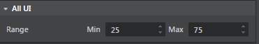
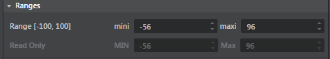
2 つの数値の最小値フィールドおよび最大値フィールドが含まれているコントロールです。
Range = {
    type = "core/types/range"
}
var range1= props.range("Range [-100, 100]", "mini", genModel(25), 'maxi', genModel(75), {min: -100, max: 100, increment: 0.5}),
var range2 = props.range("Read Only", "MIN", genModel(25), 'Max', genModel(75), {min: -100, max: 100, increment: 0.5, isReadOnly: true})
2、3、または 4 個のコンポーネントのリストを表示する場合に使用できる、回転を除くコントロールです(以下の Rotation を参照)。

Position = {
    type = "core/types/vector3"
}
// see core/types/vector3.type
export = "#vector3"
types = {
    vector3 = {
        type = ":array"
        value = ":number"
        size = 3
        default = [0, 0, 0]
        editor = {
            control = "adskPropertyVector3"
        }
    }
}
var vec2 = props.vector2("Vector2", genModel([34, 78]), {min: -100, max: 100, increment: 0.5});

var vec3 = props.vector3("Vector3", genModel([1,2,3]));

var vec4 = props.vector4("Vector4", genModel([34, 78, 67, -90]));
3 つのラジアン値で構成されたベクトルをデータ モデルとして使用するコントロールです。角度に変換された値を持つ 3 つのスピナーが表示されます。

Rotation = {
    type = "core/types/rotation"
}
// see core/types/rotation.type
export = "#rotation"
types = {
    rotation = {
        type = ":array"
        value = ":number"
        size = 3
        default = [0, 0, 0]
        editor = {
            control = "adskPropertyRotation"
        }
    }
}
var rotation = props.rotation("Rotation", genModel(0, -1.52, 3.14));