Share


Layer Theme Editor dialog

This dialog is used to modify base themes and to create and modify sub themes.

The dialog allows you to change the display options for themes and contour plots for every network object and ground model on the GeoPlan window. It consists of:

  • the theme manager pane on the left side
  • the theme editor pane on the right side

Every layer (object type or ground model) can have an ordered set of themes (its base theme and any sub themes). You can create sub themes for objects that don't have them, or create additional sub themes for objects that already have them. The order in which sub themes appear in the manager pane determines the order in which they are applied to the Geoplan.

The base theme is the default theme and is provided for every layer (network object or ground model). It is always the last theme listed in the manager pane if there are also sub themes for the same layer. The base themes can be edited, but cannot be moved, disabled, or deleted. Some layers are already provided with one sub theme.

The dialog is displayed when an Edit button is clicked in the Theme column on the Layers and Themes page of the GeoPlan Properties And Themes dialog.
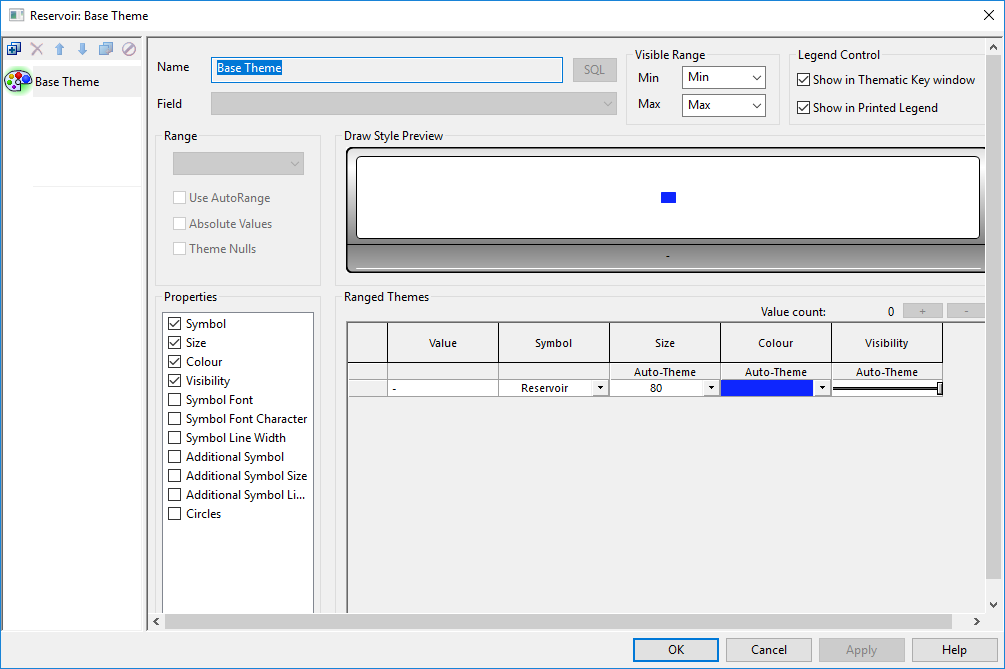
Show image

Layer Theme Editor

Manager pane

Toolbar

The toolbar allows you to manage sub themes. It has no effect on the base theme.

Theme editor toolbar

Button

Description

Add New

Add New

Adds a new sub theme. A default name for this sub theme is shown in the Name box of the editor pane: you can change this name here. To configure the new sub theme, you must first select a parameter from the Field drop-down list. You will then be able to change the other settings for the new sub theme.

Delete

Delete

Deletes the current sub theme. Clicking this button brings up a confirmation message. To confirm permanent deletion of the sub theme, click Yes, or click No to cancel.

Move up

Move Up

Promotes the current sub theme. Clicking this button raises the selected sub theme to the next level. You can click this button several times to bring the sub theme up one level per click.

The order in which sub themes appear in the manager pane determines the order in which they are applied to the Geoplan.

Move down

Move Down

Demotes the current sub-theme. Clicking this button lowers the selected sub theme to the next level. You can click this button several times to bring the sub theme down one level per click.

Duplicate

Duplicate

Copies the current sub theme. Clicking this button creates a copy of the currently selected sub theme. The editor pane will contain the same settings as the copied sub theme.

Enabled / Disable Theme button

Enables / disables the current sub theme. Clicking this button shows / hides the theme so that it is / it is not displayed on the GeoPlan window. When a sub theme is disabled, its icon is greyed out, with the disable icon displayed on top.

Click the button again to enable (show) the theme.

Theme list area

The base theme and any sub themes are listed in the area beneath the toolbar.

The current theme is shown with a green background to its icon. Settings for the current theme are shown in the editor pane.

Editor pane

Settings for the currently selected base theme or sub theme appear on the editor pane.

Item Description

Name

Name of the current theme. You can change the name of the sub theme in this box.

Field

This is available only for sub themes.

These are the parameters of the network object as known to the database. You can select one parameter for each sub theme, but other sub themes can use the same parameter. You can then change the properties used to depict the parameters you have chosen for each sub theme. You can change different properties for the same parameter in different sub themes.

The list will contain any SQL expressions previously added using the SQL editing functionality described below.

Parameters cannot be selected for the base theme.

SQL

Use to add and edit SQL expressions. This will open the Edit Expressions dialog, which is used to begin the creation of a SQL expression, or to access an existing SQL expression for editing.

Simulation parameters are prefixed with sim. If a second set of results is open for comparison in the same GeoPlan, the second set of simulation parameters are prefixed with sim2.

Added SQL expressions will become available in the Field dropdown list (see above).

You can use SQL expressions that return non-numeric results such as text strings and date types, and then theme on their results. For example, if there are some nodes with a system type of "other" and you use a user defined field, such as user text 1, for providing more information about them, then, if you want to highlight the nodes in the network that have this additional information, you can use the expression:

iif (user_text_1 IS NULL, system_type, user_text_1)

to select the applicable nodes, and then set the sub-theme parameters to show the applicable nodes in the network.

Similarly, if you wanted to use a sub-theme to show closed valves using a special symbol and open valves based on the valve mode, you can add the expression, iif(joined.pipe_closed, "Closed", joined.mode), and then set the theme parameters as required.

Note that theming using SQL expressions may not work as expected under the following circumstances:

  • Using SQL expressions that return different field types for different objects (e.g. some numbers, some strings). The correct expression type may not be identified.
  • Trying to set up SQL themes when there are no objects of the appropriate type in the network. This will assume a numeric expression type.

In either of the above cases, it may be impossible to correctly identify the return type of the SQL expression and values may be converted using a different rule than you expected (e.g. all string values become zero).

Visible Range

Sets the visible range over which the theme is applied.

For Min and Max, you can select an existing level from the drop-down list or type in a new level.

Legend Control

Controls whether the current theme is to be shown in the Thematic Key window and printed legend.

Range

The most valid range settings for your previous selections are selected by default. You can select your own range settings if the default ones are not suitable.

Range type drop-down Continuous. Displays objects differently based on a series of ranges of a parameter. Suitable for parameters with continually variable values.

Individual. Displays objects differently based on individual values (rather than ranged values) of a parameter. Suitable for parameters with a small number of discrete values.

Flag. This is a special case of an individual setting where the discrete value being displayed is the data flag.

Use AutoRange Automatically re-scales the values if you open a different network.
Absolute Values Removes any sign and simply uses the absolute value of the parameter. Ideal for removing the effect of direction.
Theme Nulls

Allows you to set up a theme for field values that have not been explicitly assigned #NULL values.

Ticking this box :

  • adds a #NULL row in the Ranged Themes grid.
  • adds a "bin" for #NULL value in the Draw Style Preview.

Tip: A #NULL value is a value that has not been explicitly assigned (nothing has been set in the corresponding drop-down list), and is distinctively different from a #NOT value.

Draw Style Preview

Displays a preview of the current theme for the permitted values detailed in the Value column of the Ranged Themes grid. If not all of the permitted values are shown in the preview section due to lack of space, the preview area will be outlined with dashed lines.

A cumulative frequency histogram of the theme ranges is displayed at the bottom of the preview. This may be used in conjunction with the AutoScale function in the Ranged Themes section, in order to select a suitable distribution.

Properties

These are the properties of the network object as displayed on the GeoPlan.

When you select a property, a corresponding column opens in the Ranged Themes grid.

For the base theme, when you change the attributes of a property in the Ranged Themes grid, those attributes will be used to depict the network object on the GeoPlan, unless overridden by a sub theme.

For a sub theme, when you change the attributes of a property in the Ranged Themes grid, those attributes will be used to depict the parameter (field) for which the sub theme was created. You can stop this from happening for a particular value controlled by a particular sub theme by applying the Ignore property (see under Properties columns, below).

Ranged Themes

Item

Description

Value count

Value count tool

For sub themes, the plus and minus buttons respectively add or remove values within the range (if applicable). Holding the buttons down adds or removes multiple values. The number of values is displayed next to the buttons.

When the range is Continuous, added values are calculated according to the distribution type that has been selected (see below).

The value count is not applicable to base themes.

Value column

Shown when the range is Individual.

You can either use the values automatically set up by InfoWorks WS Pro or fill in the values you need manually.

  • Get Values Click this to reinstate the automatic values.
Value [distribution] column

Shown when the range is Continuous.

You can either use the values automatically set up by InfoWorks WS Pro or, for values where the Fix column has a cross in the box, you can fill in the values you need manually.

  • AutoScale This applies a different type of distribution for the values. You can click until the desired distribution is obtained. Used in conjunction with the cumulative frequency histogram displayed in the Draw Style Preview to select a suitable distribution. Available distribution types are:
    • Linear (default)
    • S curve
    • N curve
    • Exponential - (useful if most of the parameter values are in the low end)
    • Log - (useful if most of the parameter values are in the high end)
Fix column

Shown when the range is Continuous.

With a cross in the box, the value in the adjacent value column can be changed manually.

  • Toggle All Turns on/off the fix for all the values of the range at once.
Properties columns

If the corresponding box in the Properties area is checked, you can make a selection for each value in its property column. You make the selection(s) by choosing from a drop-down list, by clicking a browse button Browse, by moving a slider, or by checking a box.

  • Auto-Theme Where available, this interpolates between set low and high values for the range, and generates graduated intermediate values. This is particularly useful if you added intermediate values using the Plus button in the Value count section (where allowed). You can set a value for the top and bottom property settings in the grid and then click Auto-Theme so that the software interpolates between the low and high values to create a graduated distribution. For properties relating to colour, clicking again on this button cycles through different colour schemes.
  • Symbol This makes it possible to select a symbol from the drop-down menu. The available options include Circle, Square, Triangle, Rectangle, Outline Circle, Outline Circle with Cross, Outline Square, Star, Star Small, Square Bars Vert, Square Bars, Rectangle Bars, Valve, Pond, Screen, Siphon, Compound, Channel, Bridge Arch, InfoAsset Hydrant, InfoAsset Meter, InfoAsset Smoke, InfoAsset Smoke Box, Culvert Inlet, Culvert Outlet, Droplet, Exclamation, Quadrant, Semi-Circle, Flume, Hyperlink, Anchor, Gauge Limit, Sluice, Spill, Weir, Hydrant Test, Maintenance, Address Point, Control Valve, Pump, Fixed Head, Float Valve, Hydrant, Incident, Live Data, Meter, Non-return Valve, Closed Pipe, Release Valve, Pump Station, Reservoir, Transfer Node, Well, Spiral, Transient Event, Surge Protection Dev., InfoWaterTank, InfoWater Reservoir, InfoWaterPump
  • Size This makes it possible to select the size of the symbol from the drop-down menu. Available options are 0, 20, 40, 60, 80, 100.
  • Colour The colours in this column can be copied and pasted using Ctrl+C and Ctrl+V, respectively. The destination for the paste operation can be another colour cell in this application, or it can be an external application, such as a spreadsheet. When pasted into an external application, numeric values will be inserted, rather than the actual colour. You can use the Shift and Ctrl keys to select multiple cells in the usual way.
  • Visibility This allows you the adjust the opacity of your symbols.
  • Symbol Font This allows you to select the font style of the symbol.
  • Symbol Font Character This allows you to select the font character of the symbol.
  • Symbol Line Width This allows you to select the line width for the symbol from the drop-down menu.
  • Additional Symbol This allows you to select an additional symbol from the drop-down menu. The additional symbol will appear next to the main symbol.
  • Additional Symbol Size This allows you to select the size of the additional symbol.
  • Additional Symbol Line Width This allows you to select the line width for the additional symbol from the drop-down menu.
  • Circles This allows you to insert circles to the main symbol, and allows you to select the number of circles that will appear by selecting from the drop-down menu.
  • Ignore This makes it possible to ignore the current sub theme for a particular value and instead use the display attributes set up for that value in the next sub theme. If the same ignore option has also been invoked for the next sub theme, then the sub theme after that is used. If no sub themes can be used, then the base theme is used.

Dialog buttons

OK - Closes the dialog and applies changes.

Cancel - Closes the dialog and does not apply any changes.

Apply - Applies changes to the selected theme without closing the dialog.

Help - Opens the related Help topic.

Was this information helpful?