The Results and Compare dialog includes a Potential Energy Savings chart for an energy analysis. Use this chart to focus on the features of a building's design, construction, and systems that can save the most energy.
The data in the chart comes from 37 separate energy simulation runs that are run simultaneously in the cloud. Each simulation varies a combination of building features, including aspects like roof and wall insulation, glazing properties, lighting controls, and infiltration. These simulations are designed to test extreme values seen in new and existing buildings and to help design teams get a high-level understanding of how sensitive the building's energy performance is to each parameter.
How to read the chart

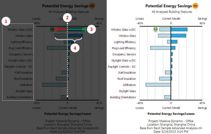
1: Building Features Analyzed. Each bar in the chart represents a building feature that is being analyzed to determine its importance to the building's energy performance. A range of design options are tested for each building feature.
2: Current model baseline. The center vertical line at 0 represents the energy performance of the building model, as submitted for analysis.
3: Savings/Losses potential. Features with the highest potential to save energy are at the top of the list. The size of the bar to the right of the centerline is the potential savings percentage, based on the current model. The size of the bar to the left of the centerline is the potential losses percentage.
4: Sensitivity. The overall size of the bar illustrates how sensitive the energy analyses are to this building feature. If this bar is large, a change to this feature can have large impacts to energy use. The size of the bar is also driven by how much the value of this feature is varied with the alternative runs. The runs are chosen to represent extremes.
How to Use the Potential Energy Saving chart
Energy analysis is most valuable when used early and often enough in a project to take advantage of opportunities to make choices that will reduce a building's energy use. Architecture and engineering teams need to work together to scope and prioritize energy efficiency measures. This chart is meant to make that process easier and can be generated easily from any Revit model.
The chart is designed to identify important energy features at a glance:
- Large bars are important building features affecting energy use (more sensitive). Smaller bars are less important to energy use (less sensitive).
- Bars that extend further to the right of the baseline have higher potential for energy savings. Bars that extend further to the left have higher potential for energy losses.
Use this data to help focus your design team on the building features that have the biggest impact on energy performance.
- Focus on the largest opportunities to improve on the baseline by investigating the features at the top of the list that have large bars on the right of the vertical line. Remember that there may be aspects of the design that are important to your building's energy use that are not simulated and represented on the chart.
- To avoid reducing energy performance, make sure you do not regress on building features that have large bars on the left of the vertical line.
- Know where you can be flexible. Building features where modifications will have little effect on energy performance have small bars on both the left and right side of the vertical line.
- For an existing building, the chart results can help prioritize your time during the building audit. Building features that have a large impact should get more of your attention during an audit and subsequent efficiency studies.
Example: Interpreting the Potential Energy Savings chart
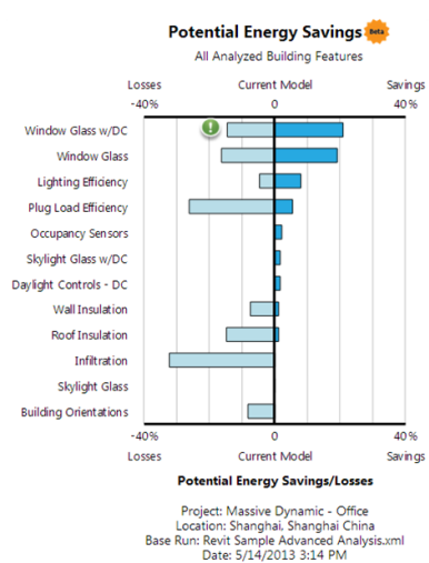
The chart below was generated from this Revit model of an office building and simulated near Shanghai. The bottom of the U-shape is facing south.


- The most sensitive building features for energy use are the Window Glass, Plug Loads, and Infiltration. Given the alternatives tested, these 3 features each have the potential to impact energy use by about 35%. Other parameters that are important, with about a 10-15% potential impact to energy use, are Roof Insulation, Lighting Efficiency, and Wall Insulation.
- The most room for energy improvement is changing the window glass, based on the current building model (~ 20% improvement). The current building model has clear double-pane glazing with a U-value (SI) of 3.16 (0.56 English), SHGC of 0.69, and VLT of 0.78.
- More efficient lights are the next biggest area for improvement over the baseline. They can improve energy performance by about 8%.
- Because changes in infiltration and plug loads can make a big difference to energy use, and because these values can vary widely in reality, check the assumptions in your model. If the building is sealed poorly, infiltration could cause over 30% worse energy performance than the model submitted.
- The roof and wall insulation specified are relatively good. There is only a small energy savings potential here, but it’s important to avoid regressing.
- You can expect about a 3% improvement in overall energy efficiency from Daylight Controls. You can see this impact in the "Daylight Controls - DC" alternative, and also in the window glass and skylight glass alternatives that include daylight controls (DC). Daylight controls are bundled with skylight and window glass to determine if you get more benefit from daylight controls if you use different glass.
Conclusions from this chart: