ListView ActiveX Control
"Microsoft ListView Control 6.0 (SP4)" "MSComctlLib.ListViewCtrl.2" "{BDD1F04B-858B-11D1-B16A-00C0F0283628}"  ActiveX Controls have been deprecated by Microsoft in the latest versions of the
Windows operating system in favor of the DotNet framework and its controls.
While MAXScript still supports ActiveX controls, these have to be installed and registered on the system to be accessible to MAXScript.
As a replacement of ActiveX controls, MAXScript supports DotNet controls in 3ds Max 9 and higher.
See the topic Converting ActiveX ListView Control to DotNet ListView Control for an example of switching existing ActiveX code to DotNet.
The ListView ActiveX Control is one of the most often user ActiveX Controls in MAXScript rollouts. It is very flexible and customizable and is thus discussed in detail in this chapter. It can be used to create lists and spreadsheet-like user interface controls.
ListItems
This property provides access to the ListItems. ListItems represent the rows in the Listview and have the following properties and methods:
Get/Set the number of ListItems in the ListView control.
Returns the Indexed ListItem. The index is 1-based.
Adds a new ListItem to the ListView control.
Clears the ListItems. All ListItems will be removed from the ListView.
ColumnHeaders
This property provides access to the column headers of the ListView.
Get/Set the number of Column Headers in the ListView control.
Get the indexed Column Header from the ListView control. The index is 1-based!
See ColumnHeader Properties and Methods for a list of properties of single Column Headers.
Clears the ColumnHeaders. All Column Headers will be removed from the ListView.
Removes the indexed Column Header. The index is 1-based.
Not accessible through MAXScript, return type is not supported.
.Add Index:undefined Key:undefined Text:undefined Width:undefined Alignment:undefined Icon:undefined
Adds a new Column to the ListView control.
This property lets you enable and disable the column headers. When set to true, the column headers will be hidden. When set to false, the column headers will be displayed. Note that column headers are only available when the .View property is set to #lvwReport .
When set to true, the user can drag the columns to define their order. When set to false (default), the columns order is locked and cannot be changed interactively.
ListView Layout:
Get/Set the view type of the ListView control.
Get/Set the appearance of the ListView control. #cc3D is default.
Controls the border style when .Appearance is set to #ccFlat . When set to #ccFixedSingle , a single pixel border will be drawn around the ListView.
Controls the arrangement of the ListView control. Default is #lvwNone .
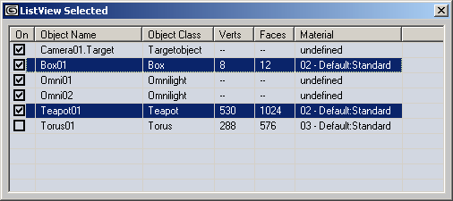
If a ListItem is assigned to this property, the ListItem will be displayed as highlighted (appearing to be selected, but without having the selected state flag set). The highlight will not be affected by the selection highlight, leaving the specified ListItem highlighted until the DropHighlight is set to undefined again.
In the screenshot below, the ListItem representing Teapot01 was assigned to DropHighlight, while the ListItem representing Box01 was selected with the mouse.
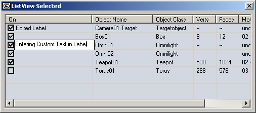
Controls the editing of the label (this is the text in the first column of a ListItem). Default is #lvwAutomatic .
When set to #lvwAutomatic , the user can click to select the item, then click again at the label location to open the text field to type in custom text.
When set to #lvwManual , the label editing can only be initiated by the developer by using the .StartLabelEdit() method.
| WARNING: |
| The 3ds Max keyboard shortcuts (accelerators) have to be disabled to be able to type in the label text field! See ActiveX - Disable3ds Max keyboard accelerators for details! |
When set to true, checkboxes will be displayed in the first column for each ListItem. When set to false (default), only the ListItem label will be displayed.
When set to true (default), the ListItems can be selected, labels can be edited, checkboxes can be checked, column widths can be adjusted etc. When set to false, the ListItems will be "frozen" and cannot be changed in any way.
Controls the foreground (text) color used to draw the ListView.
Controls the background color used to draw the ListView.
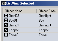
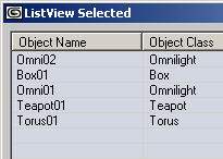
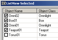
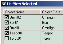
The following screenshots show the default white background (.BackColor property not set), .BackColor = color 225 215 210, .BackColor = color 215 225 210 and .BackColor = color 210 215 225
When set to false (default), no grid lines will be drawn. When set to true, lines will be drawn to delimit the rows and columns:
When set to false (default), the scrollbar will be displayed. When set to true, no scrollbar will be drawn. You can still scroll down by moving the selection using the arrow keys, but cannot scroll horizontally.
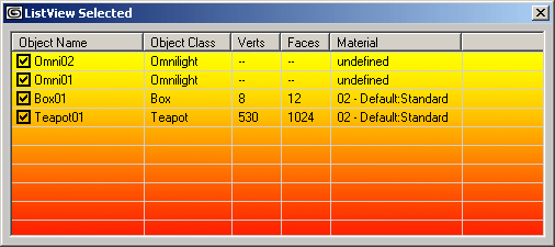
Lets you assign a picture to the background. See loadPicture for details on passing pictures as IPuctureDisp values to ActiveX controls.
In the example below, a yellow-red gradient with the size 500x200 pixels was created in Photoshop, saved as 24 bit BMP to disk and passed to the .Picture property using the line
lv.picture = loadPicture "c:/3dsmax6/images/activex_gradient.bmp"
.PictureAlignment : ListPictureAlignmentConstants( #lvwTopLeft | #lvwTopRight | #lvwBottomLeft | #lvwBottomRight | #lvwCenter | #lvwTile )
Controls the alignment of the picture assigned to the .Picture property.
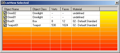
Controls the appearance of the text background. When set to #lvwOpaque, the above example will appear as
Returns an MSDisplatch value controlling the font used.Cannot be set by MAXScript.
Selection
When set to true, selecting an item or sub-item will select the complete row. When set to false, only the ListItem (first column) will be selected.
When set to true, the user can select multiple ListItems simultaneously. When set to false (default), only one ListItem at a time can be selected.
When set to true, the selection will not be displayed.When set to false, the selection will be displayed.
When set to true, the ListItems will be highlighted as the mouse moves over them. When set to false (default), there will be no effect when the mouse is moving over ListItems.
When set to true, the ListItems will be selected automatically when the mouse hovers over them. When set to false (default), ListItems will only be selected if the user clicks with the mouse.
Mouse Access
Returns the mouse icon as IPictureDisp value. Cannot be set by MAXScript.
.MousePointer : MousePointerConstants( #ccDefault | #ccArrow | #ccCross | #ccIBeam | #ccIcon | #ccSize | #ccSizeNESW | #ccSizeNS | #ccSizeNWSE | #ccSizeEW | #ccUpArrow | #ccHourglass | #ccNoDrop | #ccArrowHourglass | #ccArrowQuestion | #ccSizeAll | #ccCustom )
Get/Set the mouse pointer type when over the ListView Control. The script developer could use the mouse events described further on this page to change the mouse pointer depending on the underlying content or the allowed actions...
Sorting
When set to false (default), the ListItems will be displayed in the order they have been added to the ListView.ListItems array.
When set to true, the ListItems will be sorted alphabetically. By default, the sorting will be ascending based on the text in the first column
When .Sort is set to true, this property controls the direction of sorting.
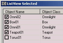
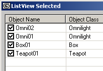
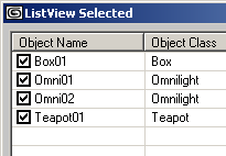
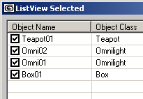
The following screenshots show the same objects displayed Unsorted, Sorted in Ascending and Descending order:
Icons
The following properties lets you assign an ImageList ActiveX Control to provide images to be used as icons by the ListView Control.
Note that icons are only visible when the .View property is set to #lvwIcon resp. #lvwSmallIcon
The property lets you assign icons to the ListView Control.The IVBDataObject containing the images to be used as icons is provided by an ImageList ActiveX Control.
The property lets you assign small icons to the ListView Control. The IVBDataObject containing the images to be used as icons is provided by an ImageList ActiveX Control.
The property lets you assign icons to the column headers of the ListView Control. The IVBDataObject containing the images to be used as icons is provided by an ImageList ActiveX Control.
OLE Windows Messaging
This is the ActiveX handle needed to send Windows Messages to the ActiveX Control. See Sending Windows Message for details.
Called before the Label Editing starts.
Called after the Label Editing ends.
Called when the user clicked a Column Header. The ColumnHeader argument will contain the ColumnHeader that has been clicked. The ColumnHeader has its own properties including index, alignment controls etc. See ColumnHeader Properties and Methods for details.
Called when the user clicked a ListItem. The Item argument will contain the 0-based index of the row that has been clicked.
Keyboard and Mouse Click Events
Called when the user pressed a key. The KeyCode argument will contain the integer code of the key that has been pressed, the Shift argument will contain an integer whose bits represent the pressed state of the Shift, Control and Alt keys - bit 1 represents Shift, bit 2 represents Control, bit 3 represents Alt.
1 - Left or Right Shift key pressed
2 - Left or Right Control key pressed
3 - Control + Shift keys pressed simultaneously
4 - Left or Right Alt key pressed
6 - Control + Alt keys pressed simultaneously
7 - Control, Alt and Shift keys pressed simultaneously
Called when the user releases a key. The KeyCode argument will contain the integer code of the key that has been released, the Shift argument will contain an integer whose bits represent the pressed state of the Shift, Control and Alt keys - see above.
Called when the user pressed a key. The KeyAscii argument will contain the ASCII integer code of the key that has been pressed. For example, pressing Space Bar will return 32, pressing Shift+A will return 65 etc.
on <control_name> MouseDown Button:integer Shift:integer x:OLE_XPOS_PIXELS y:OLE_YPOS_PIXELS do ( ... )
Called when the user clicked the ListView with the mouse.
The Button argument will contain an integer whose bits will correspond to the mouse buttons: bit 1 represents Left Mouse Button, bit 2 represents Right Mouse Button, bit 3 represents Middle Mouse Button / Wheel.
1 - Left Mouse Button pressed.
2 - Right Mouse Button pressed.
4 - Middle Mouse Button / Wheel pressed.
Pressing two or three mouse buttons simultaneously will NOT add the values but generate separate events for each button!
The Shift argument will contain the state of the Shift, Control and Alt keys as described earlier on this page.
The x and y arguments will contain the location of the click in ListView pixel coordinates (NOT Twips!), where 0,0 is the upper left corner of the ListView Control.
on <control_name> MouseMove Button:integer Shift:integer x:OLE_XPOS_PIXELS y:OLE_YPOS_PIXELS do ( ... )
Called when the user moves the mouse inside the ListView control.
The Button argument will contain an integer whose bits will correspond to the mouse buttons: bit 1 represents Left Mouse Button, bit 2 represents Right Mouse Button, bit 3 represents Middle Mouse Button / Wheel.
1 - Left Mouse Button pressed.
2 - Right Mouse Button pressed.
4 - Middle Mouse Button / Wheel pressed.
Pressing two or three mouse buttons simultaneously will NOT add the values but generate separate events for each button!
The Shift argument will contain the state of the Shift, Control and Alt keys as described earlier on this page.
The x and y arguments will contain the location of the click in ListView pixel coordinates (NOT Twips!), where 0,0 is the upper left corner of the ListView Control.
on <control_name> MouseUp Button:integer Shift:integer x:OLE_XPOS_PIXELS y:OLE_YPOS_PIXELS do ( ... )
Called when the user released the mouse over the ListView control.
The Button argument will contain an integer whose bits will correspond to the mouse buttons: bit 1 represents Left Mouse Button, bit 2 represents Right Mouse Button, bit 3 represents Middle Mouse Button / Wheel.
1 - Left Mouse Button pressed.
2 - Right Mouse Button pressed.
4 - Middle Mouse Button / Wheel pressed.
The Shift argument will contain the state of the Shift, Control and Alt keys as described earlier on this page.
The x and y arguments will contain the location of the click in ListView pixel coordinates (NOT Twips!), where 0,0 is the upper left corner of the ListView Control.
Called when the user clicked inside the ListView control. This event does not return specific ListItems, but it could be used to query the selection state or other properties of all ListItems. It is a general notification that the user clicked the ListView, the actual actions performed by the event are up to the script developer.
Called when the user double-clicked inside the ListView control.
Called when the user changed the state of a ListItem's checkbox (if available because of property .checkboxes = true).
The Item argument will contain ListItem whose checkbox has been changed. You can then access the new state by accessing the .checked property of the item. You can also access any other ListItem property.
OLE Drag and Drop Events
Called when the user started dragging from the ListView control.
Called when the user started dragging from the ListView control.
ListItem Properties and Methods
A ListItem is created by using the .ListItems.Add() method and can be accessed using 1-based indexed access as described above. Every ListItem has the following properties and methods:
ListItem Properties:
Get/Set the Text of the ListItem.
Get/Set the Ghosted state of the ListItem.
Returns the Height of the ListItem in Twips. Cannot be set by MAXScript.
Get/Set the Icon of the ListItem.The icon is a 1-based index into the .icons array which in turn is managed by an ImageList ActiveX Control.
Returns the Index of the ListItem. Cannot be set by MAXScript.
Returns the Key of the ListItem. Cannot be set by MAXScript.
Get/Set the Selected state of the ListItem. When true, the item is selected, when false, it is not. Depending on the state of the .MultiSelect property of the ListView, only one or multiple ListItems can be selected at the same time. Settings the .selected property of one ListItem to true while .MultiSelect is set to false will automatically deselect any other selected ListItems.
Get/Set the SmallIcon of the ListItem.
Get/Set the Tag of the ListItem.
Returns the Top coordinates of the ListItem in Twips.
Returns the Left coordinates of the ListItem in Twips.
Returns the Width of the ListItem in Twips.
Provides access to the array of Sub-Items of the ListItem. Sub-Items represent the columns after the first column. Sub-Items
SubItems can be accessed through indexed access to the .ListSubItems .
Get/Set the checked state of the List Item. See also the on ItemCheck do event handler further on this page.
Get/Set the Text color of the ListItem.
Get/Set the Tooltip Text of the ListItem.
Get/Set the Bold Text property of the ListItem. When set to true, the text will be displayed in Bold characters.
ListSubItem Properties and Methods
A ListSubItem is created by using the .ListItems.Add() method and can be accessed using 1-based indexed access as described above. Every ListItem has the following properties:
ListSubItem Properties:
Get/Set the Text of the ListSubItem.
Get/Set the Text color of the ListSubItem.
Get/Set the Bold Text property of the ListSubItem. When set to true, the text will be displayed in Bold characters.
Get/Set the Tooltip Text of the ListSubItem.
Returns the Index of the ListSubItem. Cannot be set by MAXScript.
ColumnHeader Properties and Methods
Every ColumnHeader has the following properties:
ColumnHeader Properties:
Get/Set the text displayed by the Column Header.
Get/Set the alignment of the Column Header's text.
Get the index of the Column Header.
Get the key of the Column Header.
Get the left margin of the Column Header in Twips.
Get the sub item index of the Column Header.
Get/Set the tag of the Column Header.
Get/Set the width of the Column in Twips.
Get/Set the icon of the Column Header.The icon is a 1-based index into the .icons array which in turn is managed by an ImageList ActiveX Control. When no icon is assigned, the property returns 0.
Get/Set the position of the Column Header. The position controls the order of the columns. By default, .Position is set to be equal to the .Index property. Setting .Position to a different value effectively changes the order of the columns, placing the column at the desired position.


