TreeView ActiveX Control
"Microsoft TreeView Control 6.0 (SP4)" "MSComctlLib.TreeCtrl.2" "{C74190B6-8589-11D1-B16A-00C0F0283628}"  ActiveX Controls have been deprecated by Microsoft in the latest versions of the
Windows operating system in favor of the DotNet framework and its controls.
While MAXScript still supports ActiveX controls, these have to be installed and registered on the system to be accessible to MAXScript.
As a replacement of ActiveX controls, MAXScript supports DotNet controls in 3ds Max 9 and higher.
See the topic Converting ActiveX TreeView Control to DotNet TreeView Control for an example of switching existing ActiveX code to DotNet.
The TreeView ActiveX Control is one of the most often used ActiveX Controls in MAXScript rollouts. It is very flexible and customizable and is thus discussed in detail in this chapter. It can be used to create node trees and hierarchy displays.
An example of the a TreeView Control used in the 3ds Max User Interface is the Named Selection Sets dialog.
TreeView Nodes:
Get/Set the array of nodex represented in the TreeView.
Returns the number of nodes in the .Nodes array.
You can access nodes from the array using indexed access. The index is 1-based.
Nodes returned by this property have their own properties and methods which are described under TreeView Node Properties and Methods
.Add Relative:undefined Relationship:undefined Key:undefined Text:undefined Image:undefined SelectedImage:undefined
Adds a new node to the .Nodes array and returns the new node as result.
The same method can be used to add children to existing nodes to build a hierarchy. See the tutorial How To ... Develop a Scene Browser using TreeView ActiveX Control - Part One for an example.
Nodes returned by this method have their own properties and methods which are described under TreeView Node Properties and Methods
Removes all nodes from the .Nodes array of the TreeView Control.
TreeView Layout
The following properties control the layout and appearance of the TreeView Control:
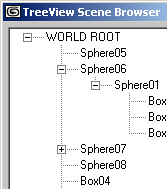
Controls the style of the lines connecting the nodes in the hierarchy. The #tvwTreeLines mode shows the root nodes without connection lines and draws lines only between their children. The #tvwRootLines connects both root level nodes and their children with lines. Below you can see the difference:
.Style : TreeStyleConstants( #tvwTextOnly | #tvwPictureText | #tvwPlusMinusText | #tvwPlusPictureText | #tvwTreelinesText | #tvwTreelinesPictureText | #tvwTreelinesPlusMinusText | #tvwTreelinesPlusMinusPictureText )
Controls the style of the tree display.
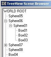
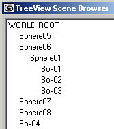
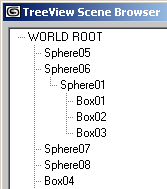
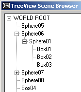
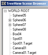
Below, you can see the typical 4 styles without icons:
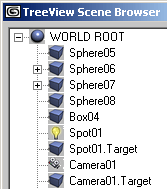
When icons are enabled, they appear between the line/plus/minus sign and the text label:
Controls the appearance of the TreeView control. #cc3D is default.
Controls the border style when .Appearance is set to #ccFlat . When set to #ccFixedSingle , a single pixel border will be drawn around the TreeView.
Get/Set the Indentation value in Twips. The value controls how far a child is indentend relatively to its parent.Note that values below 28 pixels (420 twips) will not affect the indentation anymore, but will cause the plus/minus signs to appear much smaller.
The following screenshots show Indentations of 10,28,40 and 60 pixels:
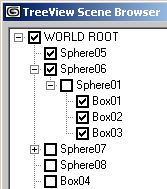
When set to true, checkboxes will be displayed in front of each Node. When set to false (default), no checkboxes will be displayed.
Defines the path separator string to be used by the .FullPath property of the Node.For example, setting the value to ">" and getting the .FullPath property of a node "Sphere01" which is child of node "Box01" which is child of node "ROOT" will return the path string "ROOT>Box01>Sphere01"
When set to true, the TreeView is editable. When set to false, the TreeView only displays the nodes but cannot be manipulated interactively. There is no visual difference between the two modes.
If a TreeView node is assigned to this property, it will be displayed as highlighted (appearing to be selected, but without having the selected state flag set). The highlight will not be affected by the selection highlight, leaving the specified node highlighted until the DropHighlight is set to undefined again.
Controls the editing of the label (the text of the node). Default is #tvwAutomatic . When automatic, the user can simply select a node and click a second time to edit the label. When manual, the label editing has to be initiated by the developer using the StartLabelEdit() method described below.
When set to true (default), horizontal and vertical scrollbars will appear whenever the tree does not fit in the TreeView area. When set to false, no scrollbars will be displayed.
Defines the Font used by the TreeView. Cannot be set by MAXScript.
TreeView Selections
The following properties provide access to and give control over the selection of nodes in TreeView Controls:
Returns the currently selected node.
When set to true, the selection will not be displayed.When set to false, the selection will be displayed.
When set to true, the whole row will be selected.
When set to true, the ListItems will be highlighted as the mouse moves over them. When set to false (default), there will be no effect when the mouse is moving over ListItems.
When set to true (default), selecting a new branch will automatically collapse previously expanded branches. When set to false, multiple branches can be open at the same time.
TreeView Images
This is the array storing all images used as icons. It expects an IVBDataObject (Visual Basic Data Object) which can be provided by an ImageList ActiveX control. See the tutorial How To ... Develop a Scene Browser using TreeView ActiveX Control - Part Two for a practical example.
TreeView Mouse Pointer
.MousePointer : MousePointerConstants( #ccDefault | #ccArrow | #ccCross | #ccIBeam | #ccIcon | #ccSize | #ccSizeNESW | #ccSizeNS | #ccSizeNWSE | #ccSizeEW | #ccUpArrow | #ccHourglass | #ccNoDrop | #ccArrowHourglass | #ccArrowQuestion | #ccSizeAll | #ccCustom)
Get/Set the mouse pointer type when over the ListView Control. The script developer could use the mouse events described further on this page to change the mouse pointer depending on the underlying content or the allowed actions...
Returns the mouse icon as IPictureDisp value. Cannot be set by MAXScript.
TreeView Sorting
When set to false (default), the nodes will be displayed in the order they have been added to the .Nodes array.
Drag and Drop Behaviors
Controls the OLE Drag mode. When set to manual, a drag can be initiated only via the scripted method .OLEDrag(). When set to automatic, the user can drag nodes from the list.
Windows Messaging
Performs a hit test at the specified x and y coordinates.
Returns the number of visible nodes.
Manually starts label editing of the currently selected node.
Refreshes the TreeView display.
Called before the Label Editing starts.
Called after the Label Editing ends.
Called when a node has been collapsed. The argument will contain the node that has been collapsed.
Called when a node has been expanded. The argument will contain the node that has been expanded.
Called when a node has been clicked. The argument will contain the node that has been clicked.
Called when the user pressed a key. The KeyCode argument will contain the integer code of the key that has been pressed, the Shift argument will contain an integer whose bits represent the pressed state of the Shift, Control and Alt keys - bit 1 represents Shift, bit 2 represents Control, bit 3 represents Alt.
1 - Left or Right Shift key pressed
2 - Left or Right Control key pressed
3 - Control + Shift keys pressed simultaneously
4 - Left or Right Alt key pressed
6 - Control + Alt keys pressed simultaneously
7 - Control, Alt and Shift keys pressed simultaneously
Called when the user releases a key. The KeyCode argument will contain the integer code of the key that has been released, the Shift argument will contain an integer whose bits represent the pressed state of the Shift, Control and Alt keys - see above.
Called when the user pressed a key. The KeyAscii argument will contain the ASCII integer code of the key that has been pressed. For example, pressing Space Bar will return 32, pressing Shift+A will return 65 etc.
on <control_name> MouseDown Button:integer Shift:integer x:OLE_XPOS_PIXELS y:OLE_YPOS_PIXELS do ( ... )
Called when the user clicked the TreeView with the mouse.
The Button argument will contain an integer whose bits will correspond to the mouse buttons: bit 1 represents Left Mouse Button, bit 2 represents Right Mouse Button, bit 3 represents Middle Mouse Button / Wheel.
1 - Left Mouse Button pressed.
2 - Right Mouse Button pressed.
4 - Middle Mouse Button / Wheel pressed.
The Shift argument will contain the state of the Shift, Control and Alt keys as described earlier on this page.
The x and y arguments will contain the location of the click in TreeView pixel coordinates (NOT twips!), where 0,0 is the upper left corner of the TreeView Control.
on <control_name> MouseMove Button:integer Shift:integer x:OLE_XPOS_PIXELS y:OLE_YPOS_PIXELS do ( ... )
Called when the user moves the mouse inside the TreeView control.
The Button argument will contain an integer whose bits will correspond to the mouse buttons: bit 1 represents Left Mouse Button, bit 2 represents Right Mouse Button, bit 3 represents Middle Mouse Button / Wheel.
1 - Left Mouse Button pressed.
2 - Right Mouse Button pressed.
4 - Middle Mouse Button / Wheel pressed.
The Shift argument will contain the state of the Shift, Control and Alt keys as described earlier on this page.
The x and y arguments will contain the location of the click in TreeView pixel coordinates (NOT twips!), where 0,0 is the upper left corner of the TreeView Control.
on <control_name> MouseUp Button:integer Shift:integer x:OLE_XPOS_PIXELS y:OLE_YPOS_PIXELS do ( ... )
Called when the user released the mouse over the TreeView control.
The Button argument will contain an integer whose bits will correspond to the mouse buttons: bit 1 represents Left Mouse Button, bit 2 represents Right Mouse Button, bit 3 represents Middle Mouse Button / Wheel.
1 - Left Mouse Button pressed.
2 - Right Mouse Button pressed.
4 - Middle Mouse Button / Wheel pressed.
The Shift argument will contain the state of the Shift, Control and Alt keys as described earlier on this page.
The x and y arguments will contain the location of the click in TreeView pixel coordinates (NOT twips!), where 0,0 is the upper left corner of theTreeViewControl.
Called when the user clicked inside the TreeView control. This event does not return specific TreeView Node, but it could be used to query the selection state or other properties of all Nodes. It is a general notification that the user clicked the TreeView, the actual actions performed by the event are up to the script developer.
Called when the user double-clicked inside the TreeView control.
Called when the user changed the state of a node's checkbox (must be visible because of property .checkboxes = true).
The Node argument will contain the node whose checkbox has been changed. You can then access the new state by accessing the .checked property of the node that was changed. You can also access any other node property like .text , .index etc. See TreeView Node Properties and Methods
Called when the user started dragging from the ListView control.
Called when the user started dragging from the ListView control.
TreeView Node Properties and Methods
The following properties and methods are available for single TreeView Nodes.
You can get single nodes either by using indexed access to the .Nodes array, or as a return value of the .Nodes.Add() method.
TreeView Node Properties:
Returns the number of children of the node.
Returns the root node (top most parent in the hierarchy).
Returns the previous node in the same hierarchy level.
Returns the next node in the same hierarchy level.
Returns the full path of the node as a string. See also the .PathSeparator property of TreeView described earlier on this page.
For example, setting the value to ">" and getting the .FullPath property of a node "Sphere01" which is child of node "Box01" which is child of node "ROOT" will return the path string "ROOT>Box01>Sphere01"
Get/Set the text displayed by the node
Get/Set the color of the text.
Get/Set the color of the node's background.
When set to true, the text will be displayed as bold. When set to false, regular text will be used.
Get/Set the checked state of the node. The state can always be get and set, but checkboxes will be displayed only when the .checkboxes property of the TreeView Control is set to true.
Get/Set the visibility of the node as a boolean value.
Get/Set the visibility of the node as a boolean value.
Get/Set the expanded state of the node. When set to true, all children will be shown. When set to false, the children display will be collapsed and only the parent node will be displayed.
Set the index of the image to be displayed by the node.The index points at the imageList property of the TreeView, which is usually assigned an ImageList ActiveX Control to provide the image management.
Set theindex of the image to be displayed when the node is selected.
Set the index of the image to be displayed when the node is expanded.
