Ribbon Guidelines
The following are aspects of the ribbon UI that can be modified by individual API developers. These guidelines must be followed to make your application's user interface (UI) compliant with standards used by Autodesk.
Ribbon Tab Placement
To make more room on the ribbon, third-party applications can now add ribbon controls to the Analyze tab as well as the Add-Ins tab.
- Applications that add and/or modify elements within Revit should be added to the Add-Ins tab.
- Applications that analyze existing data within the Revit model should be added to the Analyze tab.
- Applications MUST NOT be added to both the Add-Ins and Analyze tabs.
Contextual Tab Focus User Option
The Revit 2012 product line contains a user option (located on the User Interface tab of the Options dialog) which allows users to choose whether or not to automatically switch to a contextual tab upon selection. This option is set to automatically switch by default. For some API applications, it may be favorable to have this option disabled, to prevent users from being switched away from the Add-ins or Analyze tab. In these cases, it is best to inform users of this option in the documentation and/or as informational text in the installer user interface.
Number of Panels per Tab
Each API application SHOULD add only one panel to either the Add-Ins tab.
Panel Layout
The following guidelines define the proper way to lay out a panel on the Add-ins tab. The following panel under General Layout provides an example to follow.
General layout

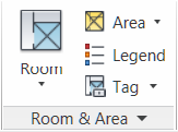
Figure 236 - Room & Area panel in the 2011 Revit products
A panel SHOULD have a large button as the left-most control. This button SHOULD be the most commonly accessed command in the application. The left-most button icon will represent the entire panel when it collapses (see Panel Resizing and Collapsing below.) This button MAY be the only button in the group, or this button MAY be followed by a large button and/or a small button stack.
Panels SHOULD NOT exceed three columns. If more controls are necessary, use a drop-down button.
Panels SHOULD only contain controls for launching commands and controlling the application. Controls for managing settings or launching help and "about this application" should be located in a Slide-out Panel.
Small button stack
- The stack MUST have at least two buttons and MUST NOT exceed three.
- The order of the small buttons SHOULD follow most frequent on bottom to least frequent on top. This is because the more frequently accessed command should be closer to the modeling window.
Panel Resizing and Collapsing
By default, panels will be placed left to right in descending order left to right based on the order in which they were installed by the customer. Once the width of the combined panels exceeds the width of the current window, the panels will start to resize starting from the right in the following order:
- Panels with large buttons:
- Small buttons lose their labels, then:
- The panel collapses to a single large button (the icon representing the panel will be the first icon on the left.)
- Panels with ONLY small button stack(s):
- Small buttons lose their labels and the panel label gets truncated to four characters and an ellipsis (three periods in a row.)
- If a small button stack is the left-most control in a panel, then the top button must have a large icon associated with it. This icon will represent the panel when collapsed.
The About button/link should be located within the main user interface and not on a ribbon panel.
Ribbon Controls
Ribbon button
A Ribbon button is the most basic and most frequently-used control. Pressing a button invokes a command.
Ribbon buttons can be one of the three sizes:
- Large: MUST have a text label
- Medium: MAY have a text label
- Small: MAY have a text label
Radio Buttons
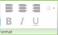
A radio button group represents a set of controls that are mutually exclusive; only one can be chosen at a time. These groups can be stacked horizontally (as seen in the justification buttons in the example below.)

Figure 237 - The Format text panel from Revit 2011
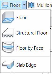
Drop-down button
- The top label SHOULD sufficiently describe the contents of the drop-down list.
- Every item in the list SHOULD contain a large icon.
- A horizontal separator can be optionally added between controls. This should be used if the items are logically grouped under one button, but are separated into distinct groups.

Figure 238 - Floor drop-down button in Revit Architecture
Split Button
A split button is a drop-down button with a default command that can be accessed by pressing the left side of the button. The right side of the button, separated by a small vertical separator, opens a drop-down list. The default command SHOULD be duplicated with the top command in the list.
A split button's default command can be synchronized. That is, the default command changes depending on the last used command in the drop-down list.
Combo Box and Text Box
The guidelines for combo boxes and text boxes in the ribbon are the same for those used within dialogs. See the Dialog Controls section.
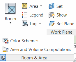
Slide-out Panel

Figure 239 - Floor drop-down button in Revit Architecture
In general slide-outs should be used for commands relevant to the panel, but not primary or commonly used ones.
Each open panel can be optionally pinned open. Otherwise, once the mouse leaves the panel, it closes by itself.
Three suggested uses of slide outs are commands that launch settings dialogs related to the panel's task(s), a Help button, and an About button.
Vertical separator
A vertical separator MAY be added between a control or sets of controls to create distinct groupings of commands within a panel. A panel SHOULD have no more than two separators.
Icons
For proper icon design, see the icon design guidelines.
Text Usage
Button Labels
These guidelines are for English language only.
- MUST not have any punctuation (except hyphen, ampersand or forward slash)
- MUST be no longer than three words
- MUST be no longer than 36 characters
- MUST be Title Case; e.g. Show Mass
- The ampersand "&" MUST be used instead of "and". A space should appear before and after the ampersand
- The forward slash "/" MUST be used instead of "or". No spaces should appear before and after the slash
- Only large buttons MAY have two line labels but MUST NOT have more than two lines. Labels for all other controls MUST fit on a single line
- Button labels MUST NOT contain ellipses (
 )
) - Every word MUST be in capital case except articles ("a," "an," and "the"), coordinating conjunctions (for example, "and," "or," "but," "so," "yet," "with," and "nor"), and prepositions with fewer than four letters (like "in"). The first and last words are always capitalized
Panel Labels
These guidelines are English-only. All rules from the Command Labels section apply to Panel Labels in addition to the following:
- The name of the panel SHOULD be specific. Vague, non-descriptive and unspecific terms used to describe panel content will reduce the label's usefulness
- Applications MUST NOT use panel names that use the abbreviations "misc." or "etc"
- Panel labels SHOULD NOT include the term "add-ins" since it is redundant with the tab label
- Panel labels MAY include the name of the third party product or provider
Tooltips
The following are guidelines for writing tooltip text. Write concisely. There is limited space to work with.
Localization Considerations
- Make every word count. This is particularly important for localizing tooltip text to other languages
- Do not use gerunds (verb forms used as nouns) because they can be confused with participles (verb forms used as adjectives). In the example, "Drawing controls", drawing could be used as a verb or a noun. A better example is "Controls for drawing"
- Do not include lengthy step-by-step procedures in tooltips. These belong in Help
- Use terminology consistently
- Make sure that your use of conjunctions does not introduce ambiguities in relationships. For example, instead of saying "replace and tighten the hinges", it would be better to split the conjunction up into two simple (and redundant) sentences - "Replace the hinges. Then tighten the hinges"
- Be careful with "helping" verbs. Examples of helping verbs include shall, may, would have, should have, might have, and can. For example, can and may could be translated as "capability" and "possibility" respectively
- Watch for invisible plurals such as "object and attribute settings". Does this mean "the settings for one object and one attribute" or "the settings for many objects and many attributes"?
- Be cautious about words that can be either nouns or verbs. Use articles or rewrite phrases like "Model Display" where model can be a noun or a verb in our software. Another example is "empty file". It can mean "to empty a file" or "a file with no content"
- Be careful using metaphors. Metaphors can be subtle and are often discussed in the context of icons that are not culturally appropriate or understood across cultures. Text metaphors (such as "places the computer in a hibernating state") can also be an issue. Instead, you might say "places the computer in a low-power state"
Writing/Wording Considerations
- Use simple sentences. The "Verb-Object-Adverb" format is recommended
- Use strong and specific verbs that describe a specific action (such as "tile") rather than weak verbs (such as "use to…")
- Write in the active voice (for example, "Moves objects between model space and paper space")
- Use the descriptive style instead of the imperative style ("Opens an existing drawing file" vs. "Open an existing drawing file")
- Make the tooltip description easily recognizable by using the third person singular (for example - "Specifies the current color" instead of "Specify the current color")
- Don't use slang, jargon, or hard to understand acronyms
Formatting Considerations
- Use only one space between sentences.
- Avoid repetitive text. The content in the tooltip should be unique and add value.
- Focus on the quality and understandability of the tooltip. Is the description clear? Is it helpful?
- Unless it's a system variable or command, do not use bold. Although bold is supported in Asian languages, it is strongly recommended to avoid using bold and italics, because of readability and stylistic issues.
-
Avoid Dabbreviations. For example, the word "Number" has many common abbreviations: No., Nbr, Num, Numb. It is best to spell out terms.
Good Example:

An example of a more useful descriptive sentence might be "Adds a file such as a .bmp or .png". This provides more detailed information and gives the user more insight into the feature.
Poor Example:

In this example, the tooltip content repeats the tooltip title verbatim and does not add value to the tooltip. Additionally, if the translator cannot identify whether this string is a name/title or a descriptive sentence, it will be difficult for them to decide on the translation style.
As with other guideline issues, follow Microsoft Guidelines for title and sentence case (listed below):
Title Case
- Capitalize all nouns, verbs (including is and other forms of to be), adverbs (including than and when), adjectives (including this and that), and pronouns (including its)
- Capitalize the first and last words, regardless of their parts of speech (for example, The Text to Look For)
- Capitalize prepositions that are part of a verb phrase (for example, Backing Up Your Disk)
- Do not capitalize articles (a, an, the), unless the article is the first word in the title
- Do not capitalize coordinate conjunctions (and, but, for, nor, or), unless the conjunction is the first word in the title
- Do not capitalize prepositions of four or fewer letters, unless the preposition is the first word in the title
- Do not capitalize to in an infinitive phrase (for example, How to Format Your Hard Disk), unless the phrase is the first word in the title
- Capitalize the second word in compound words if it is a noun or proper adjective, an "e-word," or the words have equal weight (for example, E-Commerce, Cross-Reference, Pre-Microsoft Software, Read/Write Access, Run-Time). Do not capitalize the second word if it is another part of speech, such as a preposition or other minor word (for example, Add-in, How-to, Take-off)
- Capitalize user interface and application programming interface terms that you would not ordinarily capitalize, unless they are case-sensitive (for example, The fdisk command)
- Follow the traditional capitalization of keywords and other special terms in programming languages (for example, The printf function, Using the EVEN and ALIGN Directives)
- Capitalize only the first word of each column heading
Sentence Case
- Always capitalize the first word of a new sentence
- Do not capitalize the word following a colon unless the word is a proper noun, or the text following the colon is a complete sentence
- Do not capitalize the word following an em-dash unless it is a proper noun, even if the text following the dash is a complete sentence
- Always capitalize the first word of a new sentence following any end punctuation. Rewrite sentences that start with a case-sensitive lowercase word