Create Graphs
Three different types of graphs can be created in the Results environment.
Graphs of results at selected nodes can be created. For static analyses, a bar graph is created comparing the result at a node versus the different load cases. For time-dependent analysis, a line graph is created that will track the result at a node throughout the duration of the analysis. (See Figure 1) By default, time or load case is the value on the horizontal axis.

Figure 1: Example Graph of a Result Versus Time
The temperature at two nodes from a transient heat transfer analysis is graphed.
Also, the result along a line or path of nodes through the model can be graphed. (See Figure 2) For example, the temperature through the thickness of refractory wall can be graphed. Distance between the selected nodes is the value on the horizontal axis.
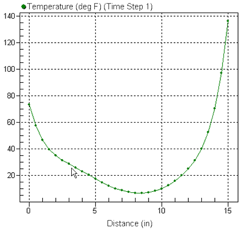
Figure 2: Example Graph of a Result Along a Path
Temperature along the edge of a model is graphed. The path plot is for one instant in time (time step 1 in this example).
The applied loads in the model can also be graphed versus time or load case. This is particularly useful for results based loads in which the user-applied load is a calculation based on the results. (See Figure 3) (Note: Some loads in static stress will not graph as expected. This is because some loads, such as nodal forces, are applied to only one load case; different load cases may have nodal forces applied to the same node, but the item selected is different.)
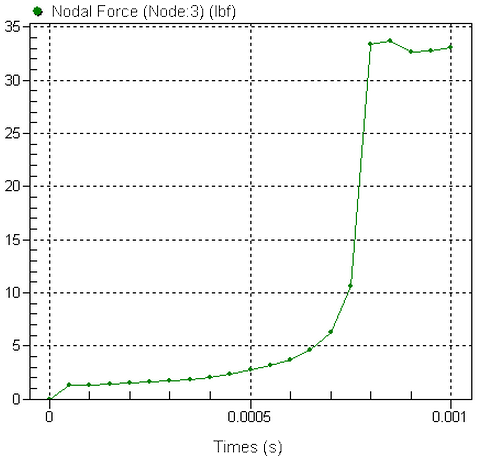
Figure 3: Example Graph of Applied Load Versus Time
The force of two magnets increase as the supporting structure deflects towards each other. Contact between the magnets occurs at 0.0008 seconds.
Except for the Embed Graph option, a graph will appear in a new window when one of the following procedures is used. If elements are hidden, the curve will be based on the results of the visible elements.
Also a heading in the tree view will appear for the new graph under the Presentations heading. See Figure 4.
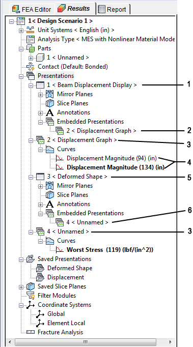
Figure 4: Tree View With Contour and Graph Presentations
Legend:
- Presentation (contour display)
- Embedded graph (from presentation #2)
- Presentation (graph)
- Two curves in one graph (bold one is active)
- Presentation (contour display)
- Embedded graph (not another presentation)
Graph Results Versus Time
To create a graph of a result at a node (or multiple nodes) versus time or load case (see Figure 1 for an example), use the following steps:
- First set the type of result to be graphed using the Results command. (The result type Precision of von Mises Stress cannot be graphed. The von Mises stress will be plotted instead.)
- Set any results options such as smoothing options, plate display options, and so on.
- Select the node or nodes in the display area (Selection
 Select Nodes), and then right-click. These commands will be available:
 - Select the Graph Value(s) command to create a graph that shows at least one curve for each node selected. Since the graph follows the same rules as the values shown in the display area, it is possible to get more than one curve per node. For example, if the node is shared by two parts and a stress result is shown, each part has a different value. Graphing the one node will result in two curves. (The smoothing between parts is off by default: Results Options: Smoothing Options: Smooth across part boundaries.) For example, plate elements have a different result on the top and bottom face. One node on a plate element will generate two curves (if all connected elements are in the same part and smoothing is on) and 2*N curves for N parts connected to the node (with the smoothing between parts turned off).
- Select the Edit New Graph command to create a graph that shows one curve for all the nodes selected. The Edit Curve dialog will appear to allow you to set how the multiple nodes are treated (summed, graph the maximum, and so on. See Modifying a Graph below).
- If a graph already exists, you will get an additional command. Select the Add Curve(s) to Graph pull-out menu to plot the selected node on an existing graph. Then select the appropriate graph.
- Graphs can be embedded into the display area of the current presentation by selecting the Embed Graph menu. The graph will then appear in the display area, and a heading will appear in the tree view under the Embedded Presentation heading. See also Working with Embedded Presentations below.
Alternatively, right-click the Presentations entry in the tree view and choose New Graph Presentation. This will create a graph of the current result for the node with the maximum value at time step or load case 1.
Create an FFT
Graphs of a result versus time can be used to produce an FFT graph in which the time domain data is converted to the frequency domain. After creating the graph of the result, use Results Inquire Graphs Graph Options Power Spectrum (FFT) to generate the FFT. This performs a numerical Fast Fourier Transform on the displayed result, which consists of the entire time range. The horizontal axis of the FFT is the frequency, and the vertical axis is power (amplitude squared). The constant component (frequency = 0) of the FFT is not displayed in the graph. It is set to zero.
For data with a non-uniform time step, the largest time step is used in the calculations, and data is interpolated as needed.
Graph Results Along a Path
There are two methods to start the process of creating a graph of a result along a path of nodes (see Figure 2 for an example). The difference is whether you let the software create the graph first and then you arrange the nodes in the appropriate order, or whether you select and arrange the nodes before creating the graph. The steps are as follows:
Method 1: Create the graph first, then arrange nodes
- First set the type of result to be graphed using the Results command. (The result type Precision of von Mises Stress cannot be graphed. The von Mises stress will be plotted instead.)
- Set any results options such as smoothing options, plate display options, and so on.
- Select all the nodes that define the path in the display area (Selection SelectNodes).
- Right-click. These commands will be available:
- Select the Create Path Plot command to create a graph that shows one curve for all the nodes selected. The Path Plot Definition dialog will appear to allow you to set various options such as the order of the nodes.
- If a path plot graph already exists, you will get an additional command. Select the Add Path Plot To Graph pull-out menu to plot the selected path on an existing graph. Then select the appropriate graph.
- Graphs can be embedded into the display area of the current presentation by selecting the Embed Path Plot menu. The graph will then appear in the display area, and a heading will appear in the tree view under the Embedded Presentation heading. See also Working with Embedded Presentations below.
- A graph and the Path Plot Definition dialog appears (see Figure 5). The nodes are listed in numerical order.
Method 2: Arrange nodes first, then create the graph
- First set the type of result to be graphed using the Results command. (The result type Precision of von Mises Stress cannot be graphed. The von Mises stress will be plotted instead.)
- Set any results options such as smoothing options, plate display options, and so on.
- Select none, some, or all the nodes that define the path in the display area (Selection Select Nodes). Any nodes selected beforehand will be used, and additional nodes can be added before the graph is created. Select as many nodes as possible while still leaving the ability to sort the nodes into a meaningful order.
- Use Results Inquire Graphs Create Path Plot to access the Path Plot Definition dialog. All options are shown. Some will not be available depending on the circumstance.
Path Plot Dialog Box
There are two main uses of the Path Plot Definition dialog. First, since a path plot uses the distance between the nodes on the horizontal axis of the graph, the order of the nodes has an effect on the graph. Here are the various ways to get the list of nodes in the proper order:
- Move Up and Move Down After a node is in the list, you can highlight the node, right-click, and choose Move Up or Move Down to move it in the list.
- Sort By X, Y, or Z Coordinate: Right-clicking in the Nodes list gives the option to sort the nodes by X, Y, or Z coordinate (based on the original coordinates, not the displaced coordinates). If one or fewer nodes are highlighted in the list, then the entire list of nodes are sorted. If two or more nodes are highlighted in the list, only the highlighted nodes are sorted. Use the Shift and Ctrl keys to select a range of entries or multiple individual entries.
- Adding Additional Nodes: In some situation, it is beneficial to add nodes individually so that the proper order is achieved. When using method 2 (described above), the Path Plot Definition dialog and the contour window are visible. Therefore, additional nodes can be added to the list by selecting the nodes on the model and then clicking the Add Selected button. This way, you have easy control over the order of the nodes. Another way to add a node, applicable for both method 1 and method 2, is to click the blank entry immediately underneath the last node. An edit field will appear in which you can type the node number to add. (Use Results Inquire Inquire Current Results in any contour window to get the node number.)
Second, the Path Plot Dialog is used to indicate how the accumulated distances between the nodes are plotted on the graph. The first node in the list is always treated as being 0 Distance. Then the distance to the next node is added, and the distance to the next node is added, and so on for all the nodes in the list. The options in the Plot Against section behave as follows: (see also Figure 5)
- X Distance The distance from the previous node i to the next node i+1 is the difference in the X coordinates of the nodes (= X i+1 -Xi), and this distance is added to the sum of the previous distances. The accumulated distance is reduced if the next node has a smaller X coordinate. See Figure 6 for an example.
- Y Distance The distance from the previous node i to the next node i+1 is the difference in the Y coordinates of the nodes (= Y i+1 -Yi), and this distance is added to the sum of the previous distances. The accumulated distance is reduced if the next node has a smaller Y coordinate.
- Z Distance The distance from the previous node i to the next node i+1 is the difference in the Z coordinates of the nodes (= Z i+1 -Zi), and this distance is added to the sum of the previous distances. The accumulated distance is reduced if the next node has a smaller Z coordinate.
- Distance The distance from the previous node i to the next node i+1 is the distance between the nodes in 3D space (=square root[(X i+1 -Xi)^2 + (Y i+1 -Yi)^2 + (Z i+1 -Zi)^2]), and this distance is added to the sum of the previous distances. By definition, the distance is always a positive value. See Figure 5 for an example.
If the analysis type has displacement results, the option Use Displaced Coordinates will be available, in which case the above calculations are based on the displaced position of the nodes.
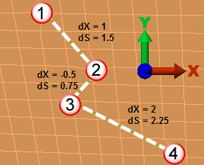 Selected nodes and distances in X (dX) and total (dS) |
Node | Abscissa Value of Node's Data Point when Plotting By: | |
| X Distance | Distance | ||
| 1 | 0 | 0 | |
| 2 | 1 | 1.5 | |
| 3 | 0.5 | 2.25 | |
| 4 | 2.5 | 4.5 | |
|
Figure 5: Comparison of X Distance Plot Versus Distance Plot |
|||
Other Path Plot Details
- Highlighting nodes on model: When using method 2 (described above), highlighting an entry in the Nodes list will select the corresponding node(s) on the model.
- Removing nodes from the list: If extra nodes get into the list of nodes, highlight them and use the Delete key or Remove button.
- Switching to different a time step or load case: Since a path plot shows the results for one time step or load case, use Results Inquire Load Case Options Load Case to change to a different step. Note: Different curves within the same graph can have different settings. Changing the load case affects only one of the curves. To change the load case for all the curves on the path plot, you need to set each curve as the active curve (right-click the curve in the tree view and choose Set Active) and change the load case. The same is true for all settings on theResults Contours tab, the Results Inquire tab and the Results Options tab: the settings are for the active curve only.
- Scatter plots: The path plots are graphs of results at the nodes. Some results actually are output at the corners of the elements: these are referred to as element results. The settings for the smoothing determine whether one result is given at the node or whether multiple results are shown at the node. (See the paragraph Understanding the Results on the page Results: Results Environment for a detailed discussion.) When plotting these element results, the path plot will be shown as a scatter of data points not connected together if any of the nodes have multiple results. Tip: After any graph is created, the method used to show the data points can be changed by right-clicking on the graph and choosing the Plotting Method command. For example, Plotting Method: Points + Lines will connect the points together. Depending on the settings for the path plot, the connected points may or may not be in the appropriate order.
For example, take the two-part plate model shown in Figure 6a. The nodes along the centerline are selected for the path plot. If the result being displayed is the X-X stress tensor, then with the default settings each node has two different values (the stress on the top and bottom of the plate), and the node at the junction between the parts has 4 different values (two values for the top and bottom of part 1 {green part}, and two values for the top and bottom of part 2 {red part}). The path plot is shown in Figure 6b. Instead of trying to plot the top and bottom stresses simultaneously, set Results Contours Settings Plate/Shell Options to top side only, make a path plot. Go back to the stress contour window, set the Plate Options to bottom side only, and add the path plot to the existing graph. This creates two curves on one plot, so the data points follow a natural connection. See Figure 6c.
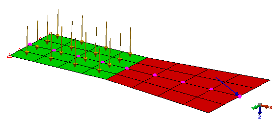 (a) A two part plate model. The nodes on the centerline are selected for creating a path plot. |
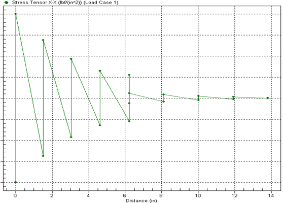 (b) Since plate elements have different stresses on the top and bottom, creating a plot of the X-X stress tensors with the default settings produces one scatter plot. When the Plotting Method: Points + Lines is used, it can be seen that the data is not connected in the expected manner. |
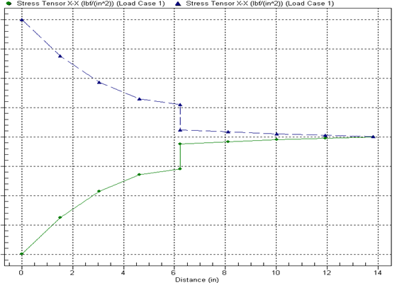 (c) When two separate plots are created, one with the X-X stress for the top side of the plates and one with the X-X stress for the bottom side of the plates, the data points make sense when connected with lines. |
| Figure 6: Example Path Plots of Element Results |
Graph Applied Loads Versus Time
To create a graph for an applied load, use the following steps:
- First set the selection mode to FEA Objects (Selection Select Loads and Constraints).
- Select the load in the display area, and then right-click. These commands will be available.
- Select the Graph Value(s) command to create a graph that shows one curve for each load selected.
- If a graph already exists, you will get an additional command. Select the Add Curve(s) to Graph pull-out menu to plot the selected node on an existing graph. Then select the appropriate graph.
- Graphs can be embedded into the display area of the current presentation by selecting the Embed Graph menu. The graph will then appear in the display area, and a heading will appear in the tree view under the Embedded Presentation heading. See also Working with Embedded Presentations below.
Modify Graphs
Once a graph has been created, the appearance can be customized by right-clicking in the graph or by choosing Results Inquire Graphs Graph Options Customize. You can adjust the font type and font size; the line type, weight and color; the vertical and horizontal scale limits; whether to include data labels or markers; and much more. There is also an export dialog you can use to create an image of the graph for inclusion in your report or to export the numerical data that is graphed. Various export formats are available. The graph settings, customization dialog, and export dialog are self-explanatory.
For time-dependent analyses, the selected item will be plotted against time by default. You can change the value plotted along the X axis by selecting Results Inquire Graphs Graph Options Axis Control. Select the Value: radio button in the X Axis section. Press the adjacent button to select the result that will be used for the X axis. If you have multiple curves in the current graph, the Existing Curve: radio button will be available. Selecting this radio button will allow you to select one of the curves in the adjacent drop-down box. The selected curve will be removed from the graph and will be used as the X axis. For example, if you have the von Mises stress of nodes 1 and 2 plotted as two curves in a single graph, you can select the curve for Node 2 in this drop-down box. The resulting graph will plot the von Mises stress of Node 1 versus the von Mises stress of Node 2.
Once a curve is created, what is shown can be changed in two ways. First, for graphs of results, you can change the type of result that is graphed for the curve. To do this, right-click the appropriate curve in the tree view and choose Set Active; the entry in the tree view will become bold. Then use the commands on theResults Contours tab, the Results Inquire tab and the Results Options tab to change what is plotted. In other words, the same menus that are used to change the display contours in a normal presentation window are also used to change the result that is graphed for the active curve.
- Different curves within the same graph can have different settings. To see the Results and Results Options settings for each curve, set the curve to active and check the menus. To change the settings for all the plotted curves, you need to set each curve as the active curve and make the changes.
- For example, imagine a graph that has the in-phase displacement plotted for nodes 5 and 11 from a Frequency Response analysis. To change the result to out-of-phase, Results Options Analysis Specific Response Type Out-of-phase is selected. But since only one curve is active at a time, one of the nodes is now plotting the in-phase response, and the active curve is now plotting the out-of-phase response. To change the other curve, set it to active and change the response type.
Second, you can change how the current result is manipulated and/or change the nodes that are plotted. To do this, right-click the appropriate curve in the tree view and choose Edit. Depending on the type of graph, the following will occur:
Path Plots
The same dialog appears (with some features hidden) as when creating the path plot initially. Refer to the paragraph Using the Path Plot Dialog above.
Time-Based Graphs
The Edit Curve dialog will appear with the following options. (This is the same dialog that appears when nodes on a model are selected in the display and Edit New Graph is chosen when you right-click.) When editing the curve for an applied load, some of these options are not relevant and will be grayed out.
Nodes Graphed: You can change the node that is plotted, or you can combine the results from multiple nodes in a single curve. This can be done by specifying the node numbers, separated by commas, in this field. If you had multiple nodes selected when creating the curve, these nodes will be listed in this field.
- When the nodes plotted is changed, the revised curve will be based on all elements connected to the node and a smoothed result (mean) of all values. Which elements are visible or hidden, the settings for smoothing, and so on, are not known to the graph. If this is important, a new graph should be created based on the appropriate settings.
- The same is true when right-clicking on the graph Presentation entry in the tree view and choosing Add New Curve. The results are based on all elements connected to the node, regardless of whether those elements were visible or hidden when the graph was originally created.
Multiple nodes: Select how you want the results from the multiple nodes combined in this drop-down box. The options are:
- Maximum: This option will graph the maximum result value from the selected node set at each time value.
- Maximum Magnitude: This option will take the absolute value of the result value from the selected node set and display the maximum value at each time value. The sign of the value will be reapplied. For example, if the result values are 1, -3, 5 and,-6, the value reported would be -6.
- Mean: This option will graph the average result value of the selected node set at each time value.
- Minimum: This option will graph the minimum result value from the selected node set at each time value.
- Range: This option will graph the difference between the maximum result value and minimum result value from the selected node set at each time value.
- Sum: This option will graph the sum of the result values of the selected node set at each time value.
Multiplier: If you want the curve values to be multiplied by a constant value, specify that value in this field. For example, the reaction force from a 2D axisymmetric model gives the force for a 1 radian slice. To graph the results for one full revolution, use a multiplier of 6.28 (= 2pi).
Operation: Select the function that you want to be applied to the curve in this drop-down box.
- None (Original Value): This option will graph the result values as they are reported. No function will be performed.
- Integral: This option will graph the integral of the result values with respect to time.
- First Derivative: This option will graph the first derivative of the result values with respect to time.
- Second Derivative: This option will graph the second derivative of the result values with respect to time.
Work with Embedded Presentations
In addition to embedding a graph directly into the presentation as described above, an existing graph can be embedded in any other display presentation. To do this, right-click the name of the graph presentation, choose Embed in Presentation, and choose the destination. The bump-out will show which presentations are available.
The embedded presentations are listed under the Embedded Presentation branch for the display presentation in the tree view. By choosing one of the embedded presentations, it can be moved or resized by right-clicking on the heading and selecting the Move/Resize command. Handles will appear around the edges of the embedded graph; drag the handle with the mouse to change the size, or drag the graph at any other location to move its position. Click outside the graph to exit the Move/Resize command.