Image Buttons
| User Interface Controls > Common Properties > Layout > Types > Image Buttons |
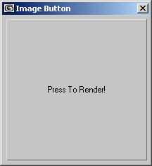
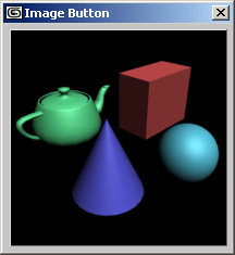
These rollout user-interface item types:button, checkbutton, mapbutton, and materialbutton can be used as either simple text buttons containing text labels or as image buttons displaying bitmaps instead of text. Images can be specified as a single icon (using iconName) or as an image list containing multiple image states.
Using a Single icon
The images to be displayed in these buttons are specified using the creation time parameters iconName/iconSize, or images.
For iconName/iconSize, the parameter form is:
iconName:<filename> iconSize:<point2>
The system will load multi resolution icons, and pick which to use based on iconSize and the system DPI scaling. The iconSize is the icon size to use at 100% DPI scaling, and the default is [24,24] if iconSize is not specified.
|
EXAMPLE: |
button rcw "" height:20 width:29 iconName:@"PolyTools\TransformTools\PB_CW" iconSize:[20,20] -- loads PolyTools\TransformTools\PB_CW* files. The PB_CS_20 file will be the icon used at 100% dpi scaling button PTdo "" height: 26 width: 26 iconName:@"PolyTools\Topology\Wall" -- loads PolyTools\Topology\Wall* files. The Wall_24 file will be the icon used at 100% dpi scaling |
Using an image list
 images: #(
<image>,
<maskImage>,
<count_integer>,
<enabled_out_image_index>,
<enabled_in_image_index>,
<disabled_out_image_index>,
<disabled_in_image_index>,
<invert_boolean>,
<colortheme_boolean>
)
The images in a button can be changed after its creation by setting its read-only .images property.
Image and maskImage (1, 2)
<image> and <maskImage> can be either a bitmap filename string or a MAXScript bitmap value.
The <image> must always be provided
The <maskImage> can be supplied as undefined if it is not required.
If either of the two images is specified as a file name, the bitmap file is searched in the following directories (in order of search):
There are four images that can be specified, one for each of the possible button states:
These images are taken from a single bitmap file or MAXScript bitmap value in which a number of images are stored side-by-side. This bitmap containing one or more images to use for the button is called the imagelist . All the sub-images in such an imagelist are assumed to be of the same width, and you can specify which image is used for which state by providing an image index into the bitmap. This means you can store the images for all the states of many buttons in one file, specifying different indices for the different buttons. The system will scale the imageList to account for DPI scaling.
For example, if you have 10 images, each with a size of 24x24 pixels, your imagelist bitmap is expected to be 240x24 pixels in size and specifying the index 2 grabs the 24 rows with pixels from pixel columns 25 to 48. See the count_integer description below for more details.
A black-and-white mask image can be used to mask the image display into the buttons. It is given in the same imagelist form and the mask image indices must be the same as the images they correspond to.
By default, black pixels in the mask let the corresponding image pixel show; white pixels hide corresponding image pixels and show the default background color for the button. This can be inverted by specifying an 8 th element in the array set to true. See Invert_boolean below.
If there is no mask file, the value undefined must be supplied for the mask file name.
count_integer (3)
<count_integer> specifies the number of sub-images in each of the bitmaps.
MAXScript deduces the width of the single image by dividing the width of the imagelist bitmap by the <count_integer> value, and the height is taken from the height of the imagelist bitmaps.
For example, if the bitmap is 2448 pixels wide and 24 high and the <count_integer> is provided as 102, MAXScript will divide 2448/102 = 24, resulting in icon size of 24x24 pixels. This is the case with the "Maintoolbar_24i.bmp" imagelist file.
XXX_image_index (4,5,6,7)
The <XXX_image_index> values specify which sub-image in the bitmaps is to be used for each of the four button states.
If the specified index is higher than the available images, the button displays an empty bitmap.
invert_boolean (8)
The <invert_boolean> value defines how to use the maskImage colors to reveal and hide image pixels.
When false, black pixels show the corresponding image pixels and white pixels mask them out.
When true, black pixels hide the image pixels and white pixels reveal the image pixels.
colortheme_boolean (9)
The <colorthreme_boolean> value defines whether to use the Windows Color Theme or not. If not specified, it will default to false.
Available in 3ds Max 2010 and higher.


