Button UI Control
| User Interface Controls > Common Properties > Layout > Types > Button |
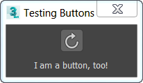
A button control is used to place a press button on the rollout which the user can click, typically to perform some task.
button <name> [<caption>] [images:<image_spec_array>] [toolTip:<string>] [border:<boolean>] [iconName:<filename> iconSize:<point2>]
The default alignment of button items is #center .

An image-specification array for providing bitmap images for the button. If this is specified, the <caption> is ignored and the contents of the button are replaced with the bitmaps.
Provides text for a tooltip for the button; there is no tooltip if not supplied.
When set to true or not specified, the button will be drawn with a border. This was the default behavior prior to 3ds Max 2009.
When set to false, the button will be drawn without a border, making it one with the UI background. If the button is enabled, the border will appear when the button is pressed, or upon mouseover.
iconName:
The filename of an icon to use as an image on the button. If iconName is specified, the caption is ignored. The iconSize specifies the iconName size at 100% DPI scaling. If not specified, the default [24,24] is assumed.
iconSize:
The size of the icon specified by iconName at 100% DPI scaling.
Sets the image-specification array for the button.
Setting the value to undefined will set the control back to displaying its caption rather than images in .
Gets or sets the tooltip string of the button.
Called when the user clicks the button.
Called when the right mouse button is released over the button.

