Property Panels provide contextual access to parameters used for creating and editing features.
What's New: 2020, 2020.1, 2020.2
The property panel floats above the graphic area and, initially, appears in the upper left of the graphics area. Panels can be resized, combined with the Model browser, moved to another location, and even to a secondary monitor. Property Panels use expandable sections instead of tabs.
Key Concepts
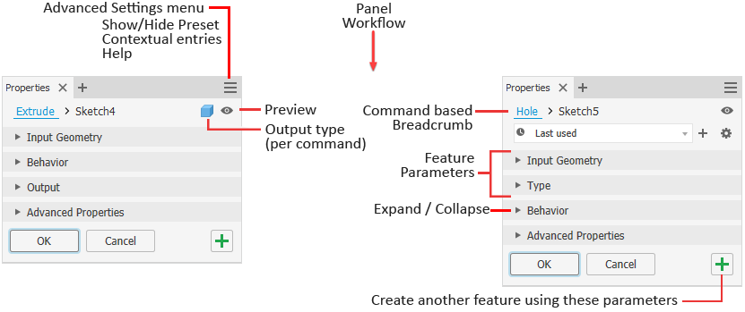
- Workflow - the property panel workflow is from top to bottom. Any property you set or change can affect the properties in sections below it. A property does not affect the properties in preceding sections.
- Breadcrumb - quickly switch from editing the feature to editing the associated sketch. Rename the feature or sketch right from the breadcrumb.
- Preview - located to the right of the breadcrumb, Preview toggles the feature preview visibility when editing the feature or sketch. During sketch editing, selected regions or loops preview in wireframe. Toggle the option to hide the preview.
- Presets - use presets to create reusable feature definitions. For more on Presets, see To Work with Presets.
-
Value edits - use Enter to apply value edits. Use Tab to progressively move to the next field. Press CTRL+Enter to end the definition and create the feature and close the property panel. When a value is invalid the value color turns red. When a value is valid the value color is black.
Edit fields cross-highlight between the property panel and the in-canvas edit controls.
- Expand/Collapse - panel sections can be expanded to expose parameters for editing or collapsed to hide seldom used parameters.
- Advanced Settings menu - the drop down provides access to Show/Hide Preset, Help and other advanced settings. The menu adjusts based on context. For example, when creating or editing a feature, the menu list contains options related only to the feature being edited. When working in the browser, the panel menu is according to the model browser state, and so on.
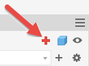
 Apply and create new - click to create the feature using the current settings and begin creating another feature using the same settings. You can change any settings, as needed, then create another feature.
- Docking - the property panel can be docked in any Inventor application graphics window, within the browser space, or remain floating whether over the application or somewhere on the desktop. This allows you to position the panel or browser wherever it is convenient for you. When docking the panel to a window frame, the target frame edge highlights.
- Display - panels remember their most recent display state and use that when next visited.
Understanding the Property Panel user interface
- Profile problems - when a profile issue occurs, the Sketch Doctor icon appears in the property panel alerting you to the issue. Click the icon to start Sketch Doctor or manually resolve the issue.
- Input needed - when a value is needed for a feature to be ready to create, the field will display in red text and an icon to the right.
- Icons or list - some icon groups have the option to be displayed in dropdown list form. Click the arrow to the right of the field to select the options. When displayed as a list, you can use keyboard entry (the first character of the word) to choose an option.
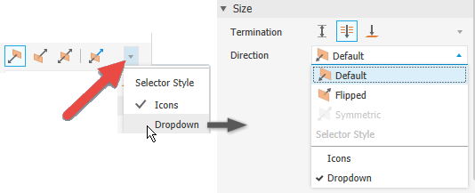 Note: In list mode, the list updates as you roll the mouse wheel.
 - Edit field behaviors
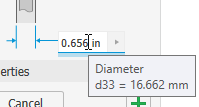
- Hover: when the cursor is over the edit field it highlights with a white background and a colored underline to show that you are actively editing a value. A tooltip displays when the cursor hovers over the edit field.
- Single click: selects the complete field, value and units.
- Second click: deselects the field and places the insertion cursor at the selected character.
- Click+drag: selects characters included in the action from mouse down to mouse up.
- Double click: selects a set of characters that is bounded by a space, comma, or special character. Examples are units, values, and parameters.
- Triple click: selects the complete field, the same as single click.
- Hover: when the cursor is over the edit field it highlights with a white background and a colored underline to show that you are actively editing a value. A tooltip displays when the cursor hovers over the edit field.
Breadcrumbs
Breadcrumbs horizontally display the current or active location in the document hierarchy. They can provide access to documents, features, and sketches depending on document type.
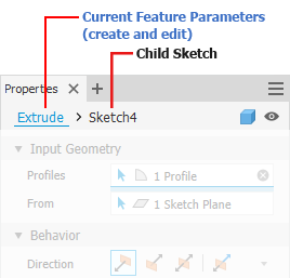
Typically, the property panel begins in the feature definition mode. You can click the breadcrumb text to switch environments, from Feature to Sketch and back again. The breadcrumb text for the selected environment displays in blue.
You can also use the
Return to Feature
 command in the ribbon to switch from sketch editing back to feature editing. The icon displays the active feature being created or edited, such as Extrude, Revolve, and so on.
Switching environments causes the current environment to commit any changes made before the switch occurs. Thus, switching to Sketch from Feature will create the defined feature before the environment changes. Switching back from Sketch to Feature causes any sketch geometry changes to be accepted before the environment change. The property panel fields update with the environment change.
- Click the breadcrumb text you want to edit to activate it.
- Click again to enter edit mode.
- Modify the text.
- Press Enter to complete the change. The browser node name is updated when you click OK to complete the feature.
Advanced Settings Menu
The Property panel menu contains settings related to the active create or edit context. When a command is active you can choose to keep a sketch visible, show or hide presets, and so on. The menu entries are contextual, only what the command will use is displayed.

In some cases, these settings are On by default. Select the menu entry to turn the option ON/OFF. The property panel state for these settings is retained between sessions. Thus, if you want to use them later, you will need to turn them back on. The settings also differ depending on the file type, IAM or IPT. For example, Keep sketch visible on (+) is available only with Part features.
For more about sharing sketches, see To Share Sketches and Features
Property Panel Navigation
Tab key
You can tab from one field to another, whether in the property panel or canvas. When you tab in-canvas, the tabs are for the displayed parameters. When you tab in the property panel, tabbing occurs for those parameters listed in the panel. Cross-highlighting occurs for the related fields.
Character key
When in a dropdown list, use the character key to quickly search for and locate a list entry.
Property Panel and In-canvas Editing
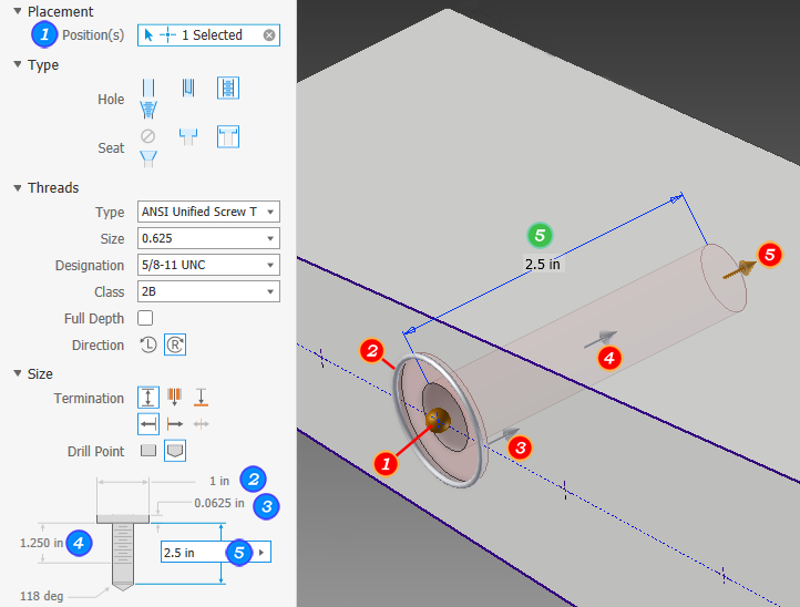
When creating or editing features you can use the edit fields in the Property panel, the in-canvas edit fields, or the feature manipulators to modify values.
The following example uses the Hole feature to illustrate the various parameter value access points.
- When the property panel has focus or a value in an edit control is highlighted, Enter completes the feature definition the same as clicking OK, and closes the property panel.
- When a value edit control has focus and you are actively modifying a value, the Enter key affects only the value.
- When a selector field is unfulfilled, ENTER acts like Continue, and moves the focus to the unfulfilled field.
- When a value edit control has focus you can complete the feature definition process and close the property panel by using CTRL+Enter.
- When using the context menu of a value edit control, after adding the value selection, the cursor moves to the end of the control, clearing the selection. This aids with making use of reference dimensions and applying factors to those values.
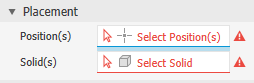
Selector States
The property panel selectors display their states using colors. The following image shows the states and ties them to an example.

Clearing Selections
When a selection is made, the selector field displays the number of items selected and an 'X' at the right end of the field. To clear the selection set, click the 'X', then, make your next selections.
Marking Menu
If the required inputs are not satisfied, the marking menu displays either a disabled OK button or a Continue button in the 3 o'clock position to alert you of the need to complete the definition.
Undo Behavior
- In an active command and a dialog or property panel is displayed: Undo cancels the active command.
- In an active command and no dialog or property panel is displayed: Undo cancels the active command and undoes one step.
- Not in an active command: Undo undoes one step.
Advanced Properties
This section populates with the more specialized options based on the feature type being created.