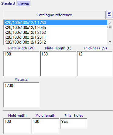
The Standard tab displays the dimensions for the catalog component that you have selected:
The exact parameters that are displayed reflect the type of component you are defining. When the program is run on a low resolution screen, the levels toolbar is automatically switched off and height of the panel is limited to leave more space for the component parameter controls.
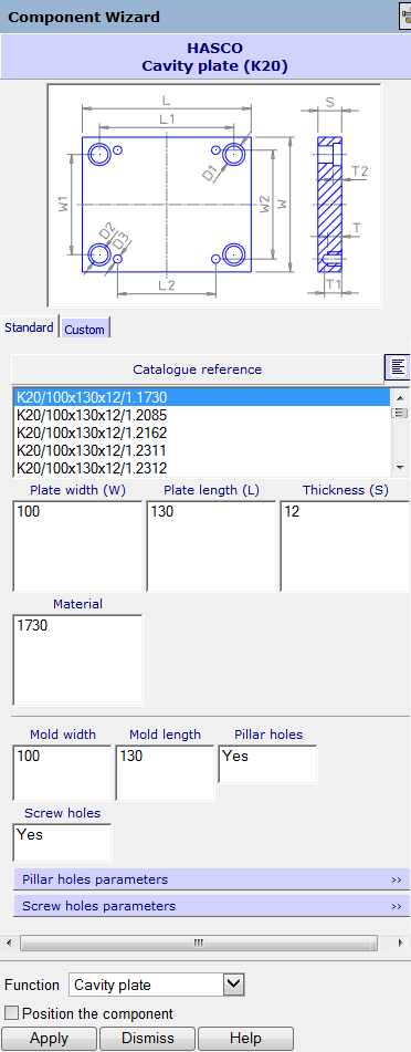
The image in the graphic window is the component you selected using the Choose a component dialog. The image shows the labels of the dimensions on the selected component.
For certain components, there are additional tabs on the dialog. These tabs correspond to the tabs displayed in the Choose a component dialog. Selecting a different tab lets you see different images for these components. This makes it easier for you to see all the parameters of complex components. The different images are displayed by selecting a tab on the wizard.
The default dimension and material options for the component that you have selected from the catalog are displayed in this section of the dialog:
To see all the catalog options for the component, click
Show All
 . Select the dimensions and material you require. Options to customize settings are available on the
Custom tab.
. Select the dimensions and material you require. Options to customize settings are available on the
Custom tab.
As you select a dimension from one column, the numbers of the other columns reduce to show valid combinations only.
Material - Select the International Standard number for the material to be used.
Click on the coloured bar to reveal the boxes:
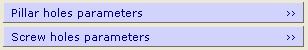
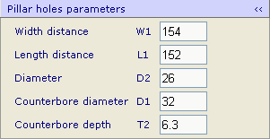
The standard parameters are displayed. Click the coloured bar again to hide the boxes.
Function — The option you select specifies which component you intend to position the component on. Either select an option from the drop-down list or use the default option (Selected on model) to pick the component in the model.
Position the component — Select this option and click Apply on the browser page to add the object to the assembly. You can then position it using the following technique from Assembly modelling.
- Select an existing component. Valid attachments are now visible on the new component.
- Click an attachment on the new component. Valid attachments on the existing component now become visible. There are two types of attachments on the existing component: plane and axis attachments.
Plane attachment — This is shown as an arrow. If you hold the cursor over this attachment, the attachment on the new component is aligned in the same plane as the existing attachment. When you click the mouse, the new component is placed at the cursor position and aligned with this plane attachment.
Axis attachment — This is shown as an arrow with a circle at the bottom. If you hold the cursor over this attachment, the attachment on the new component is fixed on the axis attachment. If you click the mouse anywhere on the screen and don't hover over another attachment, the new component is snapped onto this axis attachment.
- When a new component is added to the existing component, another one appears. Cancel the command by clicking
 on the Quick Access toolbar; the new component disappears.
The component is also registered as an assembly component. You can create further copies of this component or modify it using Assembly modelling techniques.
- Click Apply to create the component on the screen.