Custom Attributes
Use the Parameter Editor to assign custom attributes to objects, modifiers, materials, and animation tracks.
A custom attribute is an additional, abstract parameter; abstract in the sense that it does not directly extend the functionality of the object by default. It affects an object only after wire parameters, reaction controllers, or expression controllers are set up to connect the custom attribute to another parameter in the scene. You can also use custom attributes to store job-specific notes and data.
- Default menu: Animation menu > Parameter Editor
- Alt menu: Animation menu > Attributes > Parameter Editor
Custom attributes behave like other object parameters in several ways:
- They are saved and loaded in the scene file along with the object.
- They can be animated and keyframed.
- They are displayed in Track View along with the base parameters.
Each custom attribute parameter can be one of a number of different data types, including integers, floating numbers, Booleans, arrays, nodes, colors, and texture maps. Parameters added to an object or modifier appear on a Custom Attributes rollout on the Modify panel. For each custom attribute parameter you create, you can specify the name, layout, value range, default value, and UI type: spinner or slider for floats and integers, checkbox for Booleans, etc.
As you customize an attribute, the result is displayed on the Testing Attribute rollout at the bottom of the dialog.
Custom Attributes Special Features
The Custom Attributes feature offers an array of workflow-enhancing functionality, including:
- the ability to add custom attributes to specific animation tracks.
- the ability to edit existing custom attributes.
- 13 available data types.
- a variety of available UI options, such as ComboBox and ListBox for the Array data type.
- the ability to position UI elements precisely with X and Y Offset controls.
- the ability to preserve custom attributes when collapsing the stack.
- a special Attribute Holder Modifier that lets you collect attributes from different entities and access them in one place on the Modify panel.
- the ability to create, load, and save presets wherever a custom attribute can be stored.
Custom Attribute Definition Version Numbers
The custom attribute definition version number is used to control the loading of custom attribute definitions when loading or merging a scene file. If the custom attribute defined in the scene file already exists and the version number of the definition in the scene file is less than the version number of the existing definition, the existing definition is then retained. If the version number of the definition in the scene file is greater than the version number of the existing definition, the scene definition is then used. If the version numbers are the same, the behavior is determined by the custAttributes.getSceneLoadVersionHandlingBehavior() or custAttributes.getSceneMergeVersionHandlingBehavior() settings.
You can change the CA def version numbers in the Add/Edit/Delete group of the Parameter Editor or from the Edit Attributes/Parameters dialog (see the Procedures section below).
Interface
The Parameter Editor takes the form of a dialog with three rollouts: The first rollout sets general options for the attribute; the central rollout sets options for the current parameter type; and the third lets you preview the attribute user interface (UI).
Attribute rollout
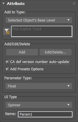
Add to Type group
Add to Type list
Choose whether the custom attribute is assigned to the selected object, its active modifier (as highlighted in the modifier stack), its material, or a picked track. Also use this drop-down list to choose the attribute type to delete or edit.
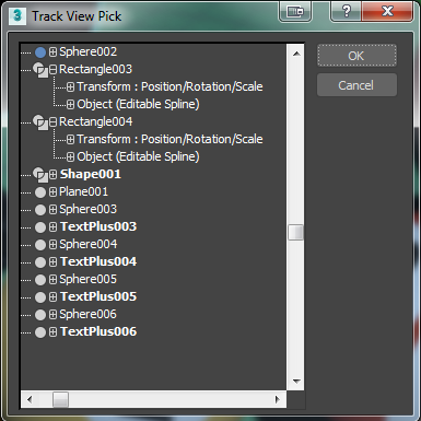
If the text “Pick Explicit Track” appears in the box below the drop-down list before you choose Picked Track, the Track View Pick dialog appears showing the Track View hierarchy. Expand the hierarchy as necessary, click the track to add the attribute to, and then click OK.
 Pick Explicit Track
Click this button to open a Track View hierarchy window from which to choose an animation track. Navigate the hierarchy to find the desired track, highlight the track, and then click OK. The controller information for the track then appears in the text box to the right of the button, and the Parameter Editor will then use this track for adding or editing custom attributes and parameters.
Add/Edit/Delete group
Add
Applies the custom attribute parameter to the current object, modifier, material, or track, depending on the current choice in the Add To Type list.
If a custom attribute parameter is assigned to an object or modifier, you can see and edit its value on the Modify panel after adding it by activating the entity to which the attribute is assigned. If the custom attribute is assigned to a material, it's available for that material in the Material Editor. To access a parameter that's assigned to an animation track, open Track View, highlight the track's Custom Attributes entry, and then right-click and choose View Attribute Dialog.
Edit/Delete
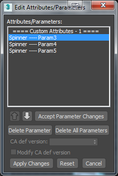
Opens the Edit Attributes/Parameters dialog.
This dialog displays a list of all of the custom attribute parameters assigned to the current object at the current level. Dialog behavior is described in these two procedures: To edit a parameter or custom attribute and To delete a custom attribute or parameter.
CA def version number auto-update
Automatically updates the custom attribute definition version number.
On the initial addition of a custom attribute to an object, a version number of 0 is assigned to the custom attribute definition. When this option is enabled, the first change in each consecutive group of changes to the custom attribute increments the version number.
Add Presets Options
Allows you to create, load, and save presets where available.
Parameter Type group
Parameter Type
Use the drop-down list to choose the data type for the current parameter. The following list includes links to the sections describing the UI settings for each parameter's data type:
- Angle: Spinner or Slider
- Array
- Boolean: CheckBox or CheckButton
- Color
- Float: Spinner or Slider
- fRGBA
- Integer: Spinner or Slider
- Material
- Node
- Percent: Spinner or Slider
- String
- TextureMap
- WorldUnits: Spinner or Slider
UI Type group
UI Type
Selects the type of UI element that controls the parameter.
The UI types available depend on which parameter type you specify. For example, float and integer values are controlled by spinners or sliders, and Boolean values by checkboxes or check buttons. Array values are always controlled by drop-down lists, node values by pick buttons, color values by color pickers, and texture map values by map buttons.
Full descriptions of each UI Options rollout follow, and the list of parameter types, above, includes links to the respective UI Options rollout descriptions.
Name
The name of the parameter. Parameter Editor gives the parameter the default name Param#, with # being a number. Change the name by editing this field.
Angle/Float/Integer/Percent/WorldUnits UI Options rollout for spinners
These are the options for a standard spinner control that sets either a whole-number (integer) value or a real-number (angle, float, percent, World units) value.
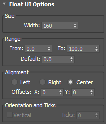
Size group
Width
Sets the width of the spinner.
Range group
From
Sets the minimum value of the spinner.
To
Sets the maximum value of the spinner.
Default
Sets the default value of the spinner.
Alignment group
Left/Right/Center
Sets the alignment of the spinner in the rollout.
Offsets X/Y
Fine-tune the position of the spinner on the horizontal and vertical axes.
Orientation And Ticks group
Vertical
This option is greyed out as it is not available for spinners.
Ticks
This option is greyed out as it is not available for spinners.
Angle/Float/Integer/Percent/WorldUnits UI Options rollout for sliders
These are the options for a standard slider control that sets either a whole-number (integer) value or a real-number (angle, float, percent, World units) value.
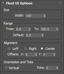
Size group
Width
Sets the width of the spinner.
Range group
From
Sets the minimum value of the spinner.
To
Sets the maximum value of the spinner.
Default
Sets the default value of the spinner.
Alignment group
Left/Right/Center
Sets the alignment of the spinner in the rollout.
Offsets X/Y
Fine-tune the position of the spinner on the horizontal and vertical axes.
Orientation And Ticks group
Vertical
When on, the slider will be displayed vertically. When off, the slider is displayed horizontally.
Ticks
Sets the number of ticks along the slider. The ticks are distributed evenly along the length of the slider.
Boolean UI Options rollout for checkboxes
These are the options for a standard 3ds Max checkbox that the user can turn on and off by clicking it with the mouse.
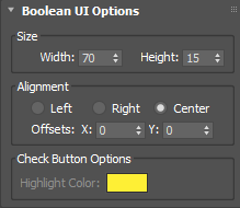
Size group
Width
Sets the width of the checkbox.
Height
Sets the height of the checkbox.
Alignment group
Left/Right/Center
Sets the alignment of the checkbox in the rollout.
Offsets X/Y
Fine-tune the position of the checkbox on the horizontal and vertical axes.
Check Button Options group
Highlight Color
This option is greyed out as it is not available for boxes.
Boolean UI Options rollout for check buttons
These are the options for a standard 3ds Max check button that the user can turn on and off by clicking it with the mouse.
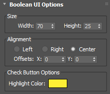
Size group
Width
Sets the width of the check button.
Height
Sets the height of the check button.
Alignment group
Left/Right/Center
Sets the alignment of the check button in the rollout.
Offsets X/Y
Fine-tune the position of the check button on the horizontal and vertical axes.
Check Button Options group
Highlight Color
Sets the color of the button when it is clicked.
Array UI Options rollout for drop-down lists, combo boxes, and list boxes
Thess are the options for controls that let the user choose a named option from a list. The options for the three Array UI types are the same; they differ in how they appear on the Custom Attributes rollout. The types are:
- Drop-Down List: Only the current choice is visible by default. The user clicks the field to open the list and then clicks to choose a different item.
- ComboBox: Displays an editable field above a list box. The user clicks to choose from the list, or edits the field.
- ListBox: Displays a list. The user clicks the desired item; the highlighting indicates the current choice.
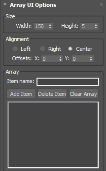
Size group
Width
Sets the width of the list.
Height
Sets the height of the list.
Alignment group
Left/Right/Center
Sets the alignment of the drop-down list in the rollout.
Offsets X/Y
Fine-tune the position of the array list on the horizontal and vertical axes.
Array group
Item name
Lets you enter a name into the list.
Click Add Item to add the name to the array list. To remove an item, highlight its name and click Delete Item. Click Clear Array to remove all items from the list.
[array list]
Displays the contents of the list.
The item at the top of the array list is the default selection.
Node UI Options rollout for pick buttons
A node is any object in the 3ds Max scene. The Node UI element creates a button that, when clicked, lets the user pick a scene node other than the one to which the attribute is attached. After selecting the node, its name appears on the button.
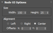
Size group
Width
Sets the width of the pick button.
Height
Sets the height of the pick button.
Alignment group
Left/Right/Center
Sets the alignment of the pick button in the rollout.
Offsets X/Y
Fine-tune the position of the pick button on the horizontal and vertical axes.
Color UI Options rollout for color swatches
This creates a color swatch that displays the current color and lets the user click it to choose a new color with the Color Selector dialog.
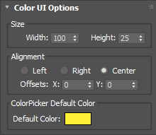
Size group
Width
Sets the width of the color picker.
Height
Sets the height of the color picker.
Alignment group
Left/Right/Center
Sets the alignment of color picker in the rollout.
Offsets X/Y
Fine-tune the position of the color picker on the horizontal and vertical axes.
ColorPicker Default Color group
Default Color
Sets the default color of the color picker.
Material/TextureMap UI Options rollout for material and map buttons
The options for the Material UI type (MaterialButton) and TextureMap UI type (MapButton) are the same. The difference is that, when the user clicks the resulting button to open the Material/Map Browser, the former displays only materials and the latter displays only maps.
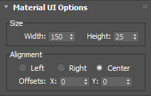
Size group
Width
Sets the width of the material/map button.
Height
Sets the height of the material/map button.
Alignment group
Left/Right/Center
Sets the alignment of the material/map button in the rollout.
Offsets X/Y
Fine-tune the position of the material/map button on the horizontal and vertical axes.
String UI Options rollout for text boxes
The String parameter type creates a text box that the user can edit with the keyboard, with optional default text.
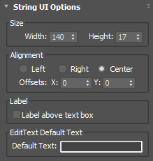
Size group
Width
Sets the width of the material/map button.
Height
Sets the height of the material/map button.
Alignment group
Left/Right/Center
Sets the alignment of the text box in the rollout.
Offsets X/Y
Fine-tune the position of the text box on the horizontal and vertical axes.
Label group
Label above text box
When off, the label (parameter name) appears to the left of the text box. When on, the label appears above the text box.
EditText Default Text group
Default Text
Enter any default text that should appear in the box before the user edits it.
Testing Attribute rollout
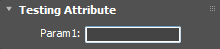
This rollout displays the UI layout for the custom attribute that you are working on. It updates continuously so that you can see how different settings in the various rollouts affect the UI display of the attribute.
The UI element is operational in this rollout in the sense that it can be moved, clicked, toggled, and so on.
Procedures
To add a parameter to an object:
Select the object.
Choose Animation menu > Parameter Editor. If using the Alt menu system, you'll find Parameter Editor on the Attributes panel of the Animation menu.
The Parameter Editor opens.
Change settings as desired.
Click Add.
The parameter is added to the level specified in the Add To Type list. If an object has no custom attributes, Parameter Editor first adds a Custom Attributes entry to the current Add To Type level, and then adds the parameter to the Custom Attributes entry. If an object has more than one Custom Attributes entry as a result of collapsing its stack, the parameter is added to the first Custom Attributes entry.
If a custom attribute parameter is assigned to an object or modifier, you can see and edit its value on the Modify panel after adding it by activating the entity to which the attribute is assigned. If the custom attribute is assigned to a material, it's available for that material in the Material Editor, on the Custom Attributes rollout. To access a parameter that's assigned to an animation track, open Track View, highlight the track's Custom Attributes entry, and then right-click and choose View Attribute Dialog.
To edit a parameter or custom attribute:
Select the object.
Open Parameter Editor.
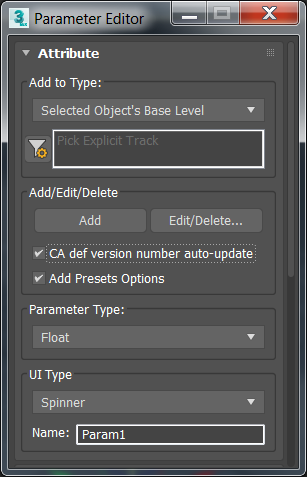
From the Add To Type drop-down list, choose the type of parameter to edit, and then click Edit/Delete.
The Edit Attributes/Parameters dialog opens.
 Note: If you chose Add To Type > Picked Track, the Track View Pick dialog might open first to prompt you to choose the animation track whose attribute to edit.
In the Edit Attributes/Parameters dialog, highlight the parameter to edit.
Its settings appear in the Parameter Editor.
Change the settings in the Parameter editor, and then click Accept Parameter changes.
With multiple parameters or custom attributes, to change the ordering, click the entity to move, and then use the up and down arrow buttons to move the entity in the list. Moving a Custom Attributes entry also moves its parameters.
Note: You cannot rename a Custom Attributes entry.To change the custom attribute definition version, click Custom Attributes to highlight it and enable Modify CA def version. You can now use the CA def version spinner to change the version number. For more information, see the Custom Attribute Definition Version Numbers section at the beginning of this topic.
When finished editing, click Apply Changes, and then exit the dialog by clicking the Close or Cancel button.
To delete a custom attribute or parameter:
Select the object.
Open the Parameter Editor.
From the Add To Type drop-down list, choose the type of parameter to delete, and then click Edit/Delete.
The Edit Attributes/Parameters dialog opens.
Note: If you chose Add To Type > Picked Track, the Track View Pick dialog might open first to prompt you to choose the animation track from which to delete the attribute.In the Edit Attributes/Parameters dialog, highlight the parameter to delete, and then click Delete Parameter. Alternatively, to delete all parameters under the same Custom Attributes heading as the highlighted parameter, click Delete All Parameters.
To delete one or more custom attributes instead, click a Custom Attributes heading, and then click Delete Attribute or Delete All Attributes. Multiple attributes can result from collapsing an object's stack with Preserve Custom Attributes on. For example, one set of custom attributes might be applied to an object and a second set of attributes assigned to one of its modifiers. Collapsing such an object results in two sets of custom attributes.
Click Apply Changes, and then close the dialog by clicking its Close box or the Cancel button.