The graph at the bottom of the main window shows the date running in the horizontal axis and the time of day running upwards in the vertical axis. The data displayed in the graph itself is the hourly wind speed from the weather station, mapped in colour/brightness to exactly the same scale as shown in the wind rose legend in the chart above it.
Within this graph, the coloured area indicates the actual date and time range over which the wind rose will be calculated. Changing this range interactively over different seasons and times of the day can often provide very useful insight into different wind patterns that you may be able to leverage within your design.
For detailed information on changing this range, see Date/Time Selection.
Data Averaging
To properly understand the wind speed data displayed in this graph, it is important to understand that rolling averages are applied by default. Without any data averaging, the wind speed graph can be almost meaningless. For example, the graph below shows raw hourly wind speeds for Waltham, just outside Boston in the United States.
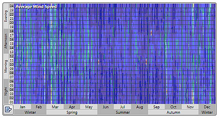
As you can see, the data looks almost random and visually discerning any significant patterns within it is very difficult. However, instead of displaying just the raw data, it is possible to display a rolling average. This is done over a specified number of days by adding up all the data for each hour across each of the days and then dividing by the total number of days to give the display result.
Thus for an averaging period of n days, for each hour at day d, the result is simply the sum of each hour starting at d-(n/2) and ending at d+(n/2), divided the total by n. To move to the next day, the hour at d-(n/2) is subtracted, then d is incremented by one, the new hour at d+(n/2) is added and the result again divided by n. This results in a 'smearing' of the data that makes overall trends in wind speeds more apparent.
It is important to note that averaging is only applied to the visualized data in the date/time graph. The wind rose is always generated from the raw and unmodified hourly wind speed and direction data.
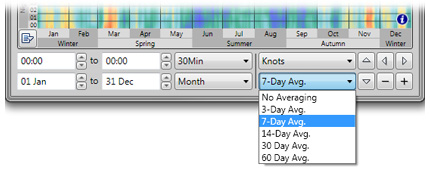
For the same raw wind speed data, these different values result in the following patterns.
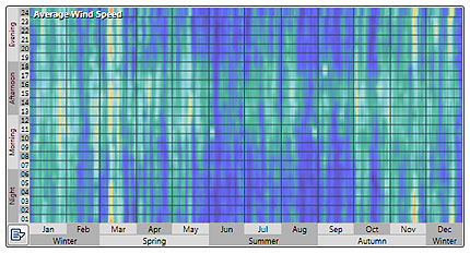
The same data as above, using a 3-day rolling average.
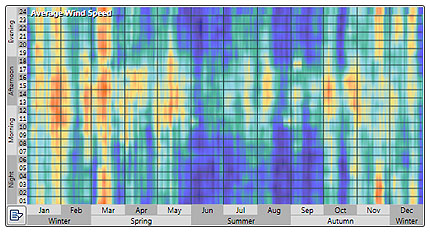
Using a 7-day rolling average.
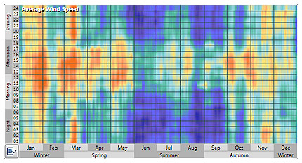
Using a 14-day rolling average.
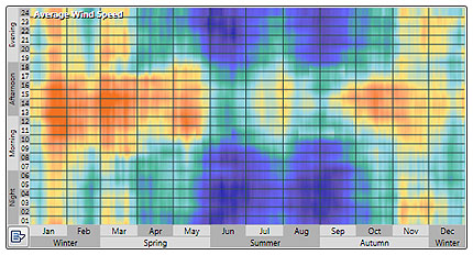
Using a 30-day rolling average.
Changing the Displayed Units
You can also change the units displayed within both the wnd rose chart and the wind speed graph using the units selector. The option you choose here is saved to the System Registry and persists between sessions.
