What's New Cards
A card list contains two or more topic cards spanning a grid of 4 columns by any number of rows, which grow with the number of cards, one card per column and row. The height of a row is dependent on the size of largest card in that row.
Cards are highlighted with a background shadow as you hover over.
Authoring Cards
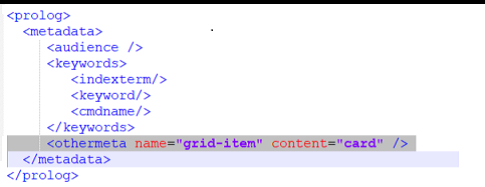
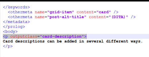
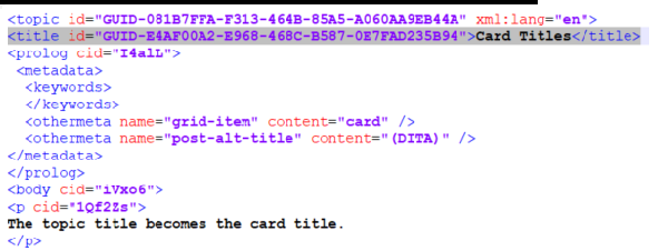
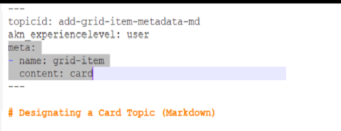
A card has three visual elements: title, description, and image. The whole card acts as a link to the corresponding card topic. A card topic can essentially be any topic that is designated as a card.
DITA
Markdown
Authoring Card Lists
A card list can be added to just about any topic. It consists of a container and a commma-separated list of topic IDs.
Since the list is topic-based, you can use any topic in the same product-release-language space.
The cards will appear in the order in which they are listed in the container.
Markdown
Use the #style helper as the container.
{{#style "whatsnew-collection-list"}}
add-grid-item-metadata-dita,
GUID-081B7FFA-F313-464B-85A5-A060AA9EB44A,
add-card-descriptions-dita,
GUID-42EA9825-C1D3-4DC3-B213-BA171F239E59
{{/style}}
DITA
Use the section element as the container. Set the outputclass attribute to whatsnew-collection-list.
<section outputclass="whatsnew-collection-list" id="GUID-4C232123-DB2D-4B99-9A0C-F19F91CB0416">
<p>GUID-4DA256DF-A803-4AB5-8D20-7D1C6D033E81,GUID-E1E0A5AC-5605-4051-B8F1-DE467CF04691,
   whatsnewcard-eight,
   whatsnewcard-five</p>
</section>