Sections
Forms, like object types, can also distribute their fields into sections. Like object sections, form sections visually distinguish their constituent fields from other fields, but form sections are rendered above one another on a form, instead of on separate tabs that are only rendered one at a time.
Visual separation is essentially the only purpose of object sections, however, and as such, object sections only have a "Name" attribute. By contrast, users can select from among three major options for form sections that enable more advanced behavior.
Lookup
For a section with the Lookup option enabled, a magnifying glass icon appears next to the section title, as shown in the screenshot below; clicking on this icon brings up a panel showing a table report. The user can select any of the rows of the table by clicking the button in the leftmost column, and the form section will be populated by the data of that row.
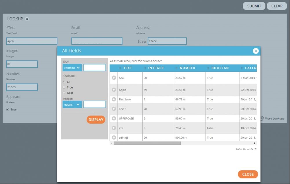
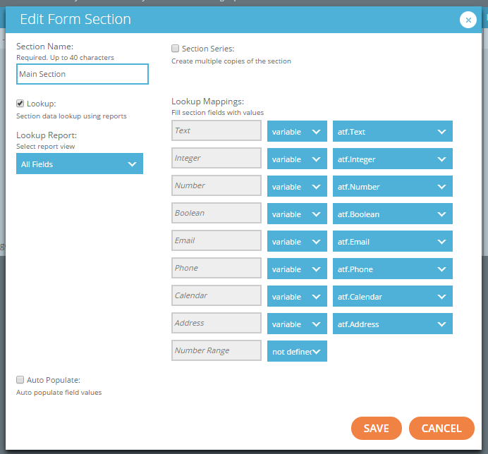
When the user selects the "Lookup" option when editing a form section, he or she can control which table report appears in the panel using the "Lookup Report" menu; this menu is populated by all the table views defined in this account with the "Form Lookup" designation, see Report Views.
To determine which fields of the chosen table row correspond to which fields within the form section, the user can fill out the provided "Lookup Mappings". For each field within this section - listed in the gray text boxes in the screenshot below - the user can either select a variable from the results of the chosen Lookup Report (i.e. a column of the table report), or build an EL expression using the variables available in the report. The Lookup attribute will not be rendered as an option unless the section already contains fields, and since a newly-added section begins at the bottom of the list of fields (and therefore empty), the user must first add fields to the section before attempting to select this option.
Auto Populate
In order to properly use the Auto Populate option, at least one Reference-type field must be defined in the form, referencing either a resource or a group type. When creating auto-populate mappings, then, the user can select a field of the referenced object type and map a field within the form section to the value of that object field.
In the example screenshot below, the form contains two Reference-type fields: "Parent", which references the "ParentGroup" group type, and "Child", which references the "ResText" resource type. When a user views the form at runtime, he or she will be able to select from among the defined instances of each of these types, and the four fields with auto-populate mappings will be populated by the values of the "TextMultiLine", "TextListOfValues", "TextLabelList", and "TextDictionary" fields of the selected ResText object, respectively.
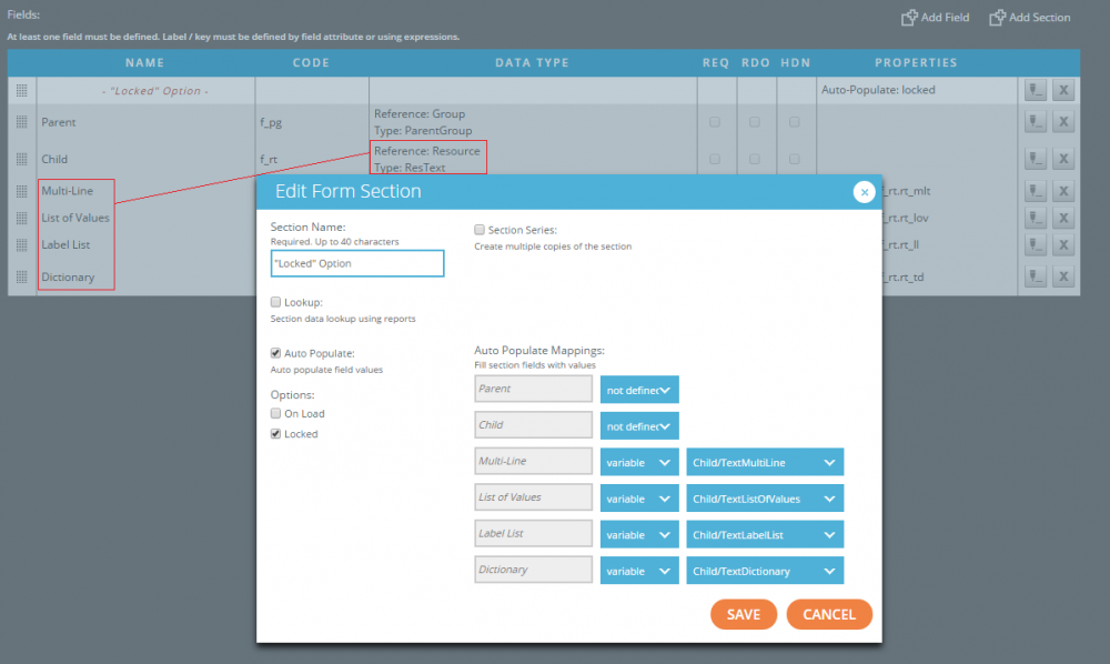
The auto-populate option contains two attributes which control when and how fields within the section are automatically populated. By default, the form will display refresh buttons next to all fields in the section. When the user presses one of these buttons, the value in the corresponding field will be replaced by the value of the mapped field of the reference object; the user is then free to edit the supplied value, and refresh again to revert to the value of the reference object.
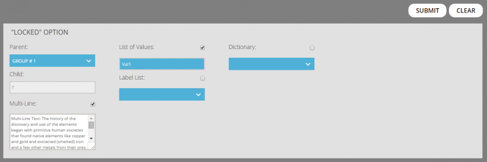
If the On Load option is selected, whenever the user selects a new reference object from the drop-down list, all mapped fields will automatically have their fields populated by the values of the new object; since the first object in the list is selected by default when the user navigates to the form, the fields of the section begin populated by the first object's values. If the Locked attribute is selected, the form renders a checkbox next to each field in the section. When a box is unchecked, the user can manually enter any value into the field, but if the user checks that box, the field becomes locked, and automatically populated by the fields of the reference object; if the user selects a new reference object after a field has been locked, that field will automatically assume the mapped value of the new object. The screenshot below shows the effect of the Locked attribute. Note that if the user selects both the On Load and Locked flags for a section, the former will override the latter.
Section Series
The last option a user can set for a form section is the Section Series option, which gives users the ability to make multiple copies of the section at runtime. This option contains several attributes:
- Initial Size attribute controls how many copies of the section are rendered on the form by default
- Increment attribute controls how many copies are added whenever the user presses the button to add more sections.
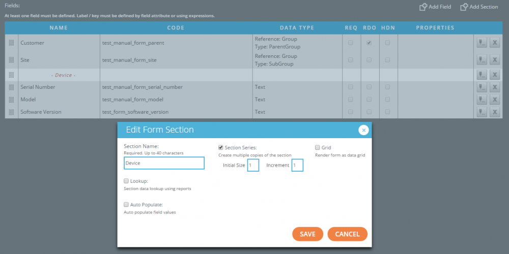
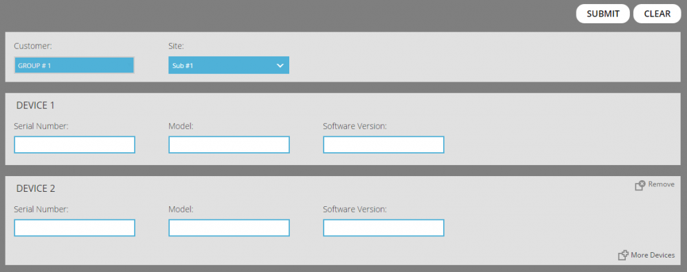
In the screenshots below, the "Device" section has the Section Series option enabled, with an initial size of 1 and an increment of 1. When a user navigates to the form, only the "Device 1" section is initially rendered, and when the user presses the "More Devices" button, a "Device 2" section is added; the user can remove this section by pressing the "Remove" button.
If there are multiple copies of a section on a form, the system processes the form multiple times, once for each copy of the section. In the below example, the system would process the form once using the values entered in the "Device 1" copy, and once using the values in the "Device 2" copy.
In some cases, a form may need to render a large number of copies of a section, and if the form renders each copy as a full section, as in the above example, the total height of the form can skyrocket.
To avoid this, a user can select the "Grid" attribute. In this case, the form renders all copies of the section as a table or grid: each field in the section becomes a column of this grid, and each copy of the section becomes a row of the grid. A "Row" column is inserted to the front of this table to show the index of each copy. The example below show an example of the "Grid" attribute in action.
