Charts
Chart views display data on graphs or diagrams, as many data sets lend themselves towards visual representation instead of simple text in a table. Charts can have either the Report Page or Dashboard Widget designations, and unlike table views, are equally functional using either designation. As discussed on the Chart Views page, the outline of a chart dictates many attributes of a chart's structure, providing a framework to be filled by the results of a data query. The screenshot below highlights the different attributes defined by a chart outline.
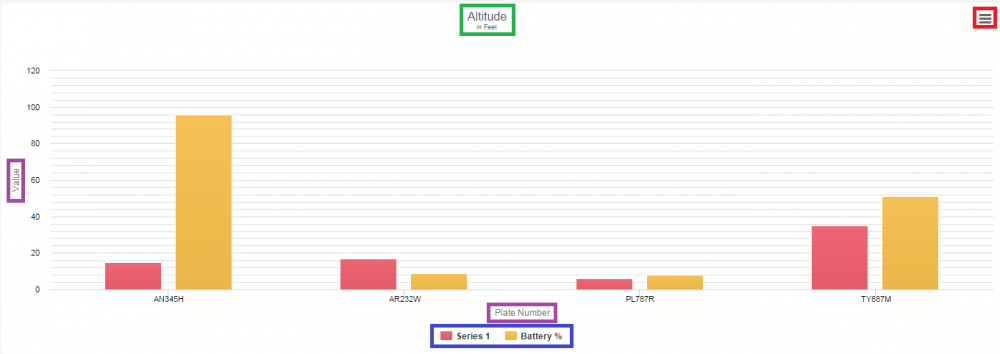
The green box contains the caption of the chart view, which acts as the title of the specific chart, as well as the sub-caption of the chart immediately below it.
The purple boxes contain the labels of the value and label axes, respectively. The blue box contains the legend of the chart, identifying the name and color of each of the data series displayed by the chart; each entry in the legend can be clicked to hide/show its corresponding series on the chart.
If the number of data series in the chart exceeds the "Legend Selector Cap" field of the chart outline, only a single data series appears on the chart at a time, and this legend disappears. In such a case, a drop-down box appears in the top left of the chart that both displays the name of the current data series and allows you to select a different one.
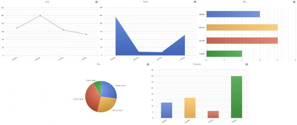
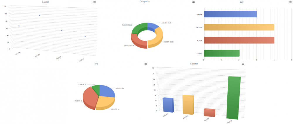
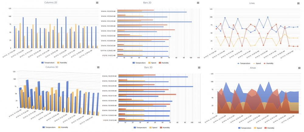
The most substantive attribute of a chart outline, however, is the chart type, which is the way that the chart displays each data set, such as a line graph, a 2D bar chart, a 3D pie chart, etc. The appearance of each chart type is shown below.
2D and 3D Charts
2D
3D
Series
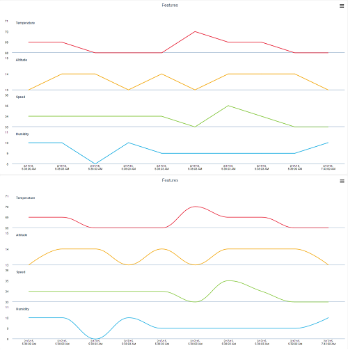
Stacked Charts (Regular or Curved)
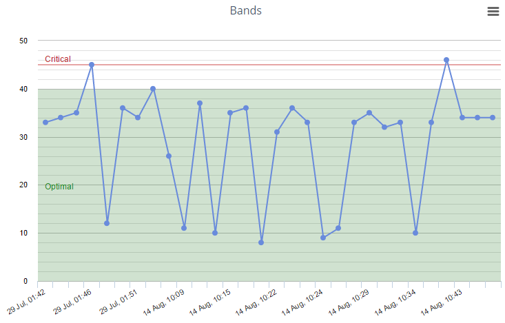
Bands
The last component of a chart's appearance are the bands that are defined within its outline. Bands are ranges along the value axis with their own names and background colors displayed on the chart.
These bands help to provide visual context to the values displayed on the chart, and while they are not directly linked to threshold values stored within system objects, they often correlate to those values. In the below example, the chart outline contains two bands: "Optimal", between the values of 0 and 40, and "Critical", at exactly the value 45, which visually inform a user of the state of the values displayed.
