Maps
Reports can display data visually on Map Views, so long as query results contain location data.
Map views can have the Report Page, Dashboard Widget, and API designations. The primary difference between report page/mobile application maps and dashboard widget maps is that report page/mobile application maps display row guides for highlighting a specific query result on the map or locating a specific asset on the map, and dashboard widgets do not. There are other differences unique to each map element type.
Markers
The Markers element type displays each query result on a map with an icon.

As is the case with other report page views, the criteria of the report appear in the left filter. The row guide of the report appears immediately to the right of this filter, showing an icon, label, and description for each query result. If a user clicks on the icon of any query result, the report will select that result and re-center the map display to focus on that result.
Users can also select any element by clicking on its icon on the map itself. Clicking on any icon on the map will bring up a popup on the map displaying the label of the selected element, as well as its geo-located address, if one exists.
Map elements can contain internal links, and if one exists within the selected map element, a "More Details" link appears in this popup as well, that will open the link in a modal window. Alternatively, the link within a map element can be opened by clicking on the label of the selected link in the row guide.
Finally, if the map element contains the "Area Radius" and "Area Color" attributes (or has conditional decorators setting these values), zones appear around the query results on the map, as shown below:
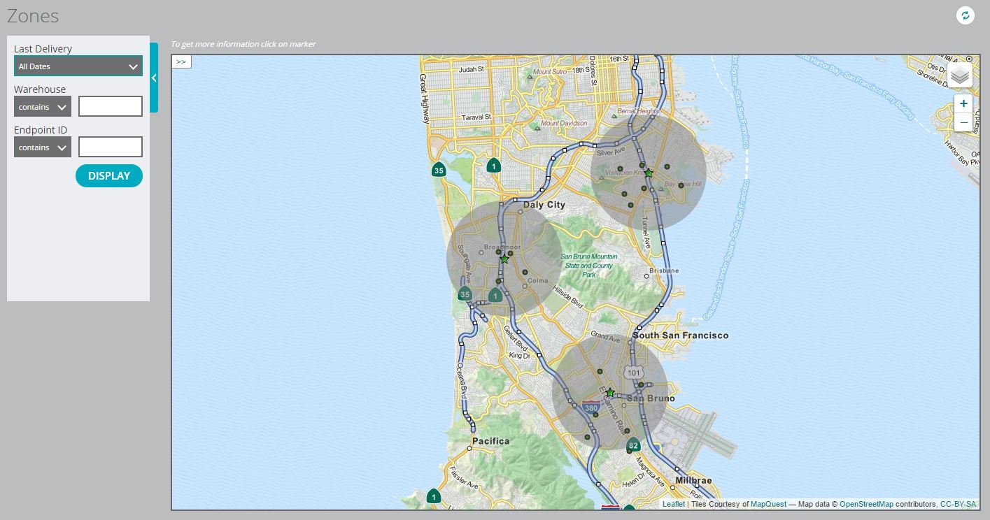
As a dashboard widget, the map itself appears the same, but no criteria filter or row guide is displayed, and while clicking on a map icon will bring up a popup containing a label and address, this popup will not contain a "More Details" link. Zones are disabled for dashboard widget maps as well.
Dots
The Dots element type displays each query result on a map as a colored dot instead of an icon, which can be useful when showing a large number of results condensed into a small area.
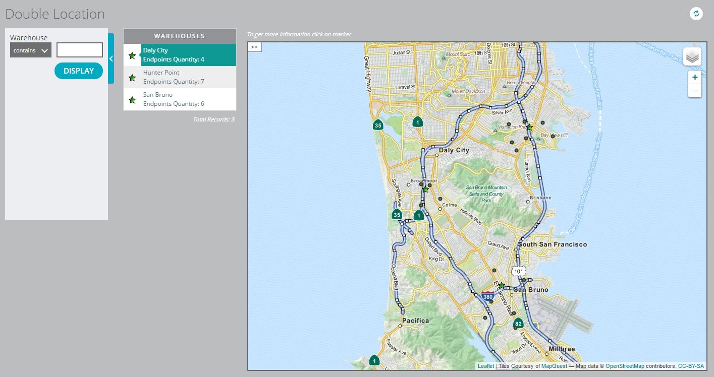
The size and color of each dot are dictated by the so-named attributes of the map element, or by a conditional decorator, if one exists.
As for the Markers element type, clicking on a dot on the map will bring up a panel showing the label of the result, the address at its location, and optionally a "More Details" link. By default, if multiple dots appear in sufficiently close proximity on the map, the map engine will display a single group icon showing the number of elements within, instead of displaying each dot individually.
If the "Zoned" flag is checked for the map element, however, the map engine will override this default and display each dot on the map, though if the user zooms out sufficiently far on the map, multiple dots will become indistinguishable. Row guides and links are disabled for dashboard widgets of this element type as well.
Paths
The Paths element type displays records as a set of chronological chains of actions, typically based on selecting some activity type.
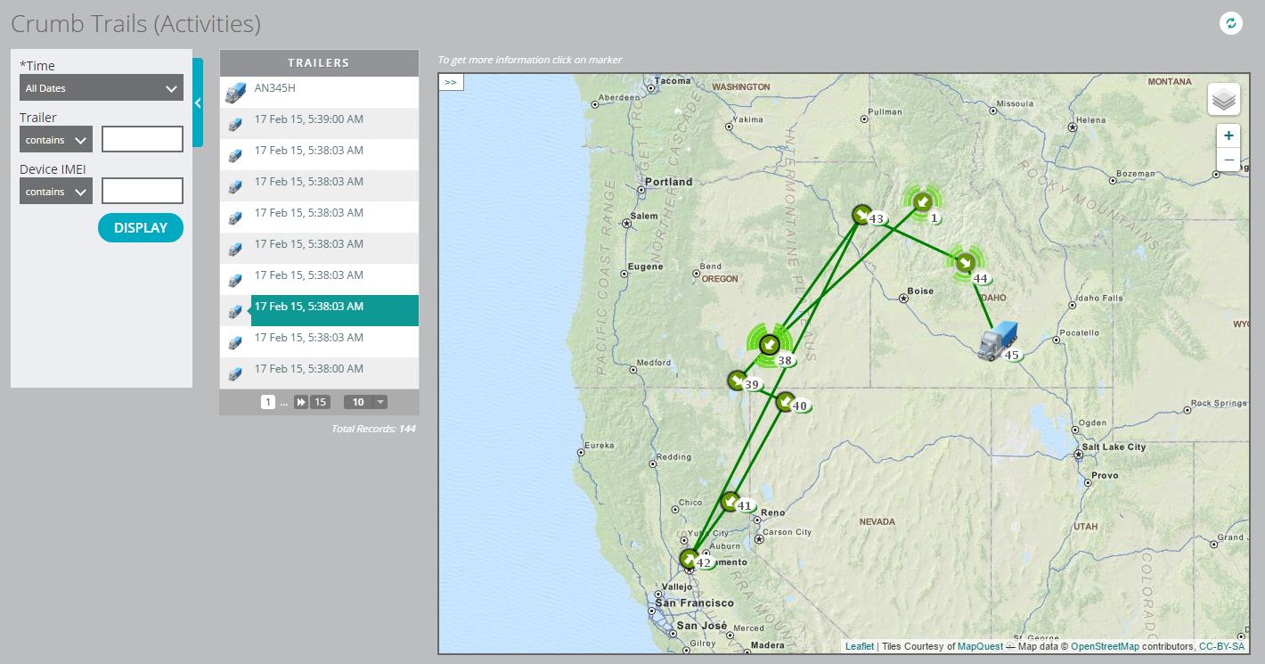
The system uses the Key variable/expression of the map element to group records together, then orders the records within a chain based on their values for the Time field of the map element.
The map engine displays each record on the map as an arrow icon pointing to the subsequent record in the ordering, though if the optional Icon field of the map element is present, that icon will override the arrow for the last crumb in the trail only. The map engine also traces a line from each record to the next. Clicking on any icon on the map brings up a popup showing the Label field of the map element, the time of that particular record, its geo-located address, and several visualization options for the crumb trail.
The row guide for a Paths element also sorts records out into chains, sorting them based on the Group Key attribute of the row guide itself, though this should always be set to the same value as the Key of the Paths element.
The records appear in the row guide in descending order of time, with a large icon and the text Label of the row guide for the most recent record in each chain, and a smaller icon and the Group Label of the row guide for each other record.
Only the elements that appear on the row guide appear on the map; along these lines, the number of crumbs appearing on a dashboard widget is capped by the Default Rows attribute of the map view, which can affect how many chains appear on the widget.
Similarly, map views of this element type often use the record time as a criterion, and when rendering a dashboard widget, the report visualizer will apply the default time span to the criterion; this value can be set to "Last 30 Days", "Last 90 Days", or "This Year" in the settings of the account, which may also affect how much data appears on the widget.
Process
The Process element type functions and appears similarly to the Paths type, but with some key differences. Each element type displays a chain of records in the same way, as a sequence of arrow icons with a possible icon for the last record in a chain, though this icon appears for the Process element type if a process contains an icon field. Where the Paths element type can display several chains on the map simultaneously, though, only a single process can appear on the map at once.
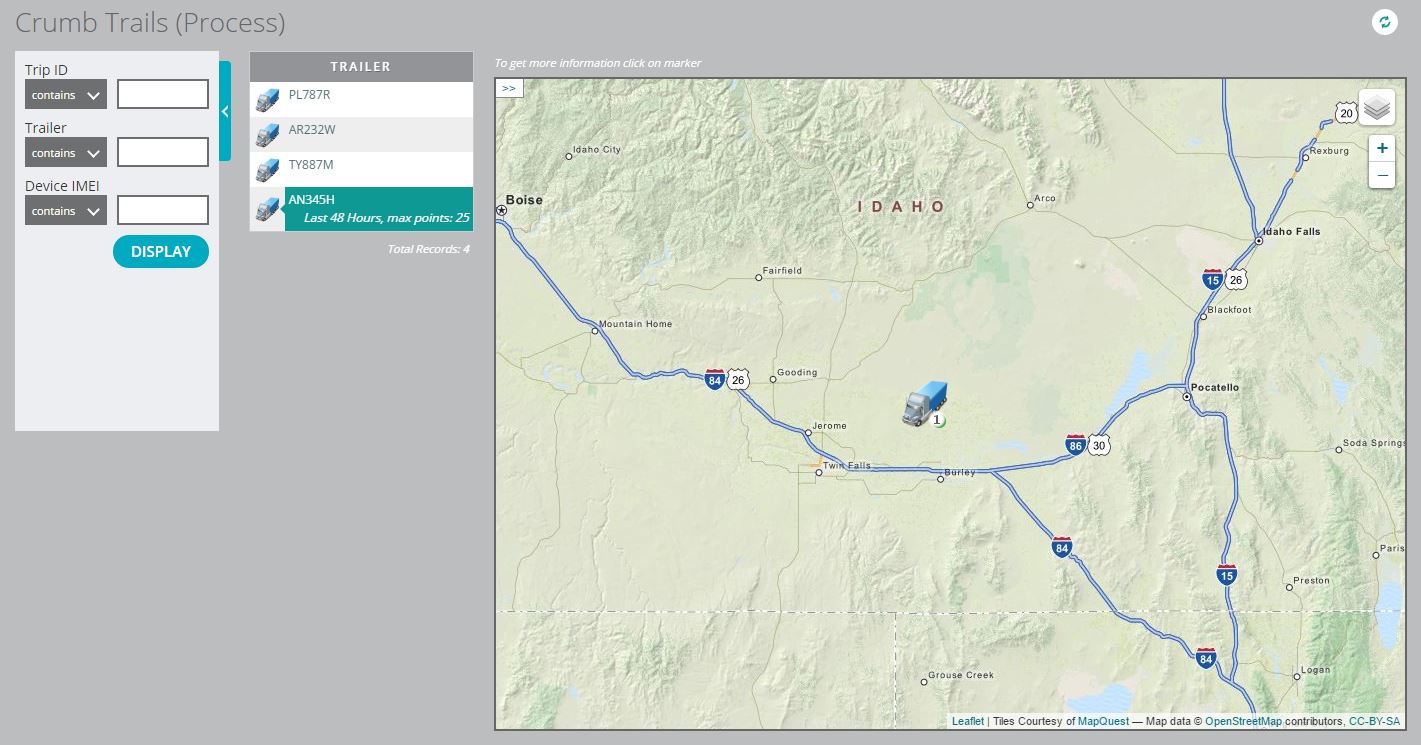
The row guide for this element type reflects this functionality: instead of displaying each activity record, it lists each process object, identifying each using the Label of the row guide, and only the process (or, rather, all activities that belong to that process) selected by the user appears on the map.
Within the selected row guide entry appears a link to a panel where the user can filter the activities within the selected process, to only show the X most recent data points that fall within a selected time range. The text of this link appears as "[Date range], max points: [X]". The panel is shown below:
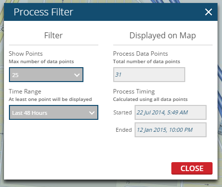
The default values for this filter are the last 48 hours, and a 25 record maximum. If the user toggles between different processes, the same filter is applied to the new process. Similar to dashboard widgets of the Paths element type, these default values can affect how much data appears in a Process-type dashboard widget.