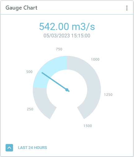
Create a gauge chart to monitor latest sensor values.
To create a gauge chart:
- In your workspace, choose Add Component
 Gauge Chart.
- Select a Data Source and give the chart a Name and Description.
- Set the Threshold values to indicate the desired or expected data range. When the latest value goes outside of this range, the needle and value will be shown in red.
- If you have access to the Demand Forecast tool and have forecast data for your sensor, under Type you can select Forecast to add this to the chart. The related scenario will be selected automatically.
- Time Range: If you want to show data for a specific time period in your chart, turn this on and then select the specific dates or how many days to go back (time offset).
- Click Submit.
