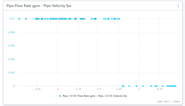
Create a Scatter Chart to visualize the relationships between two sets of time series data.
For example, a scatter chart for Flow and Velocity can provide some indication of obstructions (roots, grease) in the system.
To create a Scatter Chart
- In your workspace, choose Add Component
 Scatter Chart.
- Choose a sensor for the X-Axis time series.
- Choose a sensor for the Y-Axis time series.
- Enter a name and description.
- Series: Select the series type for the chart.
- Resolution: Select the data interval for the chart.
- Time Range: If you want to show data for a specific time period in your chart, turn this on and then select the specific dates or how many days to go back (time offset).
- Then select Submit.
Add more time series data sets
If you want to, you can add more time series to your scatter chart.
- Click on the three dots icon
 beside your chart and select Configure.
- Click on + Add Source in the top right.
- Choose sensors for the X-Axis time series and the Y-Axis time series. Then select Add Source.
- To adjust the display of this additional source, click on the source name to expand it. Then select See Source Adjustments. You can adjust the symbol and color used for the source.
