Button Layers
The basic Button component and the other three variants—ToggleButton, AnimatedButton and AnimatedToggleButton—are each made up of five layers. To see the Button component’s layers, double click the button on the stage. Be sure to double click the standard button and not one of the variants to follow the immediate sections.
The layers are:
- actions: used to place AS statements
- labels: used as a visual cue to indicate each state of a button (described in Button States)
- textField: used for the text a button displays at runtime
- button: used to place the graphical image of the button at various states
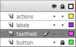
Figure 2: The button layers.
These layers, as they are, are not necessary. They may be repositioned, renamed, merged, or removed completely in favor of other layers. A button may be composed of any layers the UI artist chooses to create; however, we have provided these layers as a good starting point for organization. Keep in mind however, that a button will not function properly if the AS in the actions layer and the labeled keyframes of the labels layer are not present and in the proper positions. Likewise, graphical representation of each state must be included at the proper positions relative to the labels keyframes on the timeline somewhere. Therefore, it is recommended that the UI artist keep the layers as is until a better understanding of how the button component works has been achieved.